
Yin-Yang is a Japanese food delivery service focused on fresh sushi and rolls, along with popular European dishes. The brand first came to the agency for a design audit, to analyze its existing visual style, identity, and market recognition.
The audit showed that the company had no unified visual style: the logo and fonts were used inconsistently, and design elements changed every time. The narrow, elongated typeface was hard to spot on street advertising, causing the brand to get lost among competitors. There were also no clear rules for different touchpoints, which hurt the overall look and made it hard to build a cohesive image.


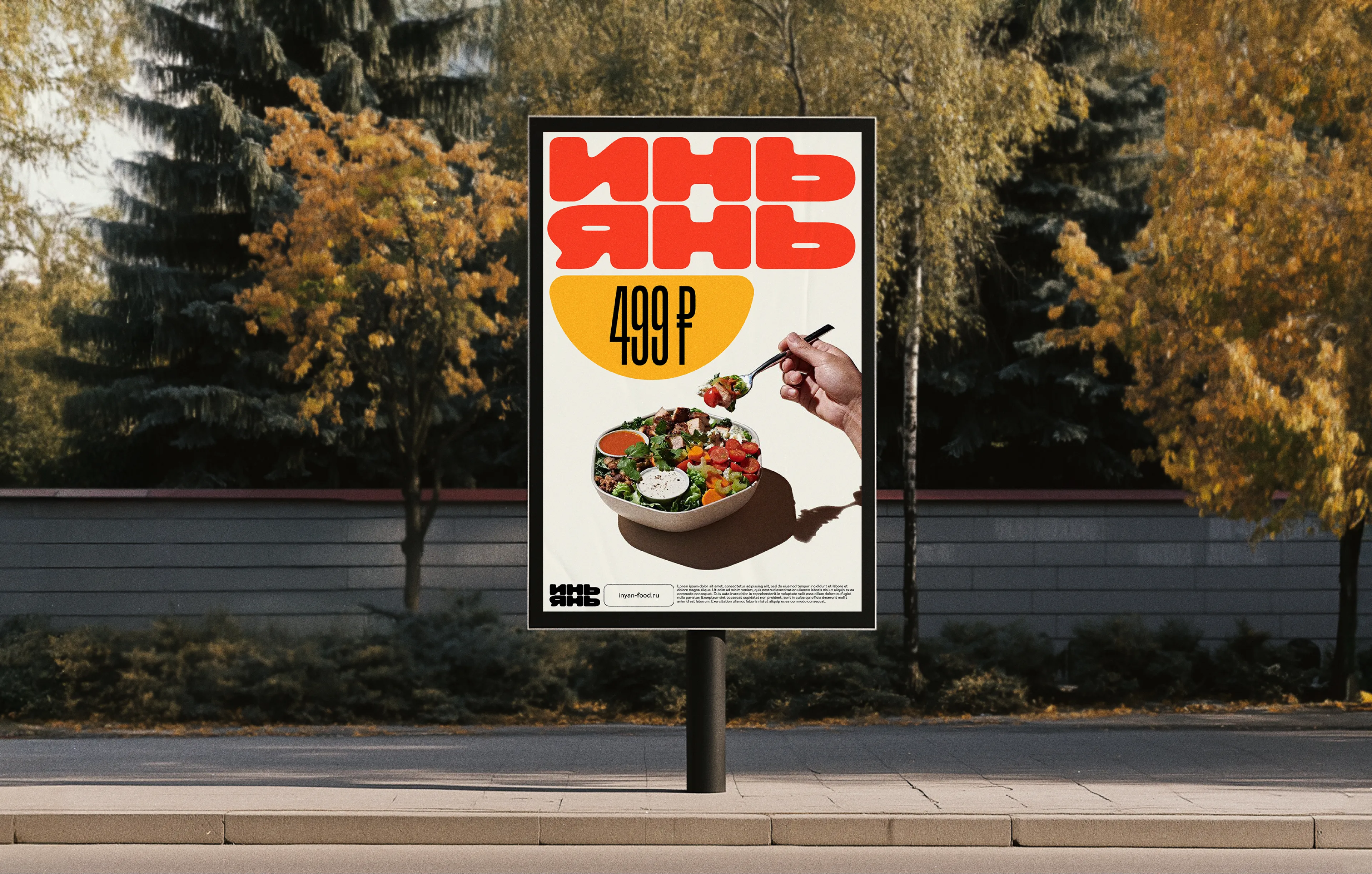
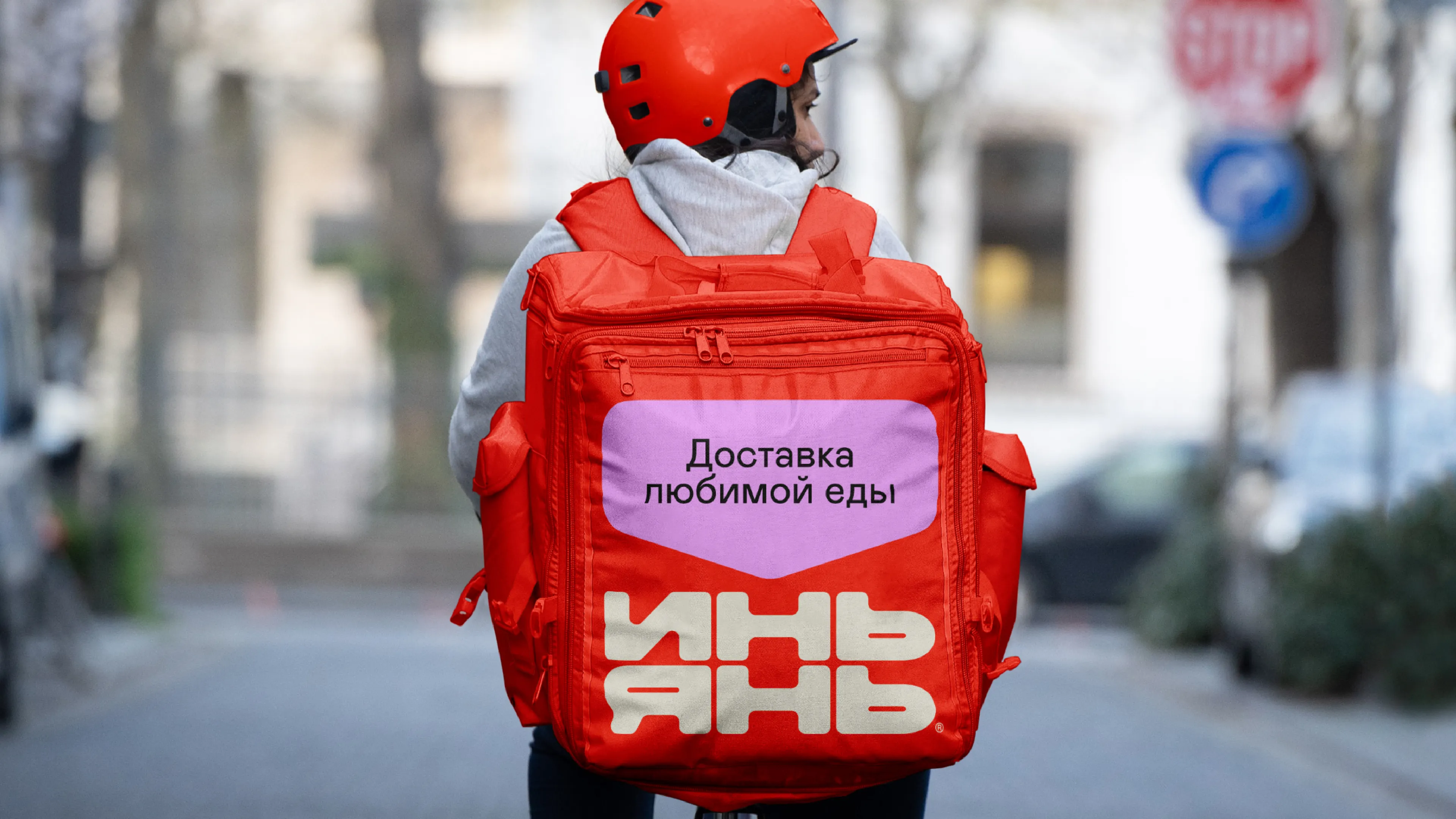
After the audit, the client decided to develop a new visual system rather than partially update the old one. We needed to convey the brand's message: choosing and ordering food is now easy and enjoyable. The new style needed to feel friendly and look energetic and vibrant. Instead of the elongated typeface that was hard to make out from a distance, we proposed a larger, rounder one to improve readability and visibility on the street. The primary color became a warm red (Pantone Warm Red) — it looks good across every touchpoint and grabs attention while adding emotional warmth.
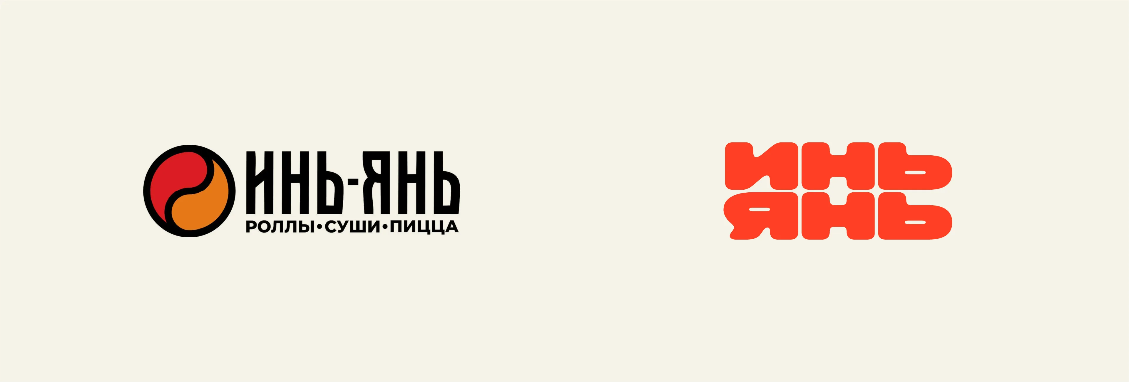


We built the concept around the principle of a traditional Japanese bento box (a compact container with different food portions). This approach runs through both the logo and the entire visual system.
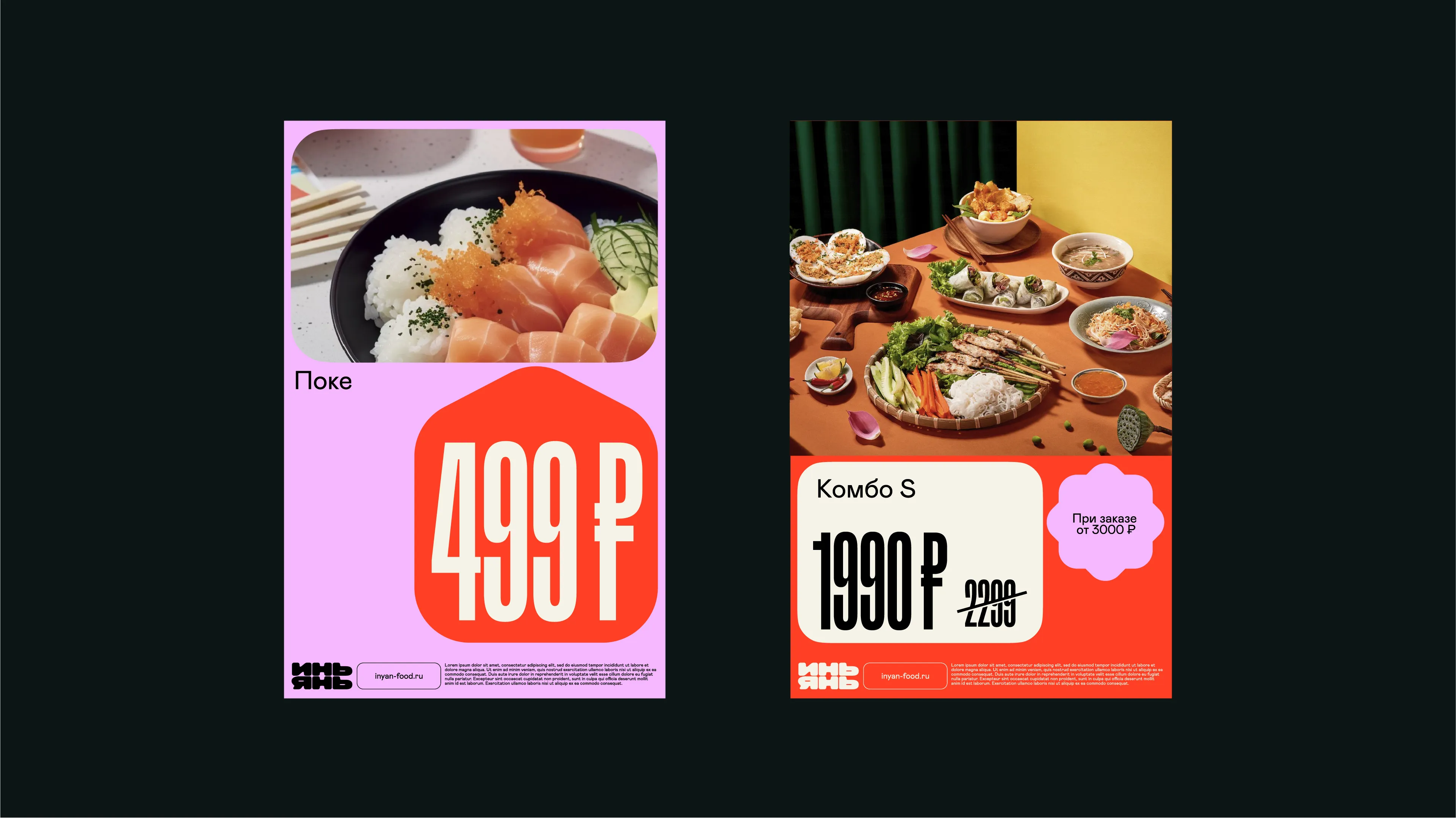
Just as bento boxes neatly separate different dishes, the new system efficiently organizes elements within layouts.

With this layout, information sits in convenient "compartments" and is easy to read. These modules can take different shapes and serve different purposes: bright color blocks, food photos, or price tags.
We developed a starter set of elements that can be expanded by creating new shapes within this style. The modular system makes it possible to assemble a wide range of layouts while keeping the brand identity consistent.

Our palette combines bright and warm tones. Soft, rounded color blocks became the core element, evoking associations with friendliness and simplicity, in line with the overall concept of the style. We gathered everything into a convenient guidebook covering rules for color, typography, and examples of the logo in use across different touchpoints.
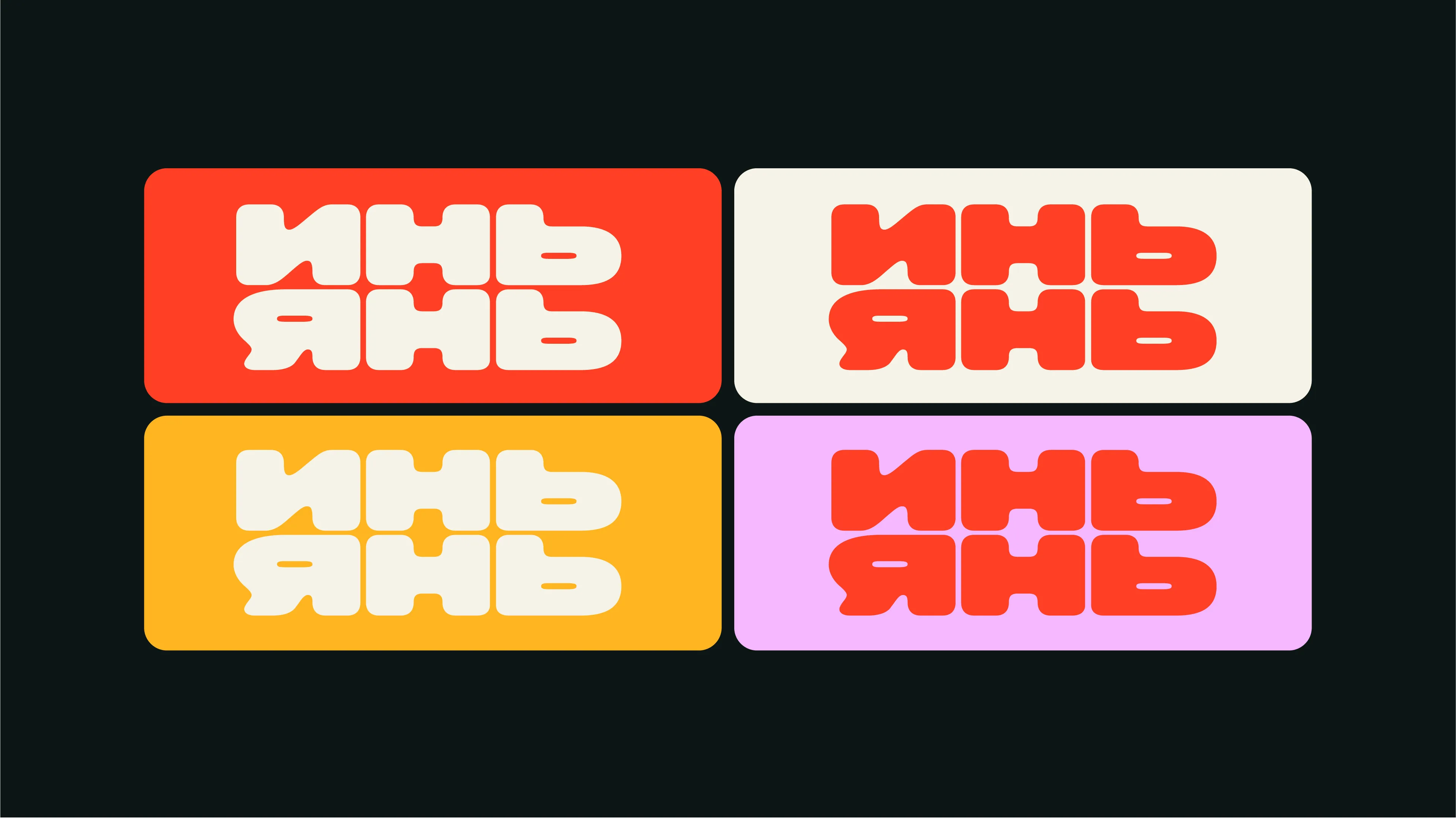


The guide spells out the details designers need: how to round the corners of the blocks and how to work correctly with the modular grid, so layouts come out clean and consistent.

We wanted to create a brand with a vivid character, one that's easy to remember and recognize if you spot it again on the street. We aimed for the new visual style to convey a sense of warmth and friendliness and make the brand easy to understand. The new design system helps maintain a consistent visual language thanks to its well-thought-out base elements. Within this system, any new design object fits easily into any layout while preserving the brand's identity.



Project team:
Leonid Danshchikov, Alina Askarova, Zhenya Oputin — design audit of the old style.
Sasha Zagorsky — brand designer.
Luiza Vasyutina — creative producer.
Veronika Mudrak — account management.
Vasilisa Kuznetsova — assistant.
Timur Yakupov — animation.
Lena Alekhina — case design.
Misha Kurnosov — case editor.
