
Banda Goretskikh is a team of Dodo Pizza franchisees from Smolensk, led by Vladimir Goretsky. The name came about spontaneously in 2018 at a partner conference, when the team wrote the hashtag #BandaGoretskikh and took a photo with it. Since then, the team has grown into its own subculture within Dodo: with its own principles, sports traditions, merch, and even an awards system. By 2025, Banda already ran more than 35 pizzerias across Moscow, the Moscow, Smolensk, and Kaluga regions, as well as in Poland and Cyprus.
Banda Goretskikh's team has long existed as its own community: making merch, running sports tournaments, and building its own traditions. But the visual side stayed fragmented and mostly relied on Dodo's brand style. Naturally, over time a need arose for an identity of their own.
Our task was to bring everything into one system and create a recognizable style that would hold up confidently across digital and merch.

During the briefing, we defined several key principles that shaped the new identity:
— The style needed to be unique, while keeping a visual connection to Dodo's identity.
— The logo: compact and concise, easy to use across any medium (unlike the previous version, which was awkward to apply).
— The style needed to convey the team's rebellious spirit, values, and corporate culture: energetic but not childish; serious but bold.
Logo
Since compactness mattered, we planned two logo versions from the start:
Full — with the name "Banda Goretskikh."
Compact — a mark suited to any format.
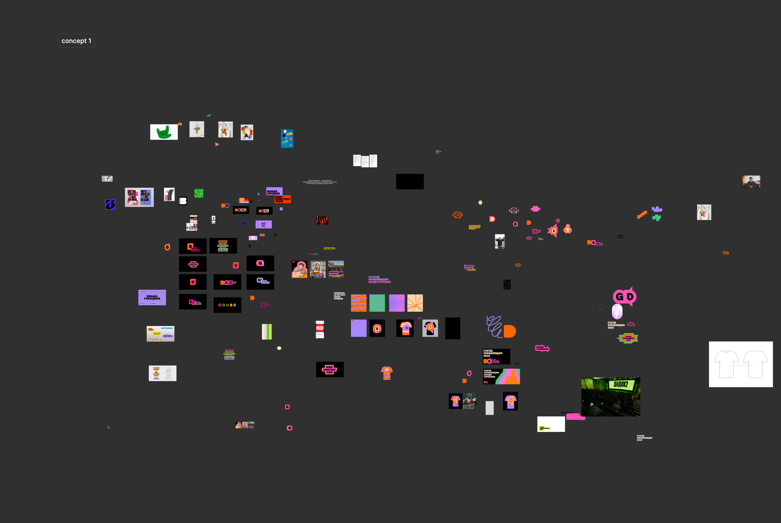
We tested various options along the way: Cyrillic, Latin, ideas tied to the surname. We needed to find a mark that was compact, confident, and recognizable all at once.

In the end, the strongest option turned out to be the letter G from Goretsky Team: it keeps the connection to the team's history, echoes the logic of Dodo's own mark, and works just as confidently across any medium, from pin badges to merch.




The logo combines easily with other text blocks and can be dynamic, forming logos for sub-brands or team departments — for example, HR, sports, marketing, and finance.
If a need arises to create symbols for specific departments, illustrations can be added to the main logo. The Banda logo also pairs well with Dodo's main logo.
Typography
Unlike most franchisees, who use Dodo's brand typeface, we suggested the team use its own — Oceanic Grotesk from Interval Type studio. It gave Banda's style more autonomy, boldness, and confidence.


Colors
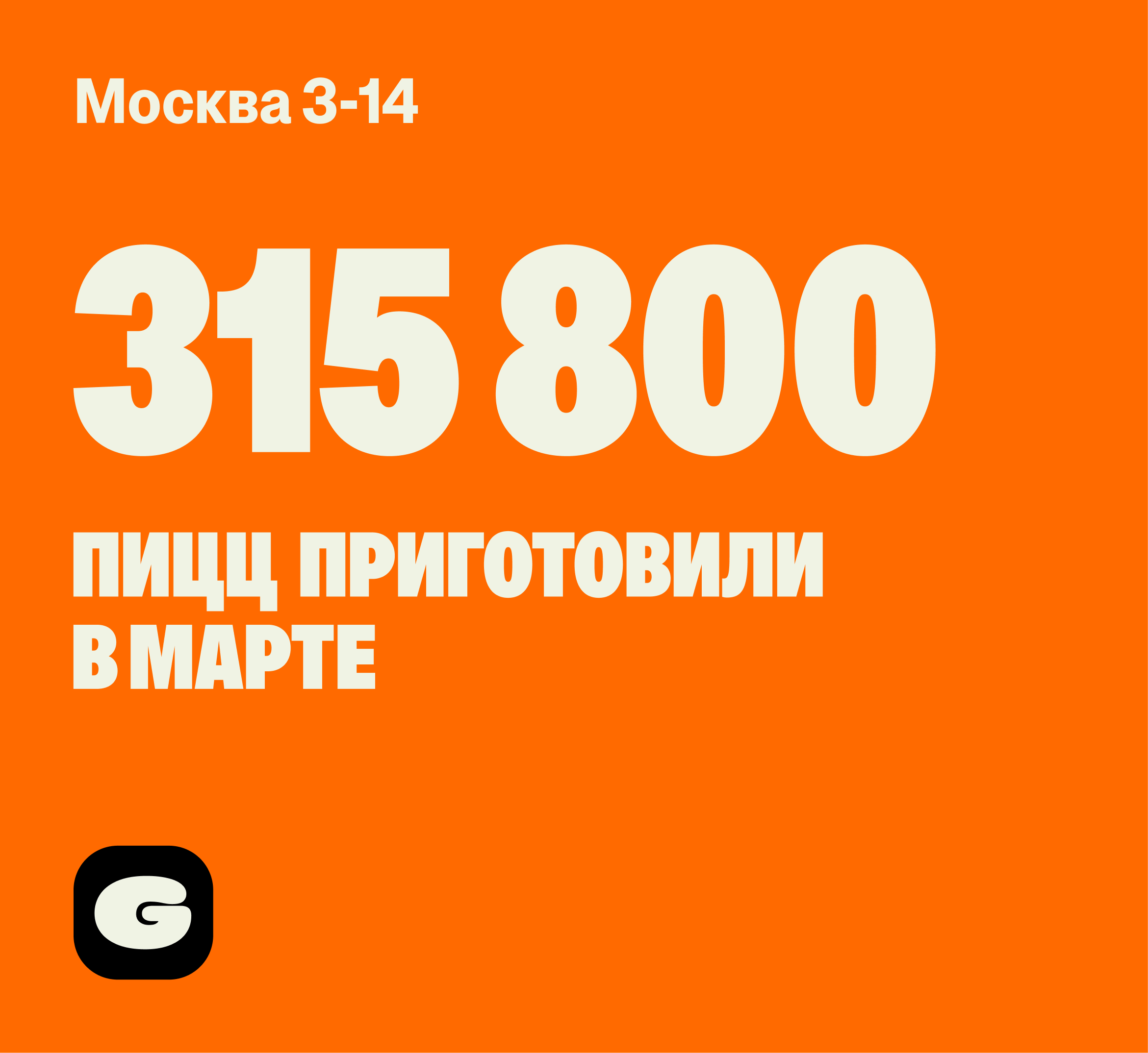
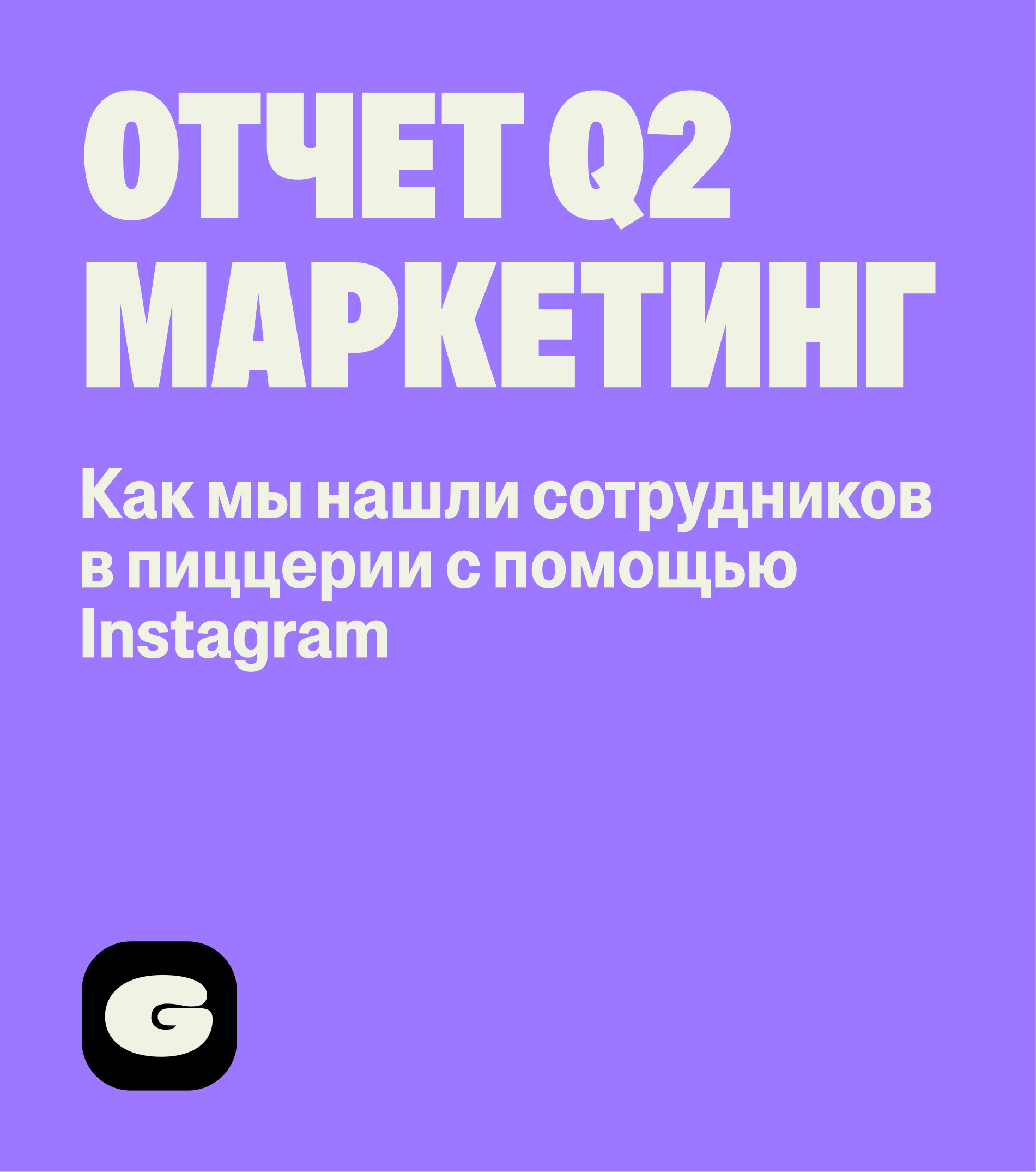
We tested different combinations, but agreed it was important to keep a connection to Dodo's color palette. We added a fresh purple alongside the signature orange, which became the primary color in communications. We also introduced a few additional shades for greater visual flexibility.

Graphics
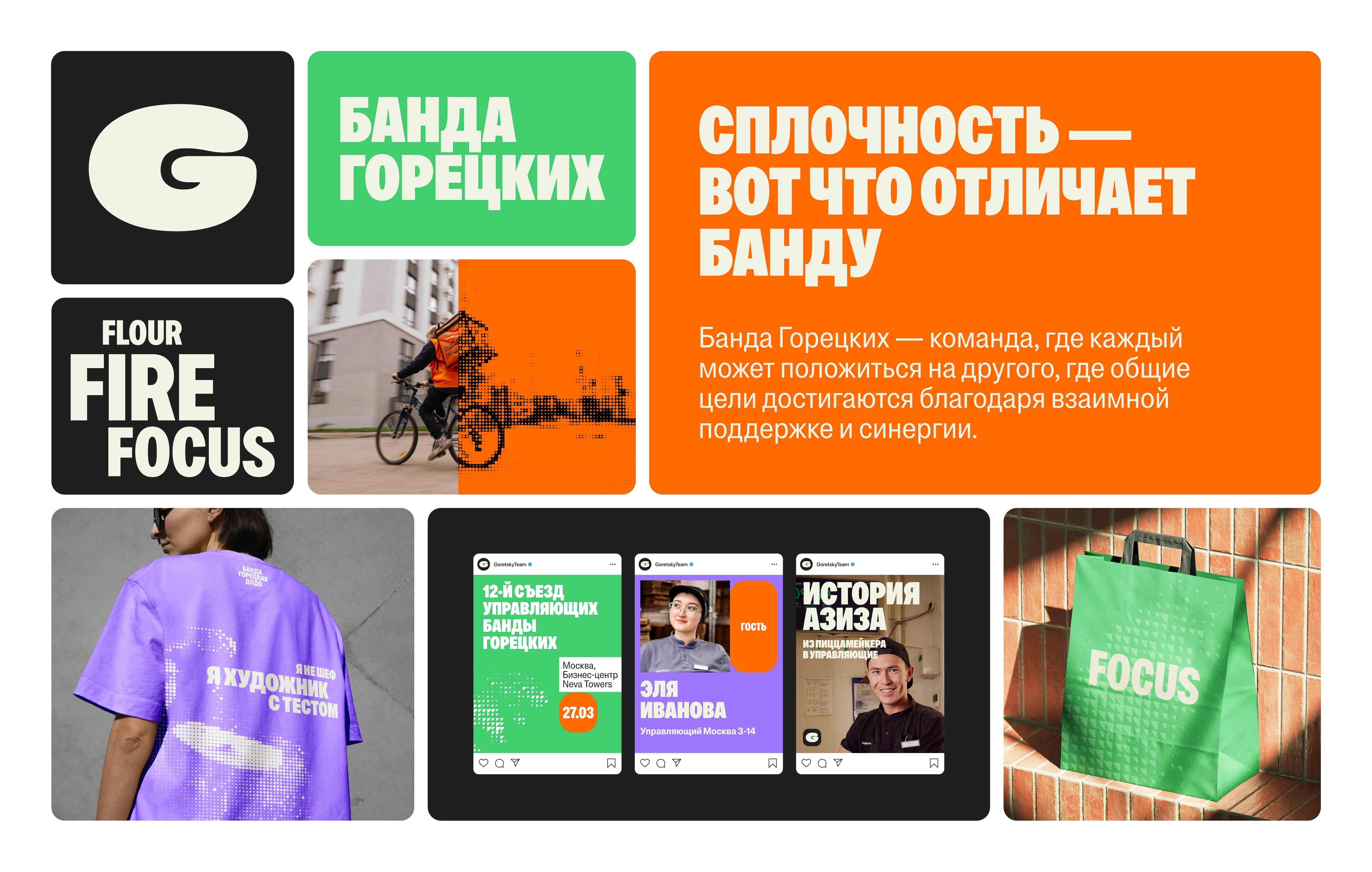
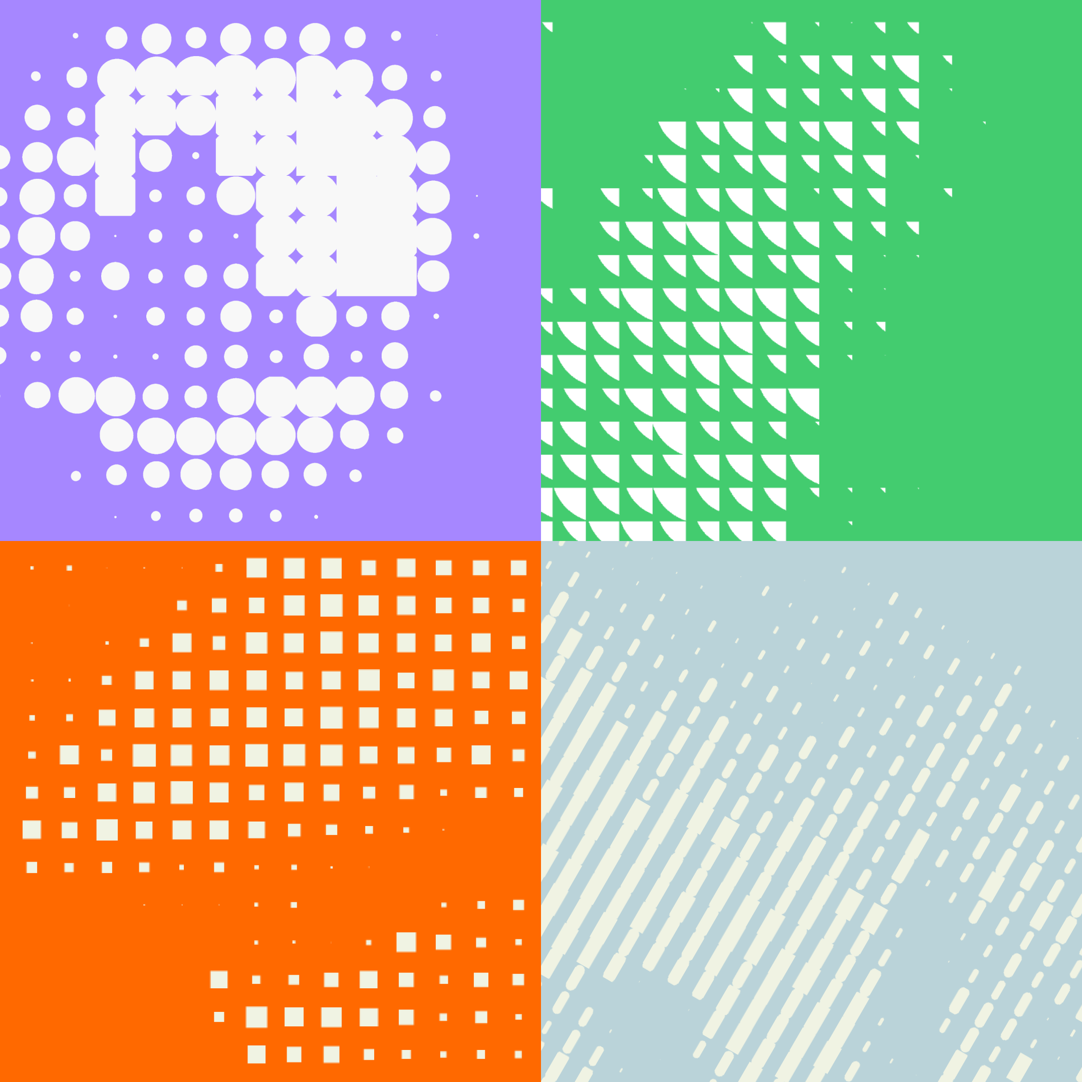
The key feature of the new identity is original graphics in a halftone style. Densely packed elements symbolize the team's unity.
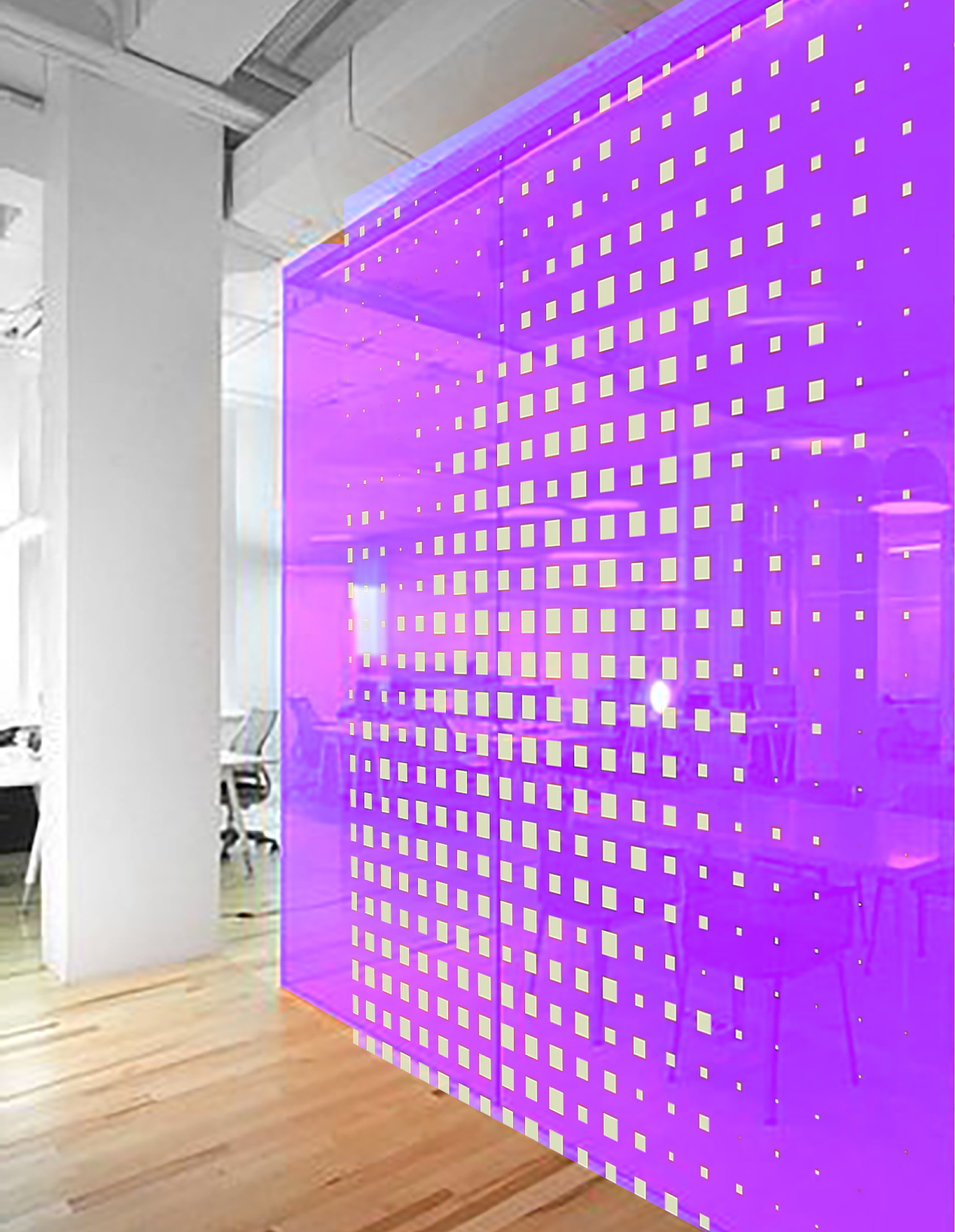
We documented in the brand book how to build graphics from any photo, so the style stays flexible instead of being limited to a set of ready-made illustrations.
In the end we arrived at two graphic directions: abstract and realistic.


Layouts

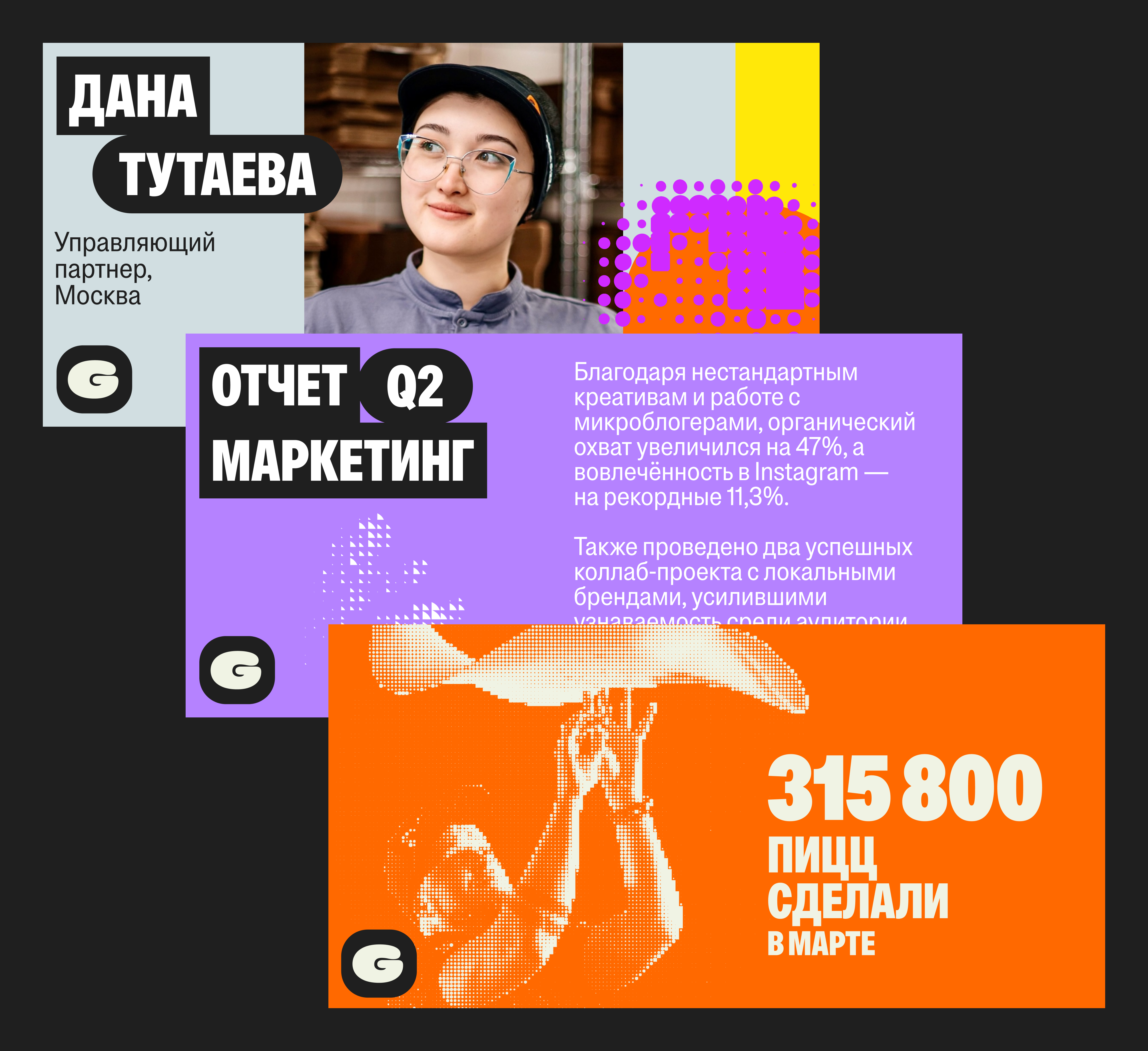
All layouts are built on the principle of tightly packed blocks that align edge to edge. Text blocks are the exception — we leave margins around them to preserve readability.
For convenience, we created a set of templates for presentations and social media posts.


Merch
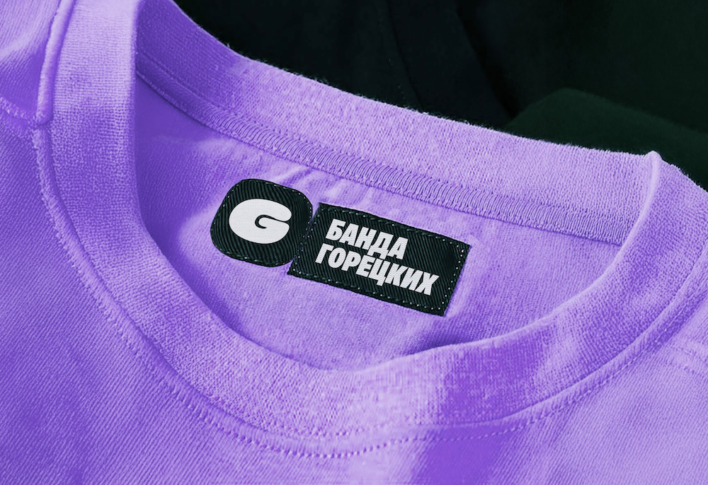
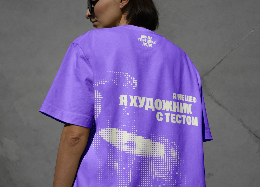
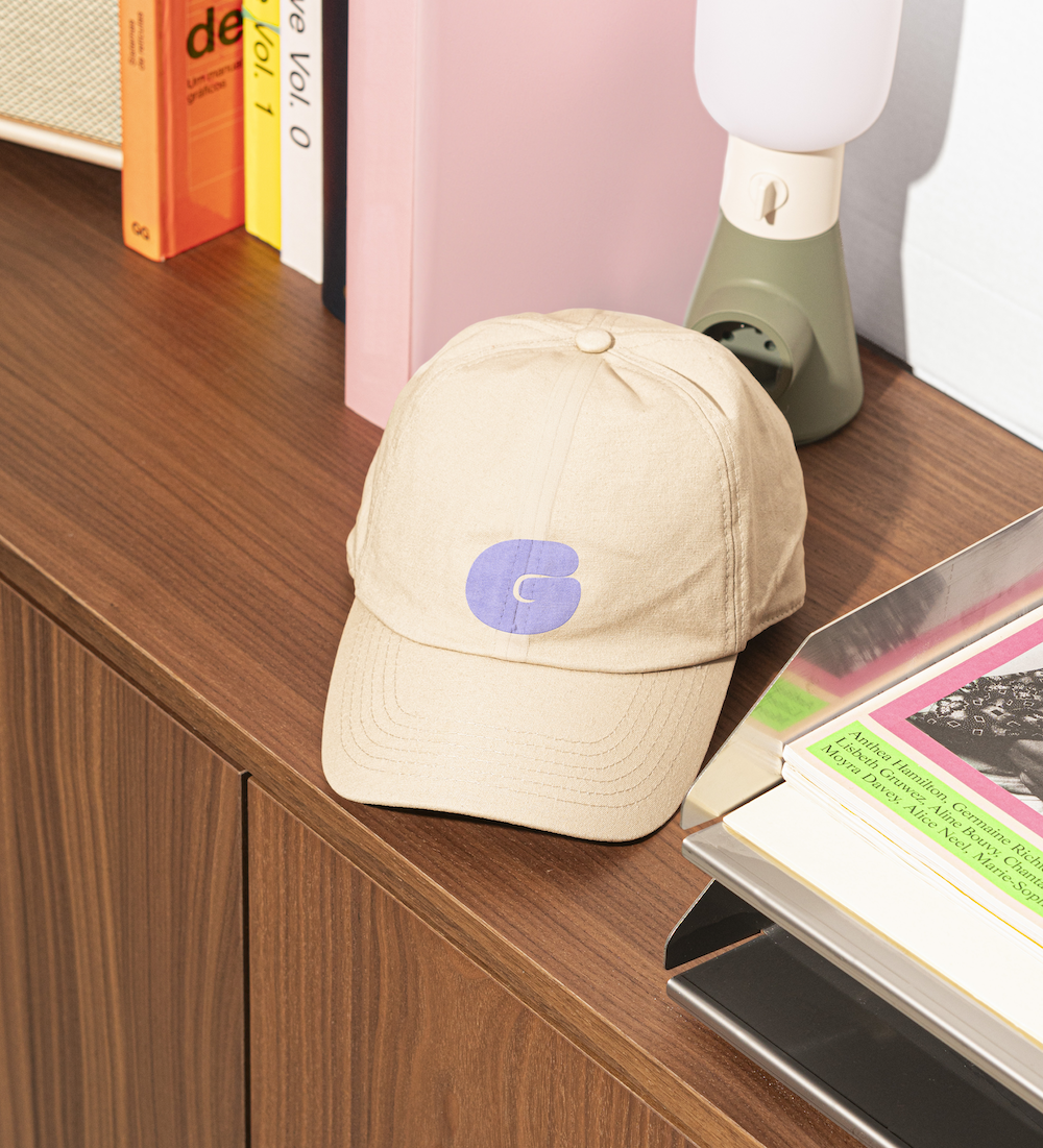
For the merch concept, we proposed writing short, memorable pizza-themed phrases. The goal was to create clothing and accessories that would work in everyday life without being overloaded with branding.
The result was a set of t-shirts and tote bags with phrases and graphics in the brand style.

Motion
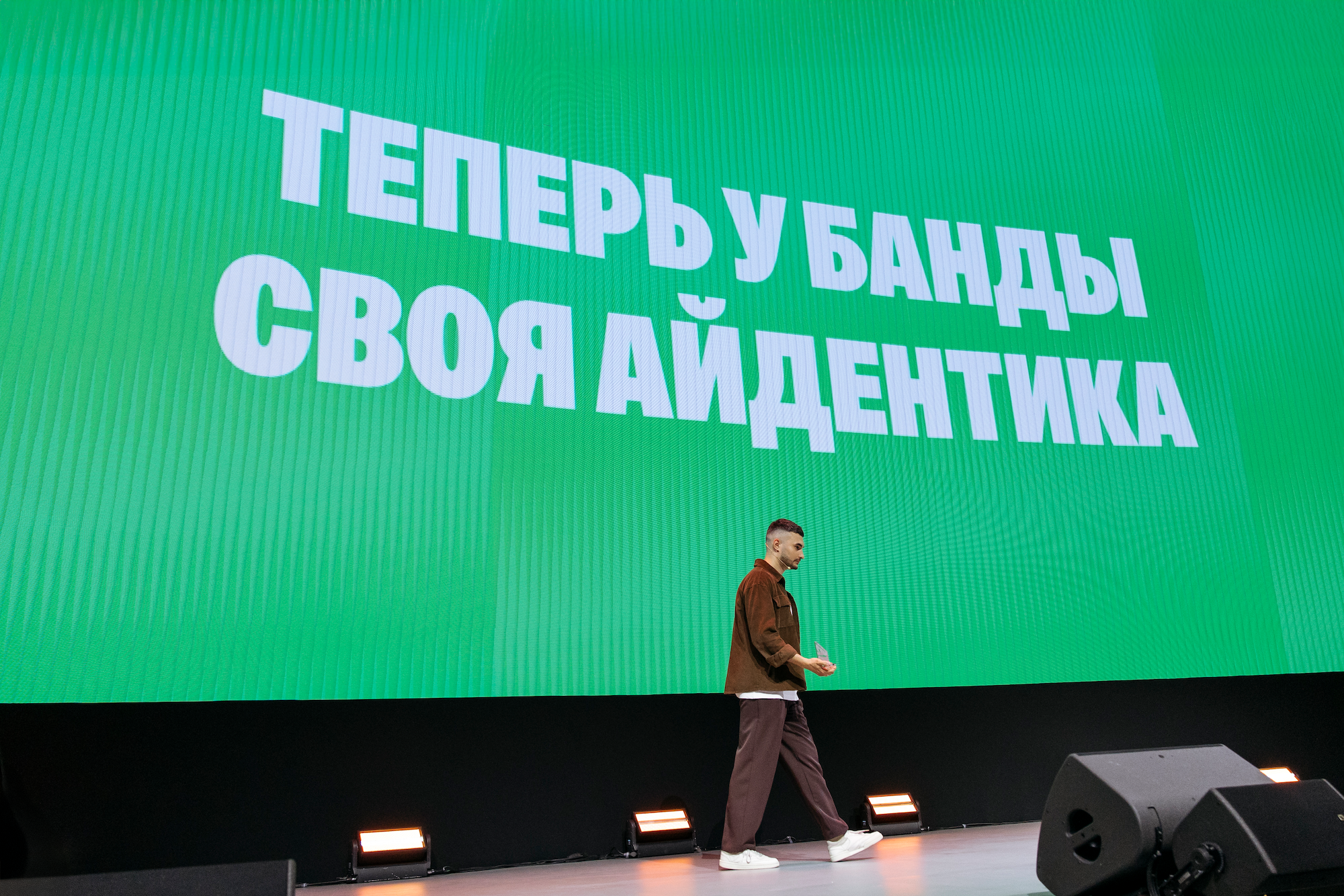
Once we'd put the identity together, Banda Goretskikh wanted to present it at the 2025 Dodo Pizza Partner Conference and asked us to create a video that would show the style in motion.
We decided to bring not just the graphics to life, but also the team's static photos: using AI, we gave them movement and created a sense of presence. Thanks to this, the video came out lively, energetic, and clearly conveyed the character of the new identity.
Banda Goretskikh now has a complete system: a logo, color palette, graphics, templates, merch, and a video. It's now a cohesive style that works across every channel.
The identity reflects the team's character: serious and bold at once. It helps strengthen the HR brand, support internal culture, and make a statement externally.
Project team
Design — Maxim Novokhatsky
Art direction — Zhenya Oputin
Motion — Timur Yakupov
Manager — Dasha Yushketova
Case design — Vika Sargsyan, Polina Livaich
Case editor — Misha Kurnosov
