
From Samara to New York: a complete branding solution for species-appropriate food for dogs and cats.
The client is an ambitious entrepreneur from Samara who wanted to create a natural pet food brand focused on species-appropriate nutrition — raw ingredients in convenient packaging with a balanced diet.
Our team was tasked with creating a branding that highlights the food's natural qualities, convenience, and care for pets. The goal was to show pet owners that feeding their companions could be easy and safe.
We created the name, logo, packaging, and marketing materials, then adapted the brand for the international market.
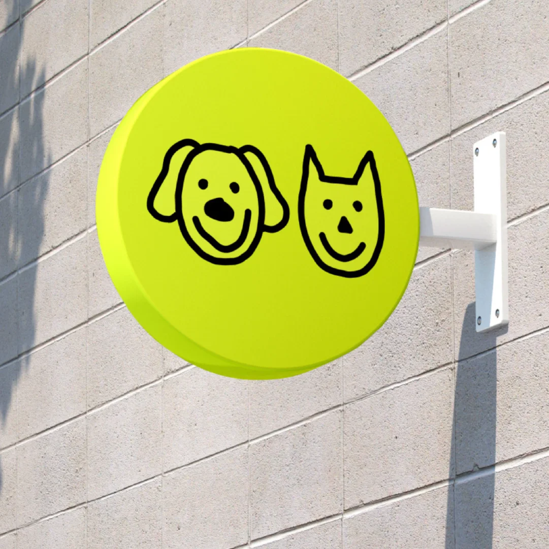

Dog and cat owners want to feed their pets healthy, natural food without spending a lot of time on preparation.
The brand name 'Можно!' ('You may!') conveys the simplicity and ease of using the product. It's a command every dog owner knows well — and it also captures the essence of the product itself: the ease and joy of feeding your pet right.

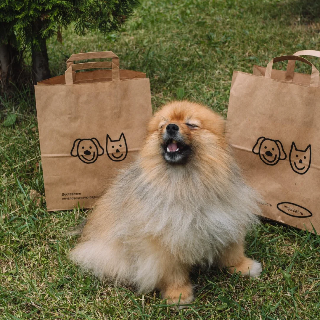
The visual concept for the 'Можно!' brand is built on the ideas of simplicity, naturalness, and care for pets. To convey these key messages, we chose minimalist, hand-drawn-style graphics that create a sense of ease and accessibility.
This style underscores the key research insight: people want simplicity, and their pets want quality. We decided that a minimalist graphic language perfectly captures this idea and makes the product visualization clear and appealing to a broad audience.
The visuals create the impression that everything — from feeding your pet to the brand design itself — is easy and convenient.

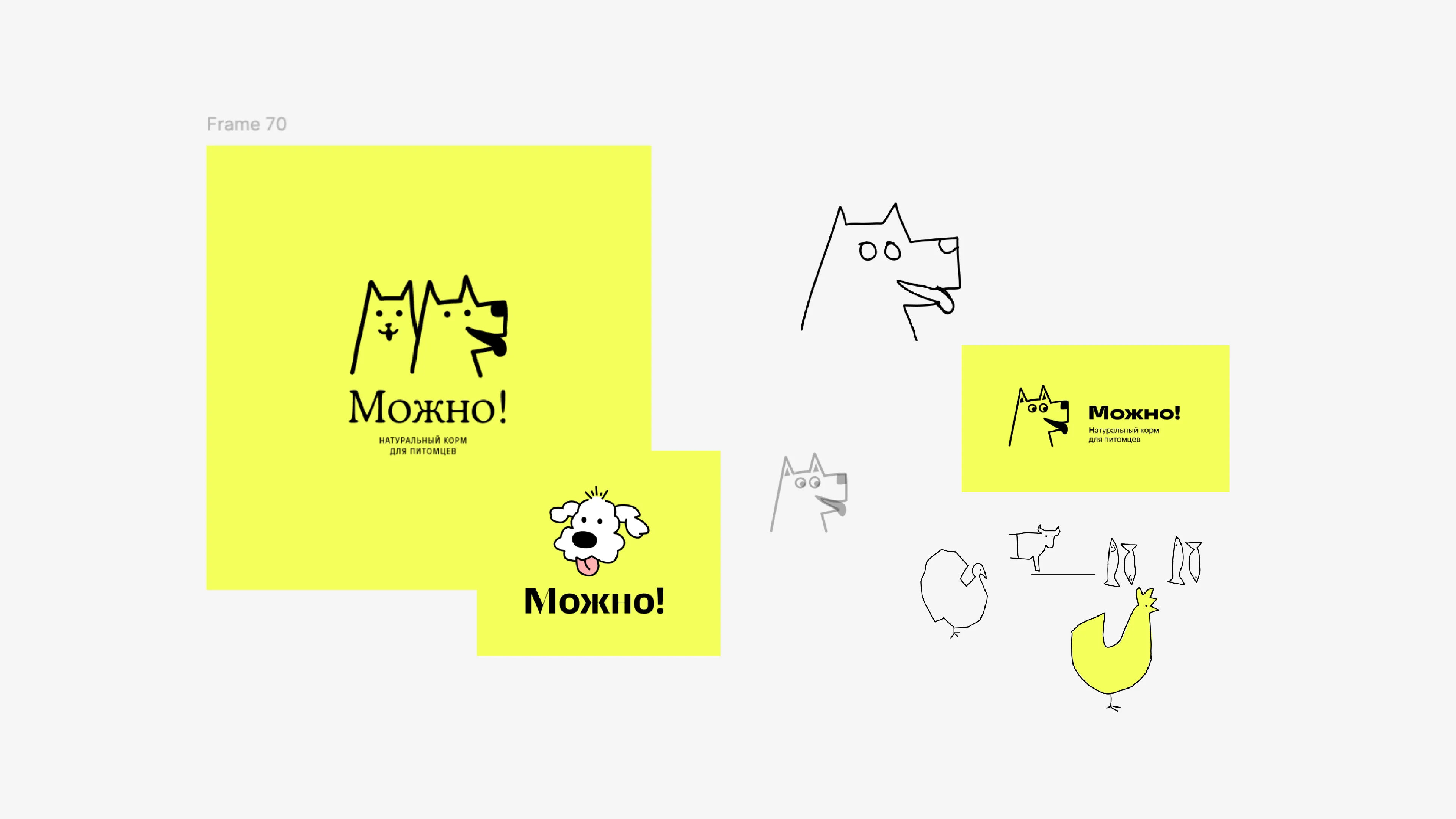
We came up with several logo options, and the client chose the design that became the foundation of the visual identity.

Based on the logo, we developed guidelines for the color palette and typography, along with examples of how to use the logo across different media. The guidebook became the foundation for future marketing materials.
To convey the product's energy and natural qualities, we chose a palette of bright, saturated natural colors: lime green, pink, and blue. They reflect the product's freshness and natural quality, while creating an emotional connection with the target audience.
We used modern typefaces with rounded forms to reinforce the brand's sense of ease and friendliness.

Our task was to craft simple, clear messages that would resonate with both existing pet owners and a new audience. We created a set of slogans and ad copy that perfectly capture the idea of easy, convenient pet feeding.

After the visual identity was finalized, the client came back asking us to design five packaging variations for different product lines. Packaging is where a customer's relationship with the brand begins.
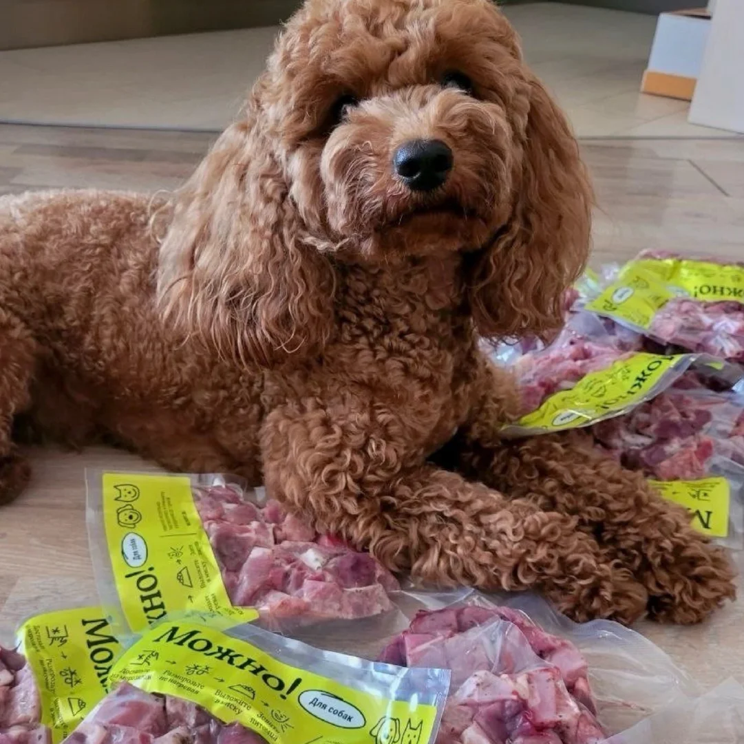
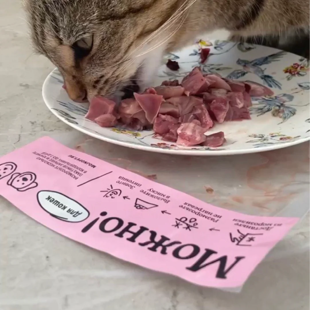
We designed packaging that highlights the product's natural quality and ease of use. The process included creating 3D renders and visualizations, and photographing the product for the catalog. The resulting packaging is convenient to store and has clear, intuitive navigation.
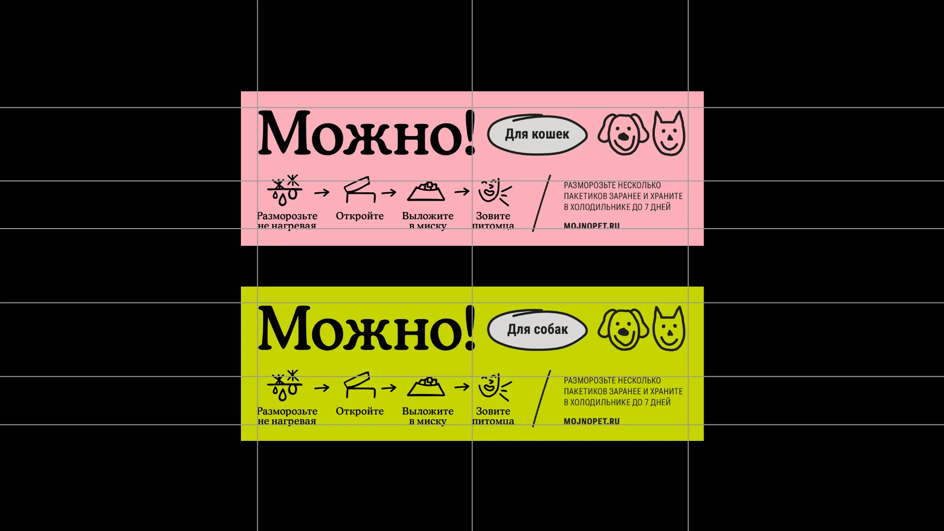
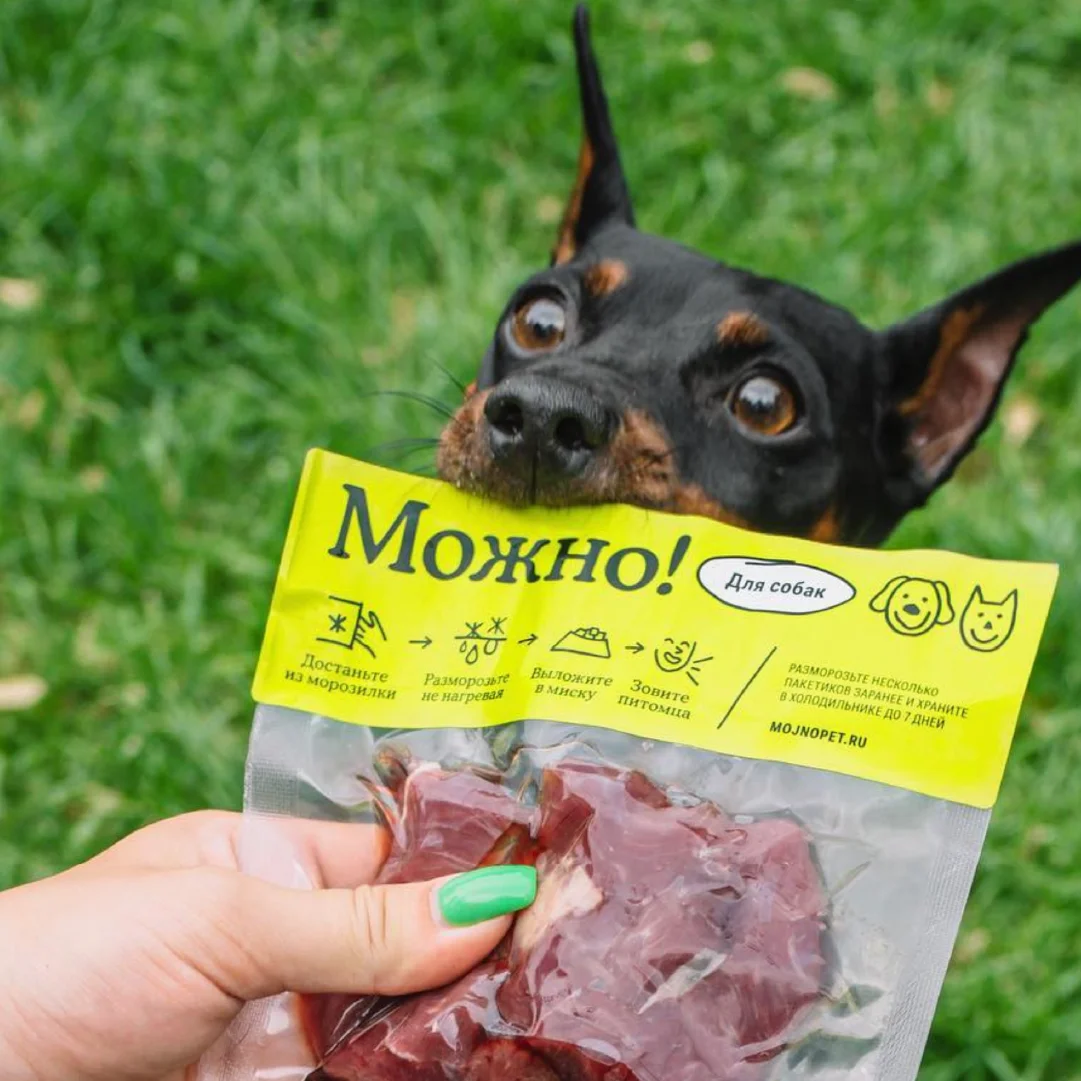
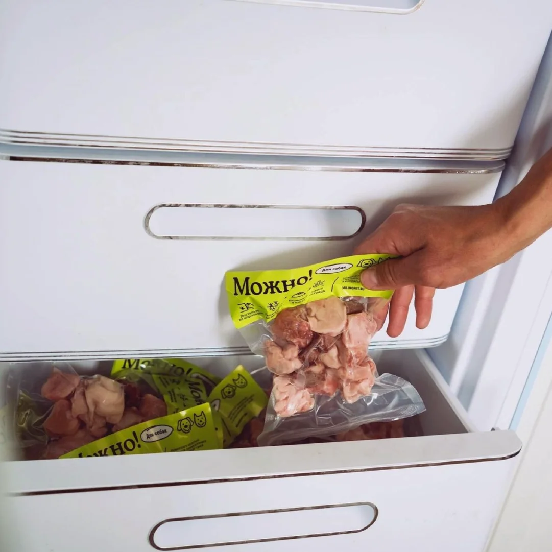


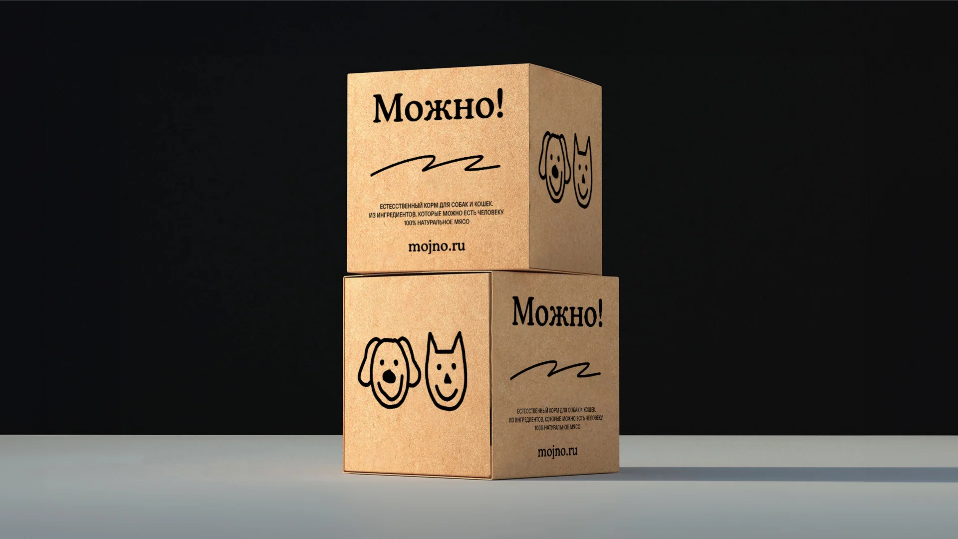
To promote the brand, we created a series of advertising materials that adapt easily to any environment — from city posters to digital spaces. The ad layouts reflect the brand's philosophy: feeding your pet made easy and beneficial.
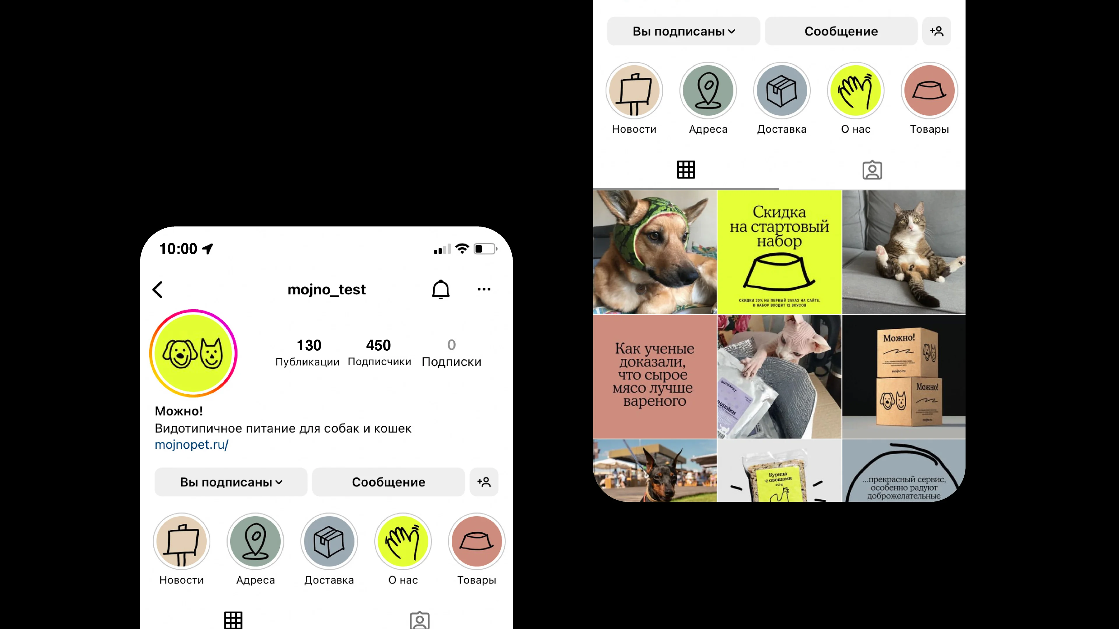


After the project wrapped up, the client wanted to adapt the brand for international markets. We proposed the name Fetch! as an English-language counterpart to 'Можно!', and translated the materials so the brand would be clear and appealing abroad.

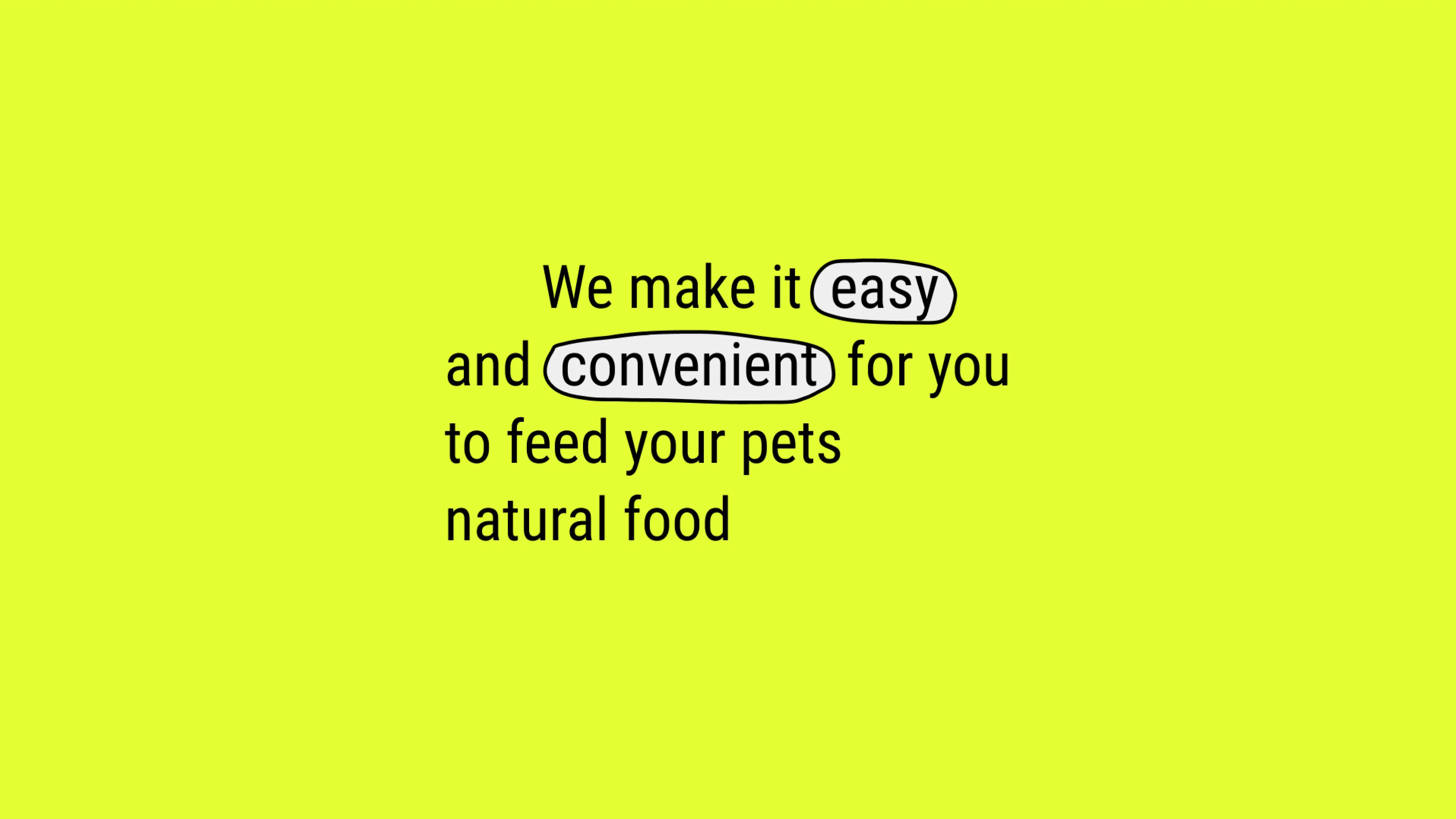


Fetch! has successfully launched on the market, and customers have responded well to the product's convenience and the brand's appeal.
Thanks to thoughtful naming and visual design, the brand stands out confidently among competitors in the natural pet food market. Going forward, the brand plans to expand its product line and scale.

Project team:
Alina Askarova, Anastasia Timofeeva, Maria Podoprigora — creative and copywriting.
Max Novokhatsky — art director and designer.
Kristina Bachurina — styling, meat and bones.
Irina Knutas — accounting, production, and props.
Ekaterina Efimenko — props.
Alisa Pravotorova — retouching.
Daniil Demin — photographer.
Olesya Naranovich — translations.
Timur Yakupov — animation.
Lena Alekhina — case design.
Misha Kurnosov — case editor.
