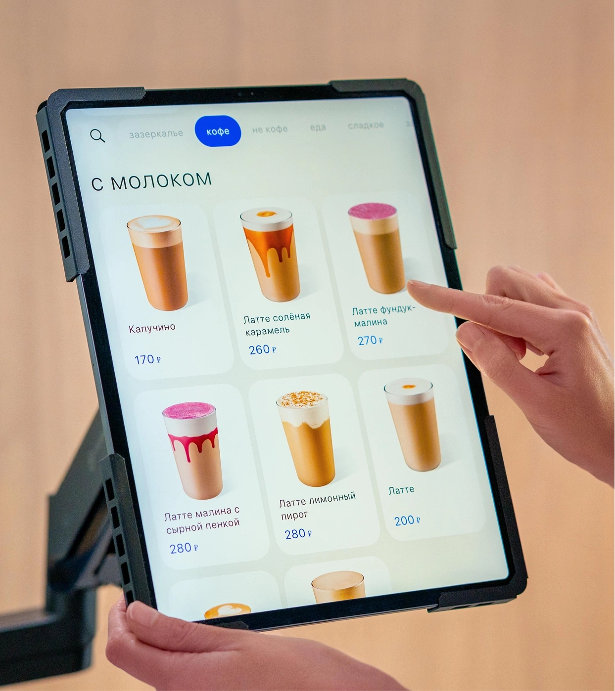
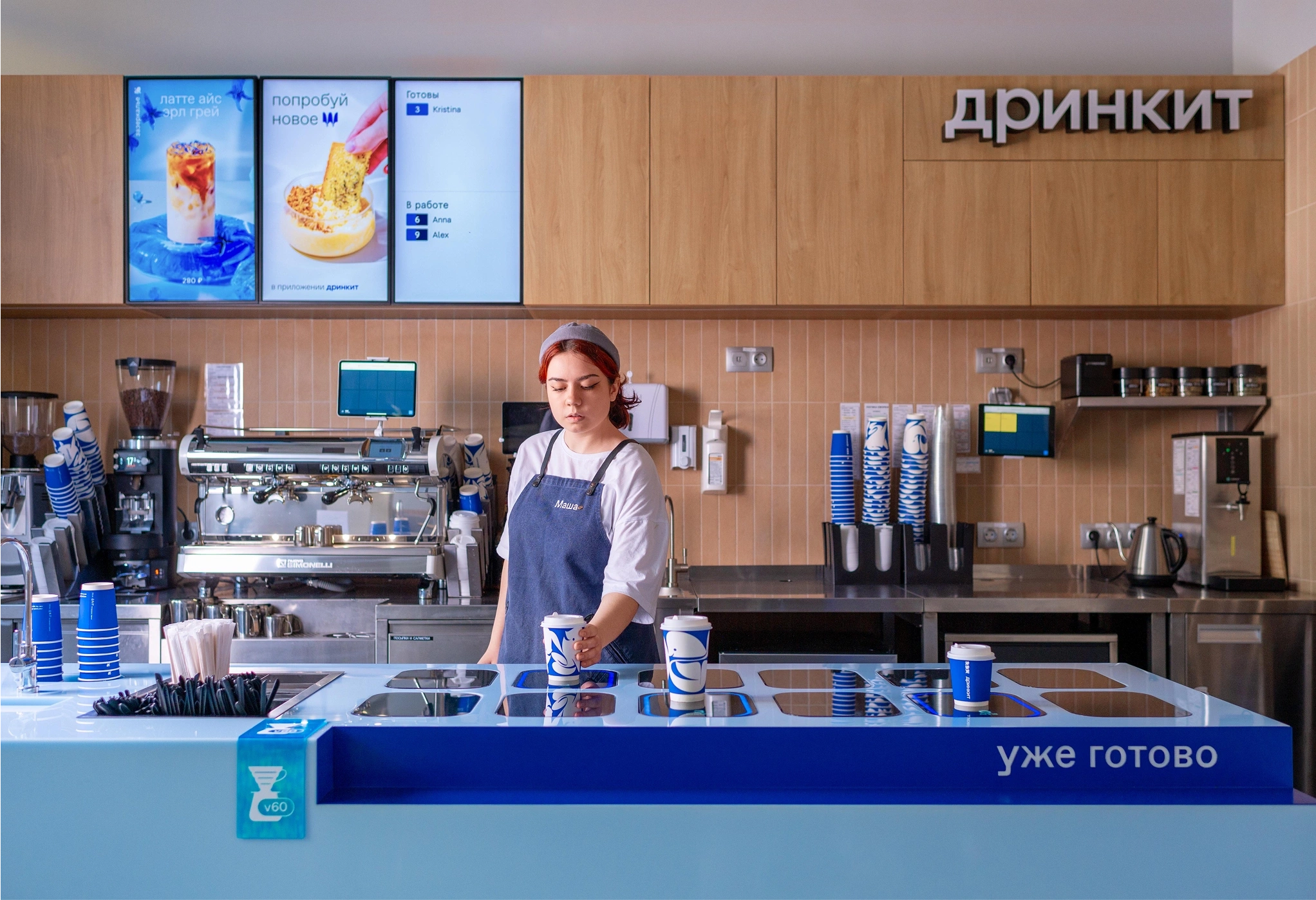
Drinkit is a new-format coffee shop chain, a project by Dodo Brands. There are no traditional registers here: customers place and pay for their order in advance through the app or on a tablet in the café, and the finished drink waits for them at a dedicated pickup counter.
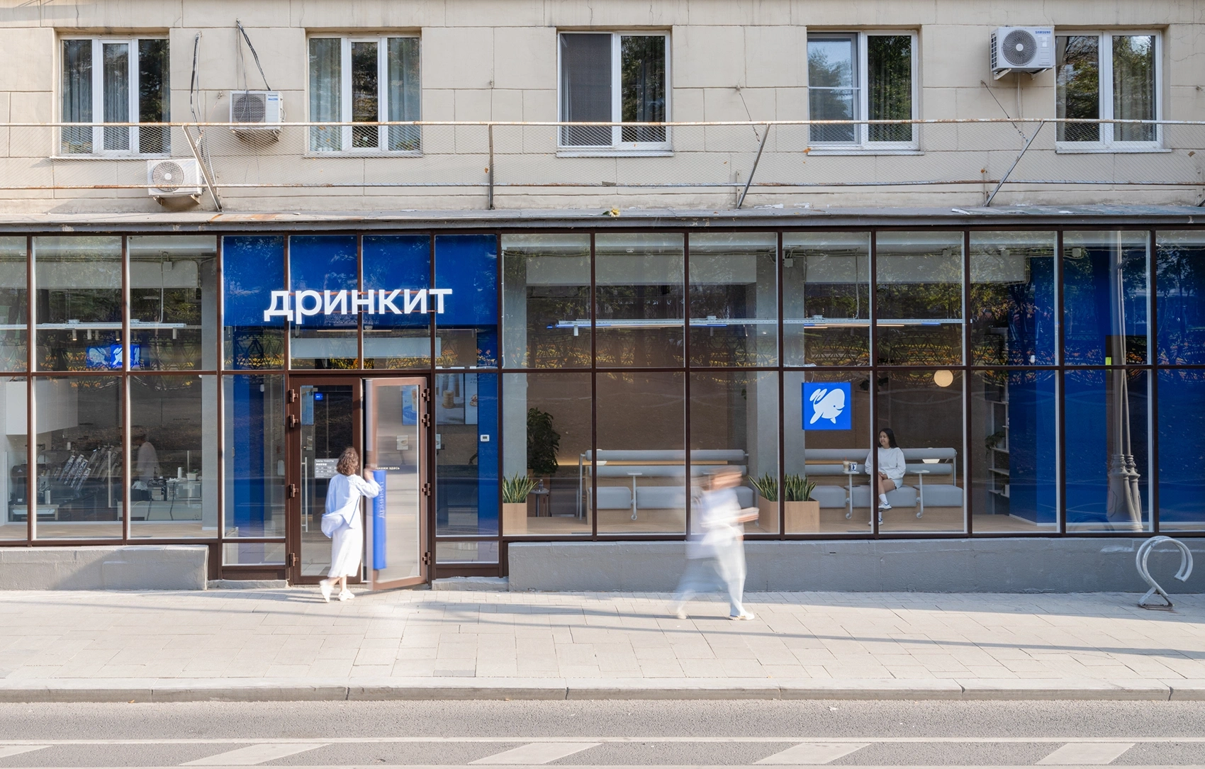
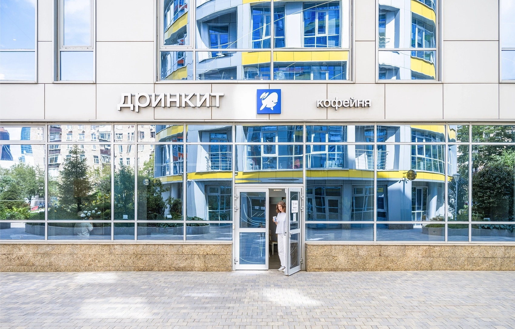
Test a hypothesis: whether in-store communications alone are enough to promote food and the mobile app inside the coffee shops. The Drinkit team decided to launch test materials at two locations with different formats: a street location and a business-center location.
The project had two key goals.
1. Grow the number of mobile app users. The app helps ease queues during peak hours and gives access to the loyalty program.
2. Increase food sales. Coffee shops don't have a display case, so it was important to find other ways to show the range and make the food visible to guests.
There were a few more requests:
— Creative solutions were needed that accounted for the different user journeys at the street location versus the business-center location.
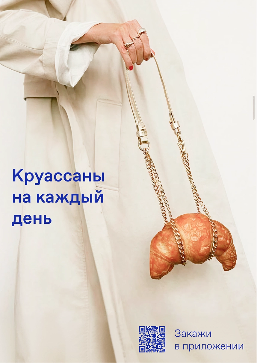
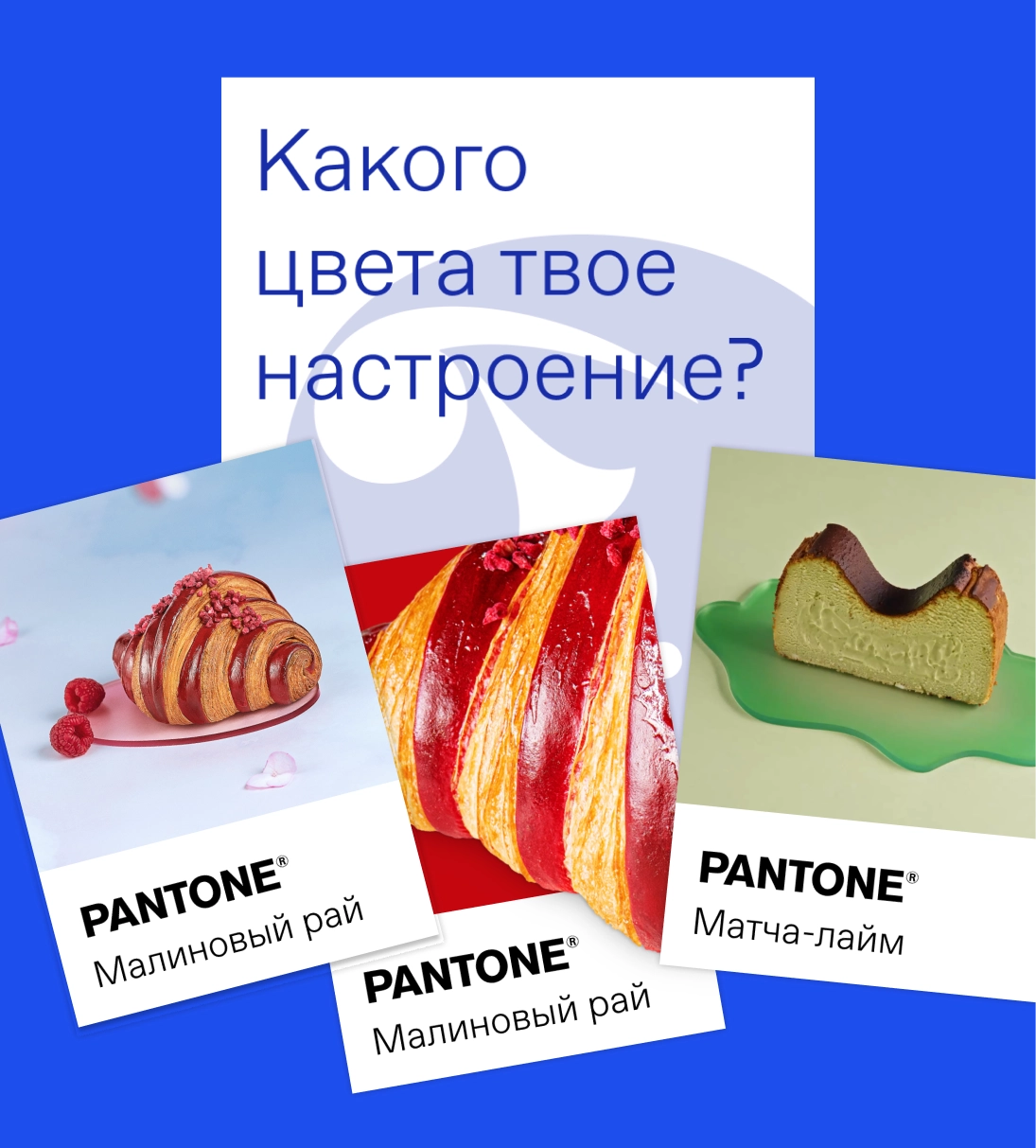
— Use the raspberry croissant (Drinkit's flagship product) as the key product for communication, and use it to convey the message that food is available at the coffee shops.
Visiting the locations
First, we visited both coffee shops to see everything through a guest's eyes and walk through their journey from entrance to order.
On site, we broke down behavior scenarios, ran a quick brainstorm, noted good spots for placing information, and identified problem areas.
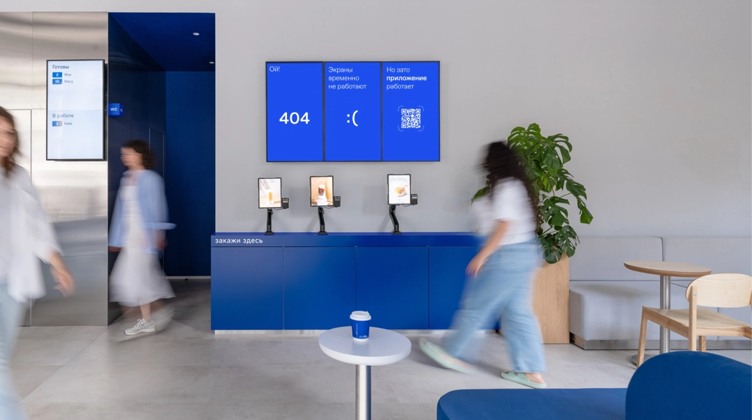
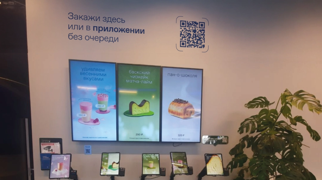
The screens with the app-download QR code are overloaded.
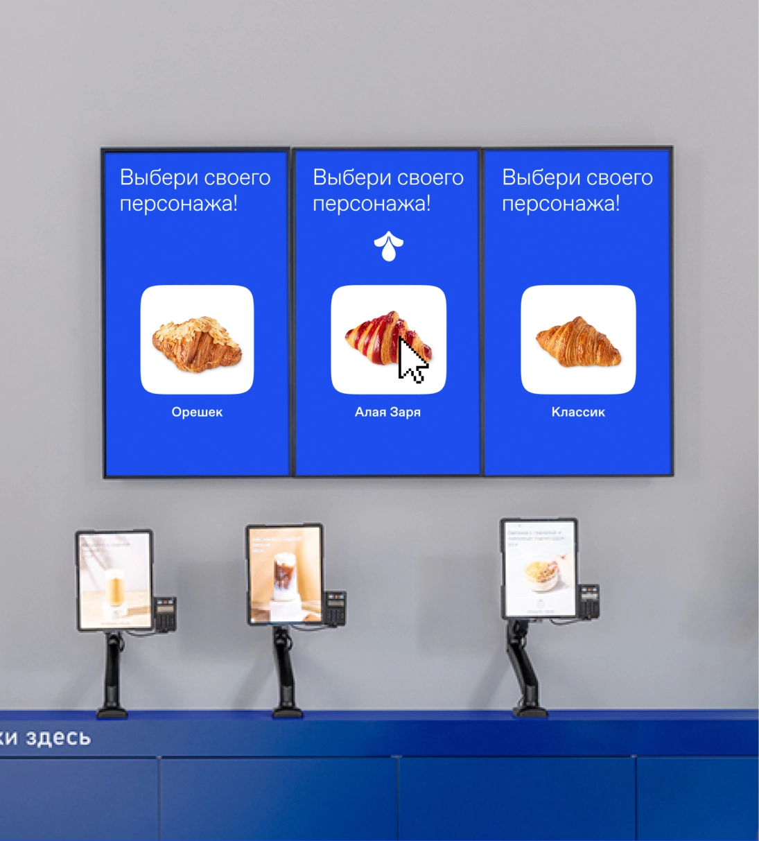
The TV boards could be used more actively — show a state with the code and a call to action about the app across all three screens.
A light motion effect and a strong visual emphasis are needed.
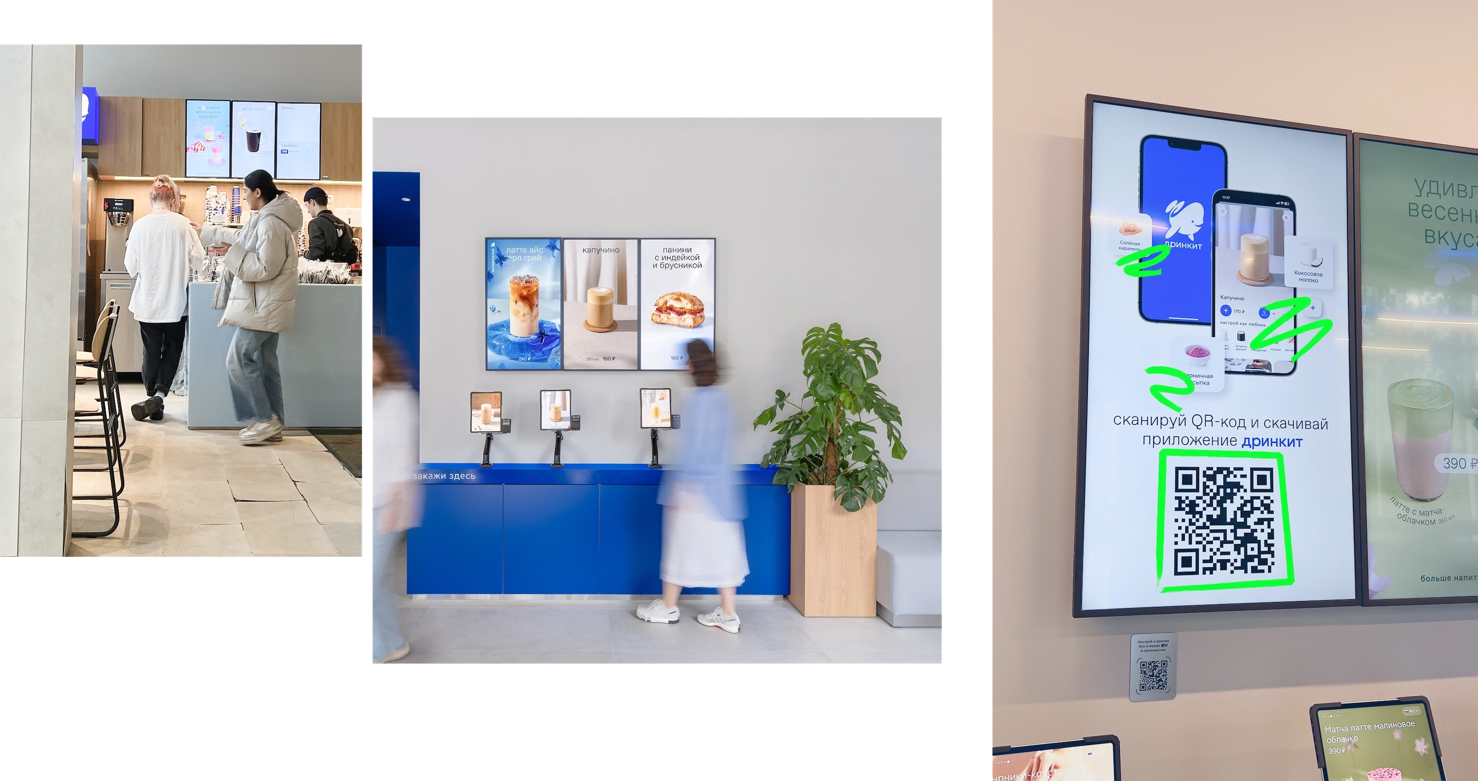
The QR-code signs are too small and in the wrong spots:
1. In the "slow zone" (where people wait for their order) — it's already too late, the person has already ordered.
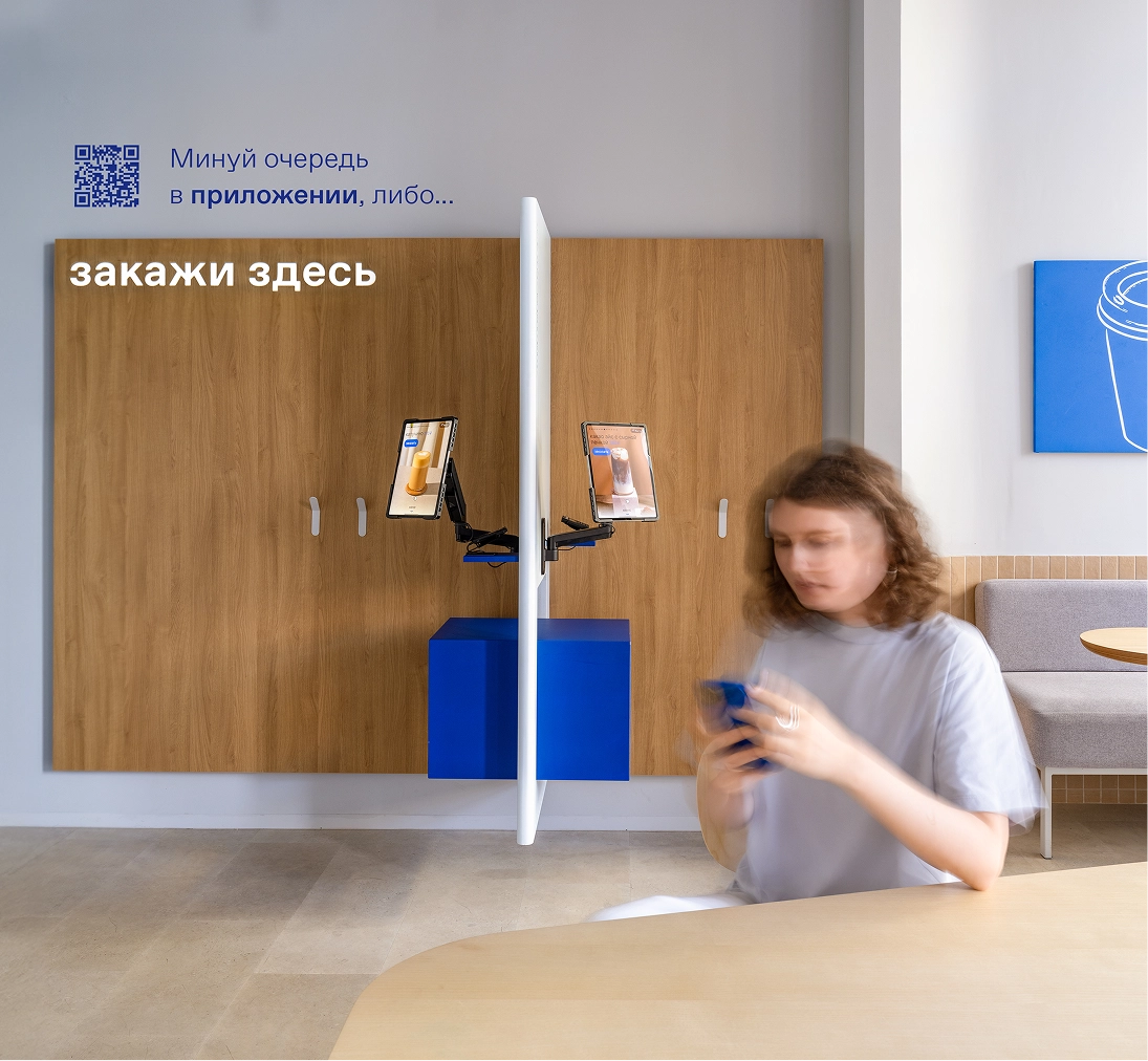
2. Behind the kiosk — out of reach while the guest is placing an order.
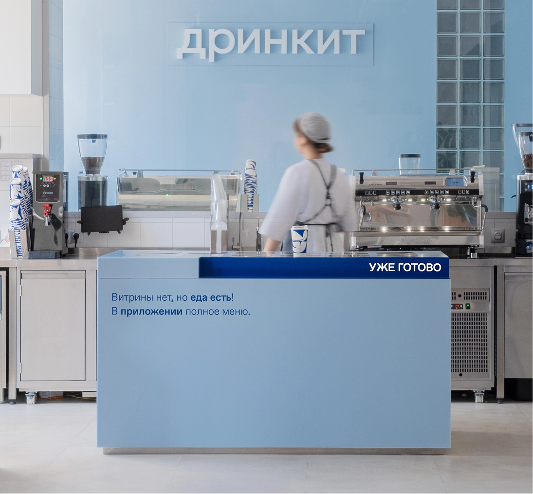
3. At the pickup counter — at this moment the guest wants to get their food, not scan codes.
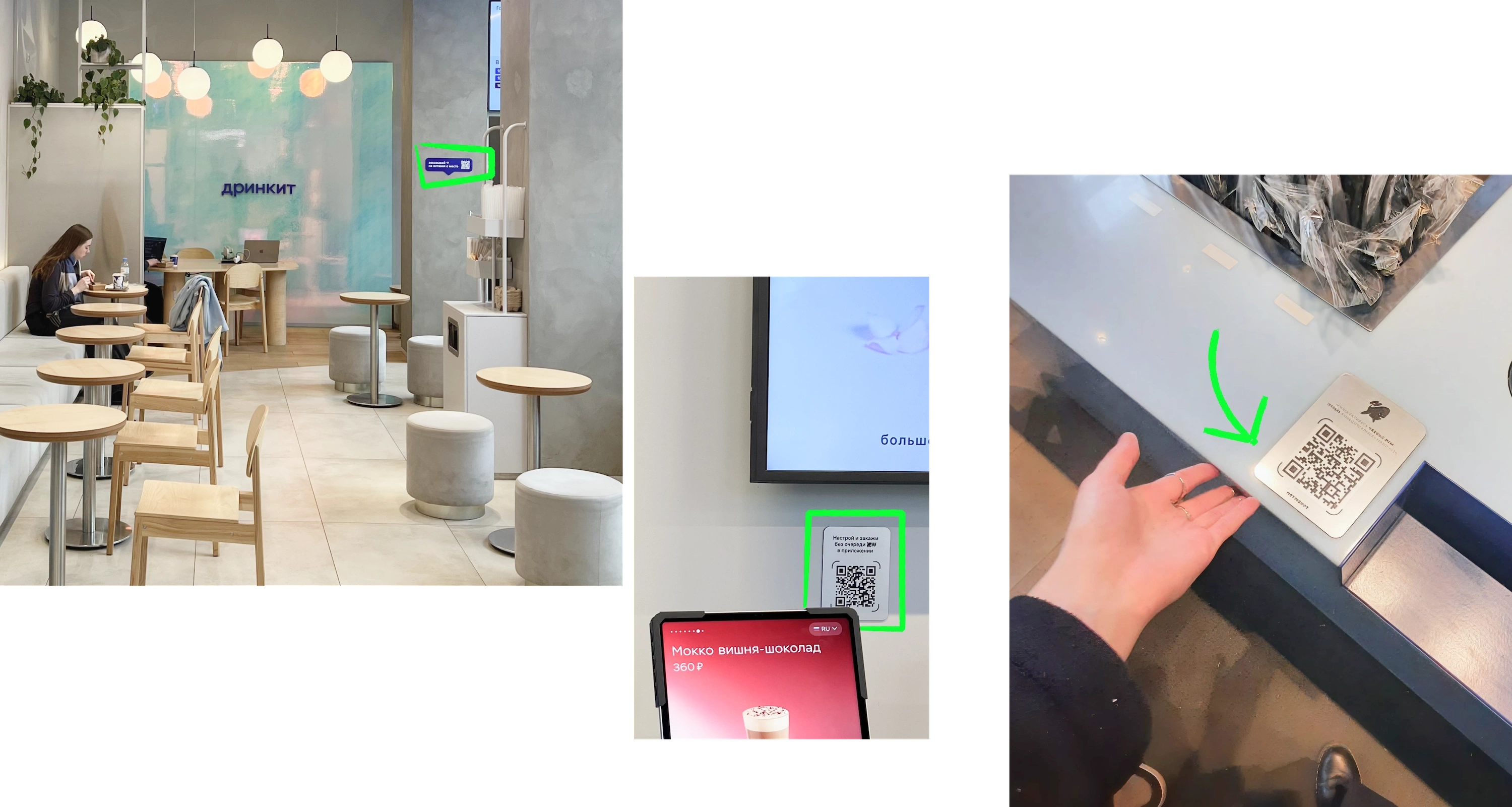
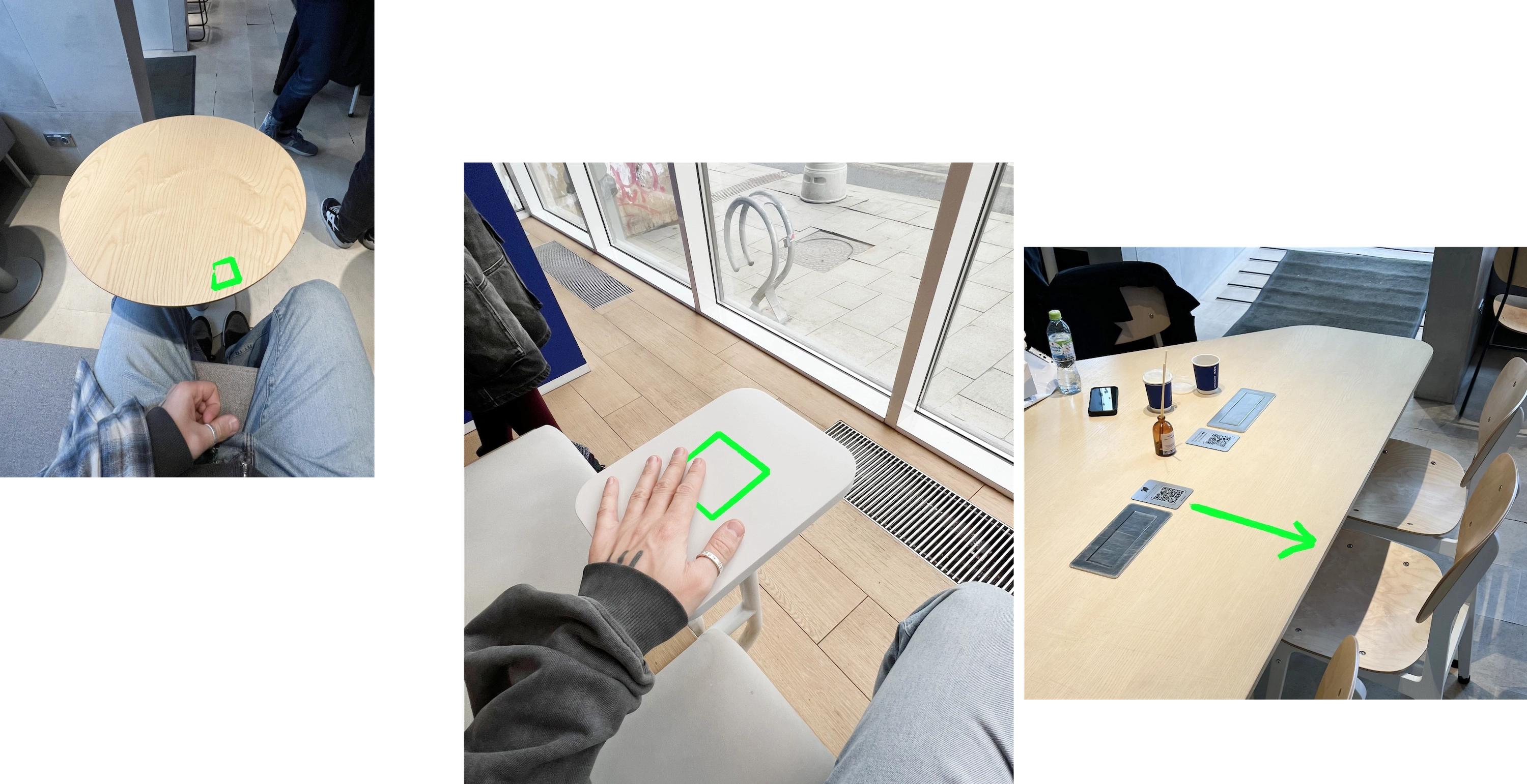
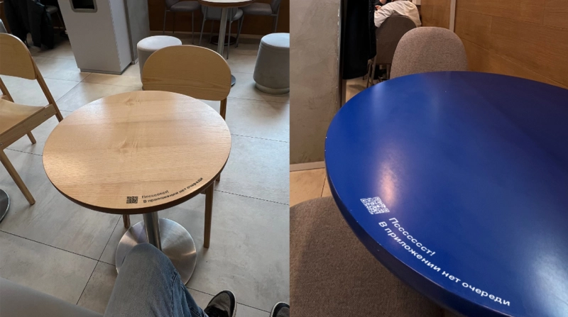
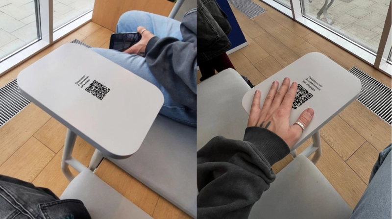
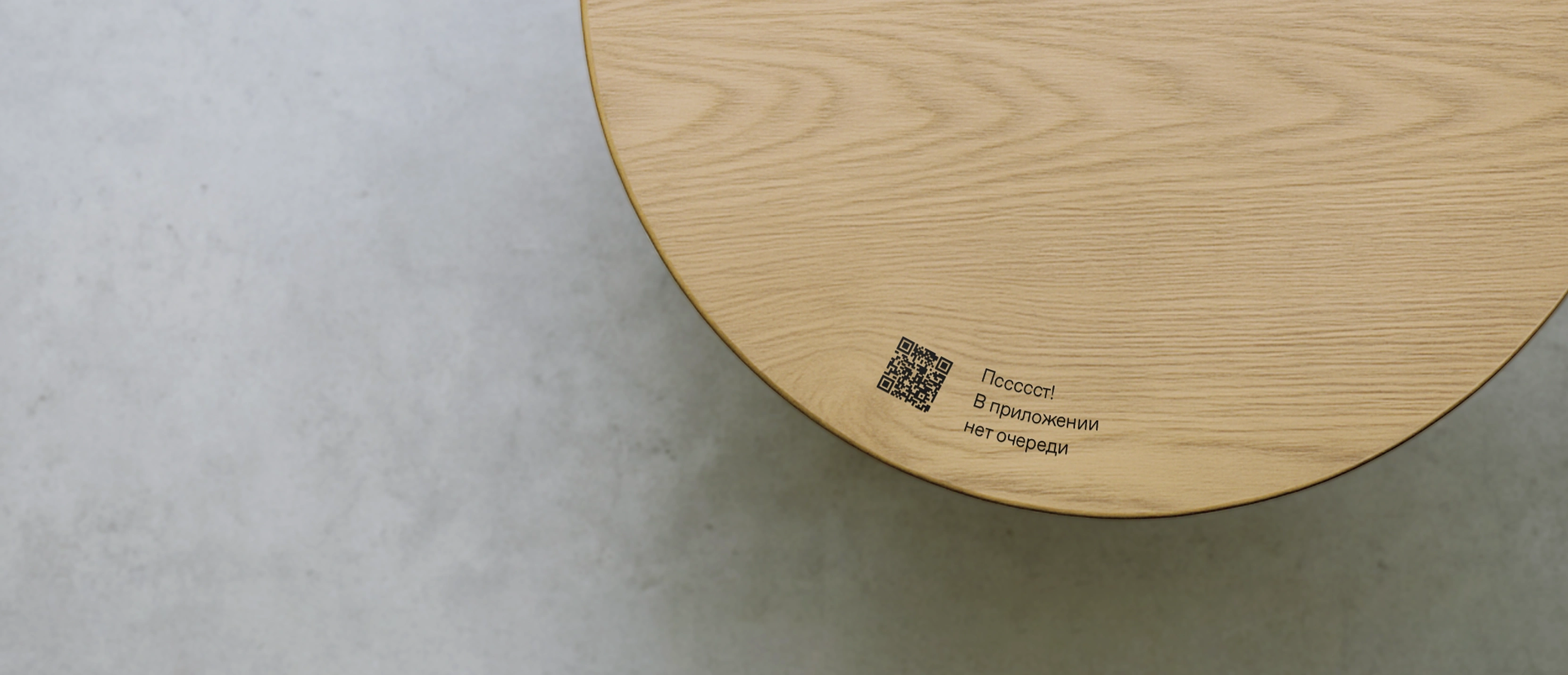
Codes work better placed on tables — a seated guest is relaxed and has the time and opportunity to scan a code. It's better to place the signs closer to the edge of the table, especially if the table is large.
Information about the app is also worth placing within the guest's sightline while they're standing in the kiosk queue.
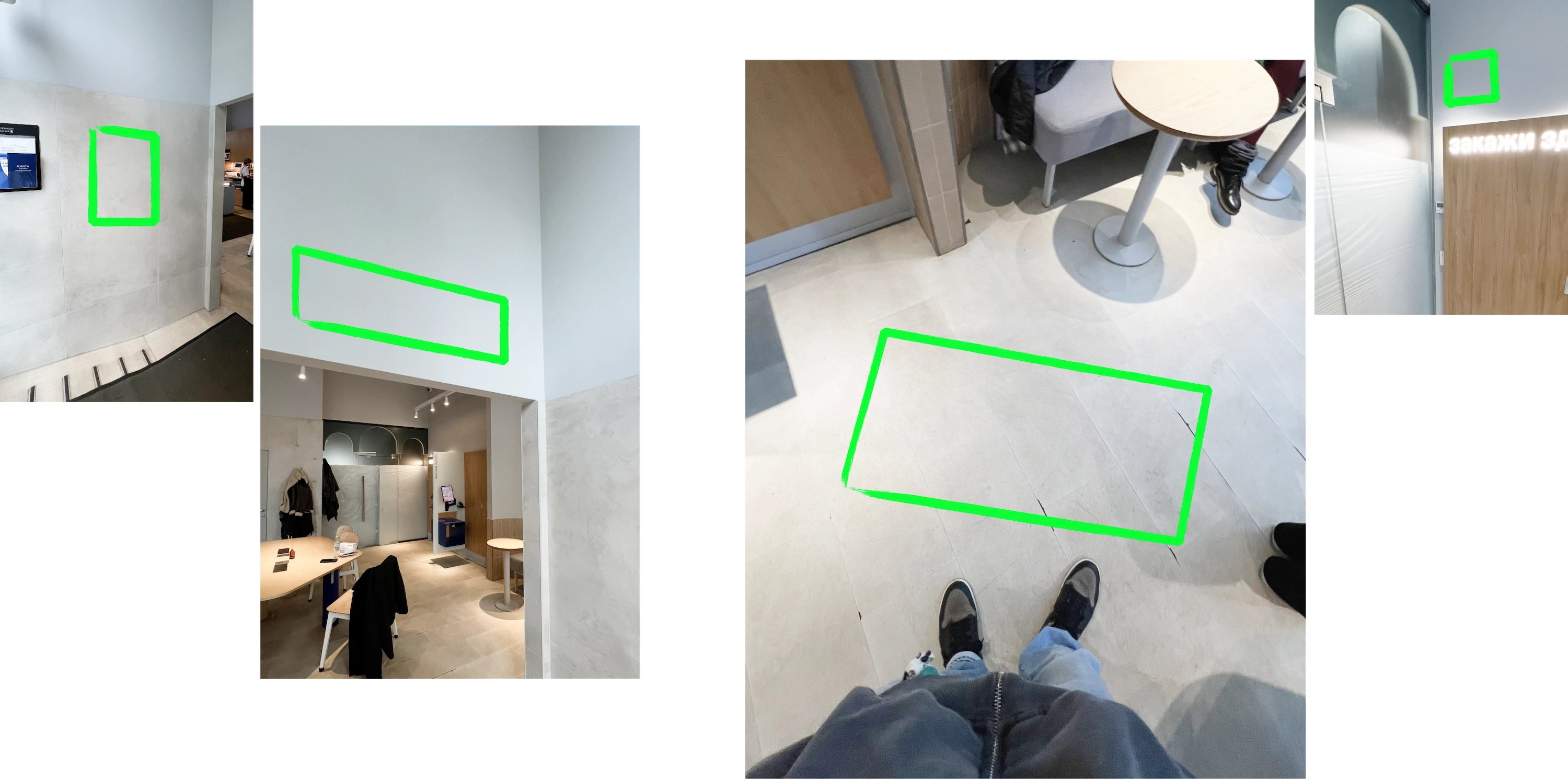
There's no call to action or link for downloading the app.
Takeaways from the locations
The key insight is that the coffee shop's space splits into fast and slow zones, which directly affects how communication is perceived.
Guests approaching and entering the restaurant have different amounts of time to engage with information — in some spots they need to hurry, in others they can take their time studying the materials.
For example, the tables and the sightline of a guest standing in line are a slow zone, while the pickup counter or the area near the kiosks is a fast zone.
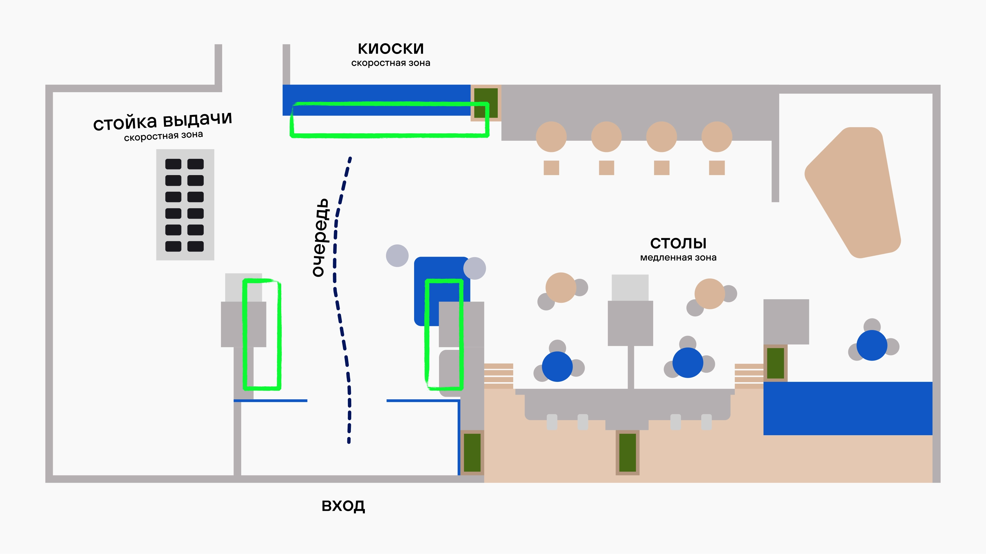
The second important feature is that the app needs to be promoted at the moment the guest is already standing in the kiosk queue. That's exactly when its value becomes obvious: you can skip the queue and order in advance.
This led to requirements for the materials:
— Every touchpoint needs a clear call to action.
— The simplest possible path through a QR code, which needs to be noticeable and easy to scan from a distance.
Finding placement spots
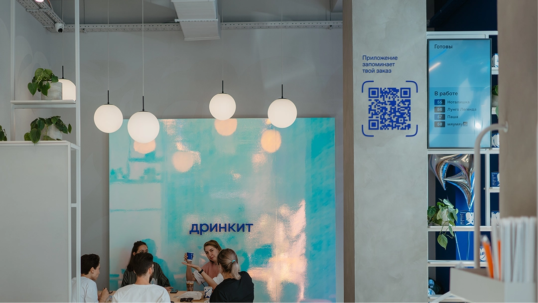
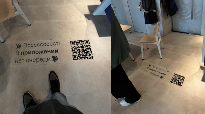
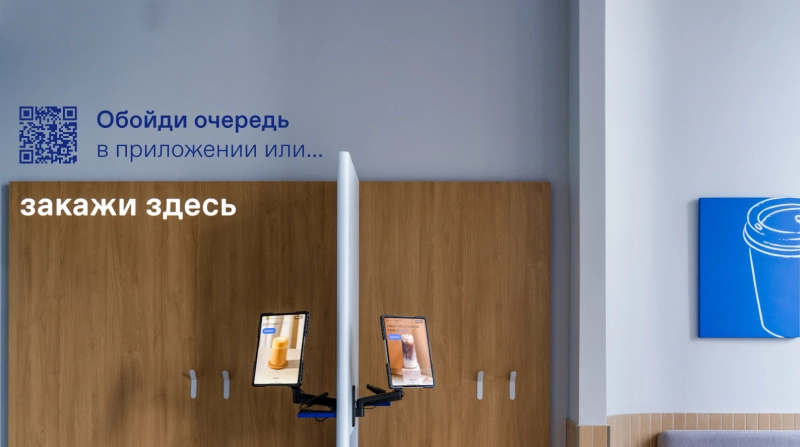
Once we'd marked the zones for placing information, we started test-fitting QR codes with an interim design at different touchpoints.
This let us check two key things: how naturally the code fit into the coffee shop's interior, and whether it was noticeable enough. It was important to find the sweet spot where the code stood out without disrupting the harmony of the space.
Finding the creative
Next we moved on to the creative work, building on the zones and touchpoints we'd chosen and generating ideas for specific scenarios inside the coffee shop.
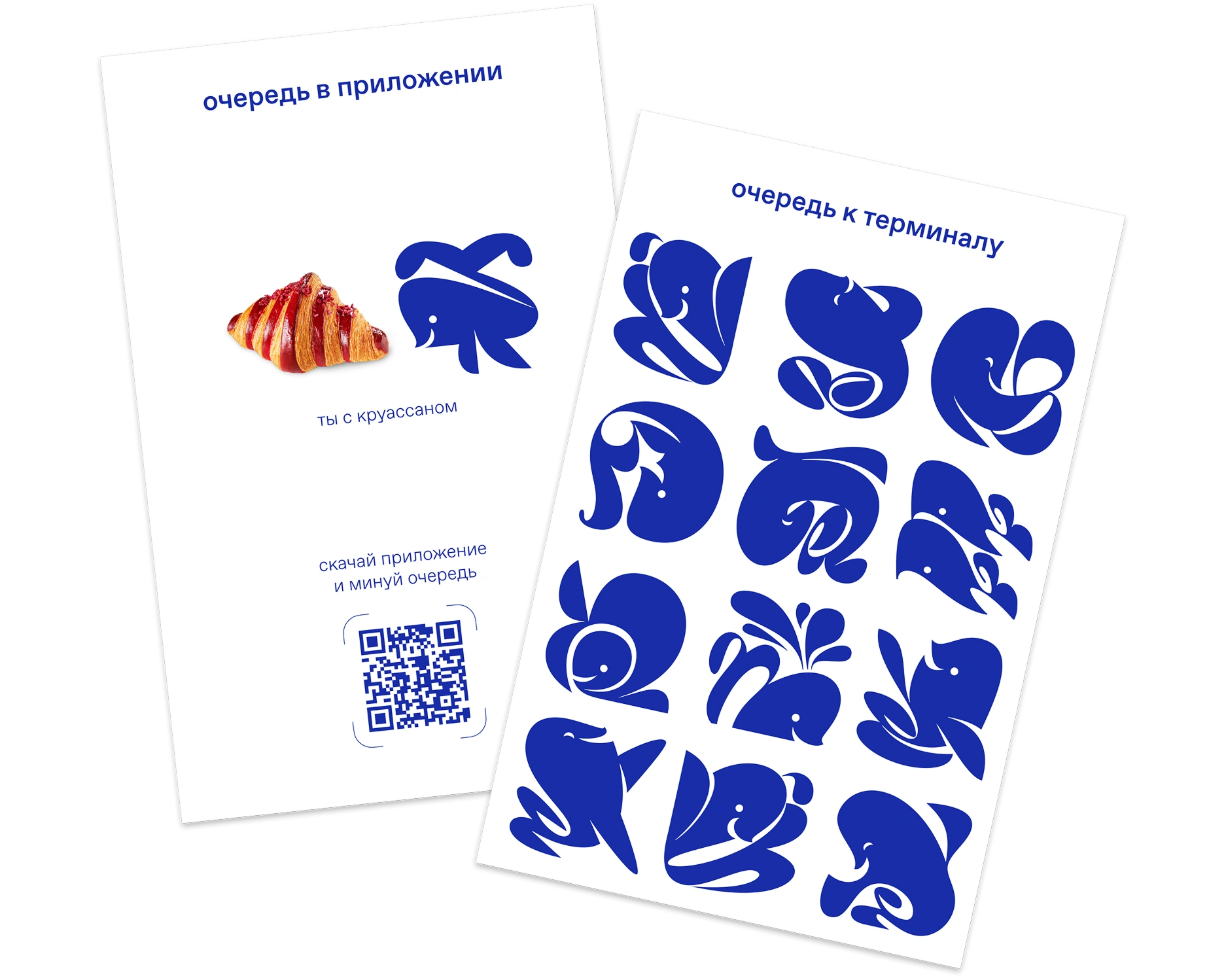
We tried playing with the theme of the queue in front of the terminal.
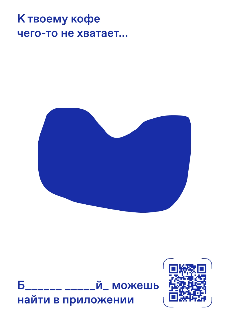
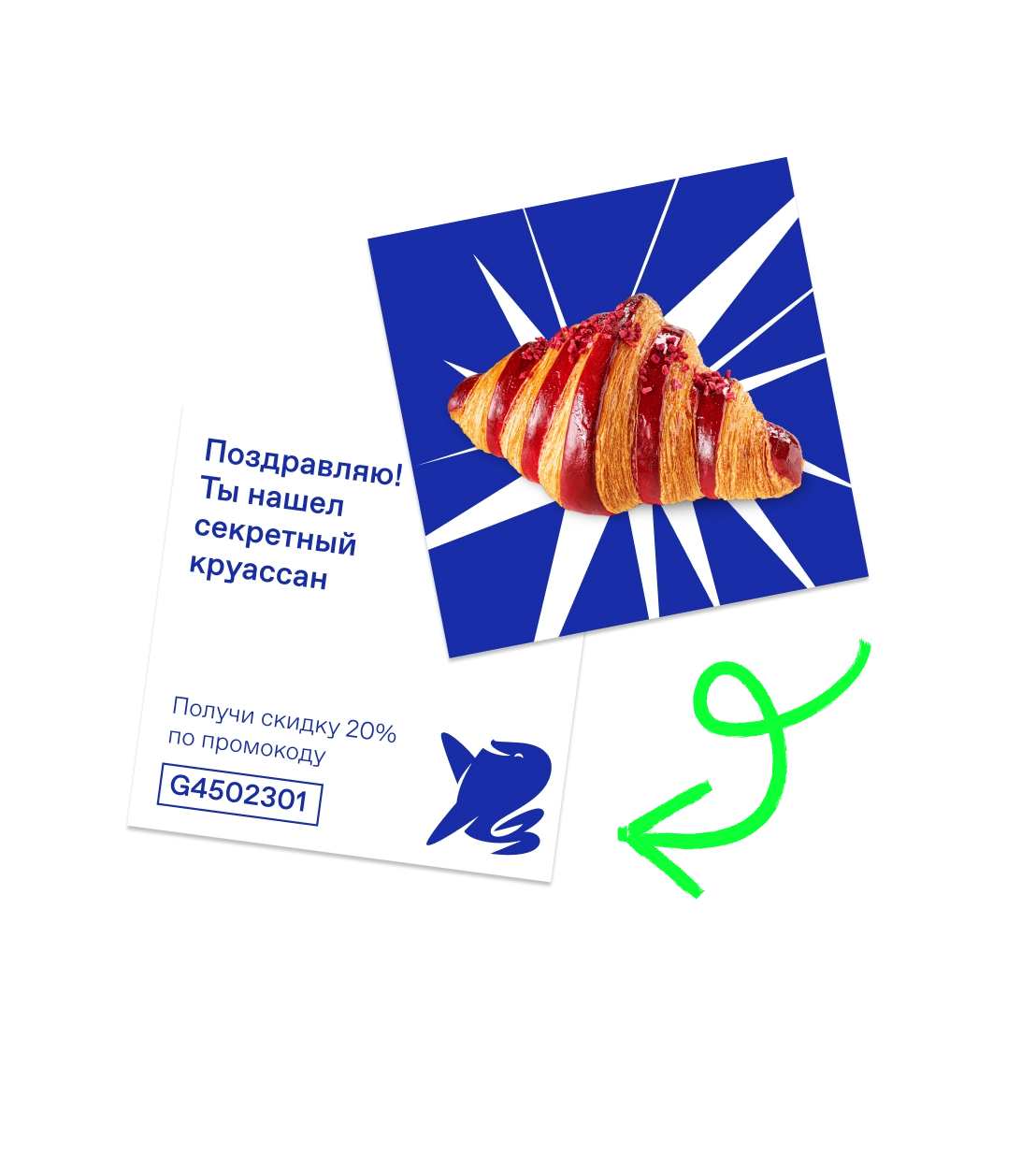
We sketched out ideas built around intrigue about the croissants.
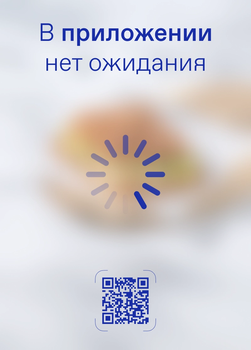
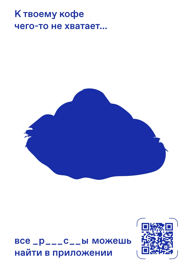
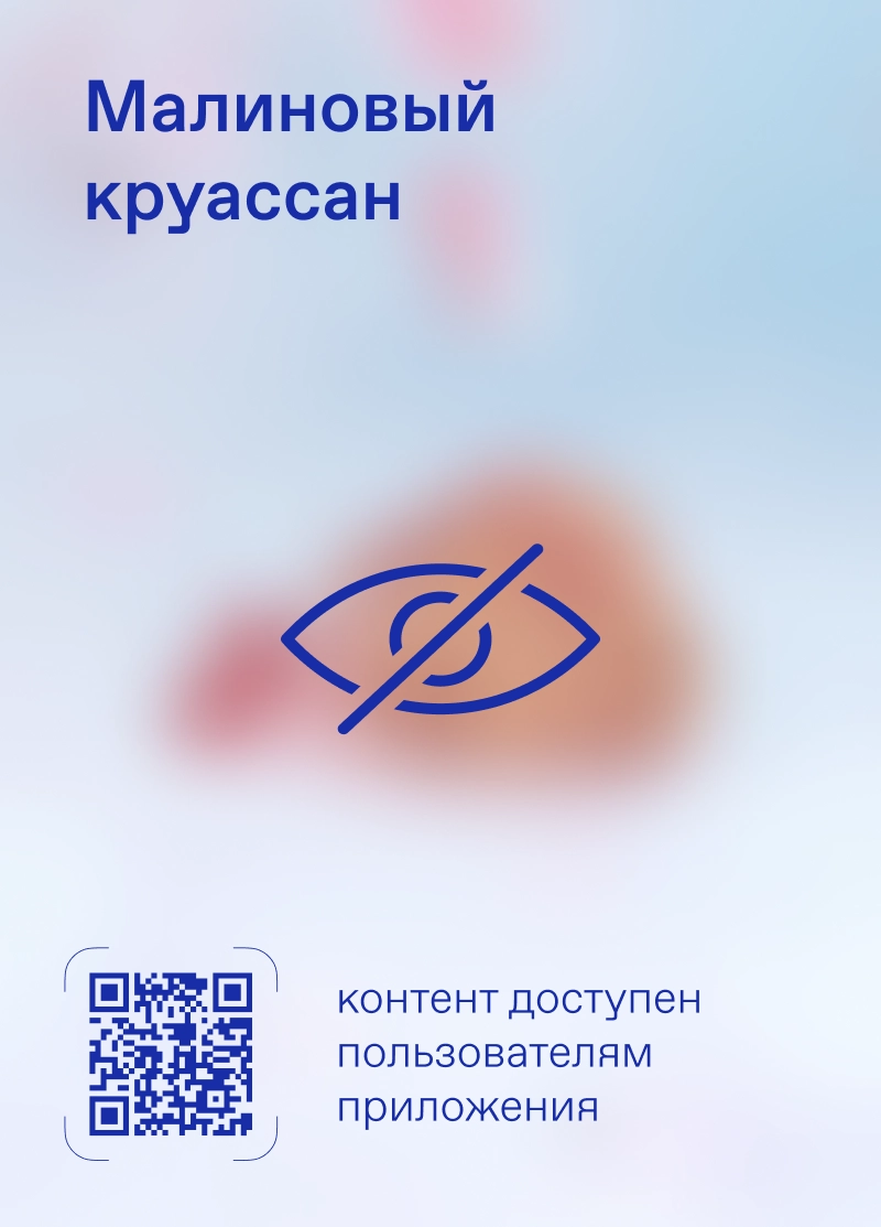
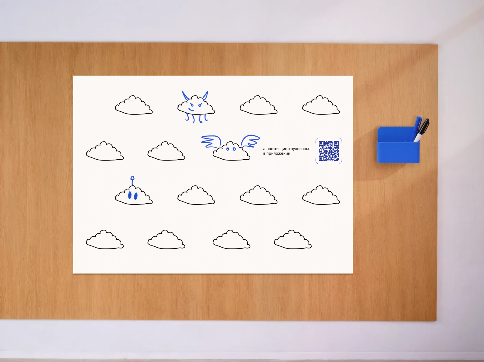
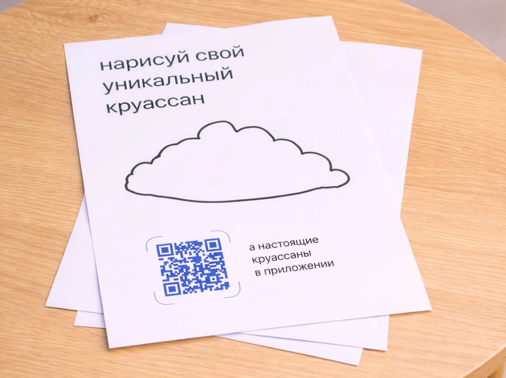
We added interactivity.
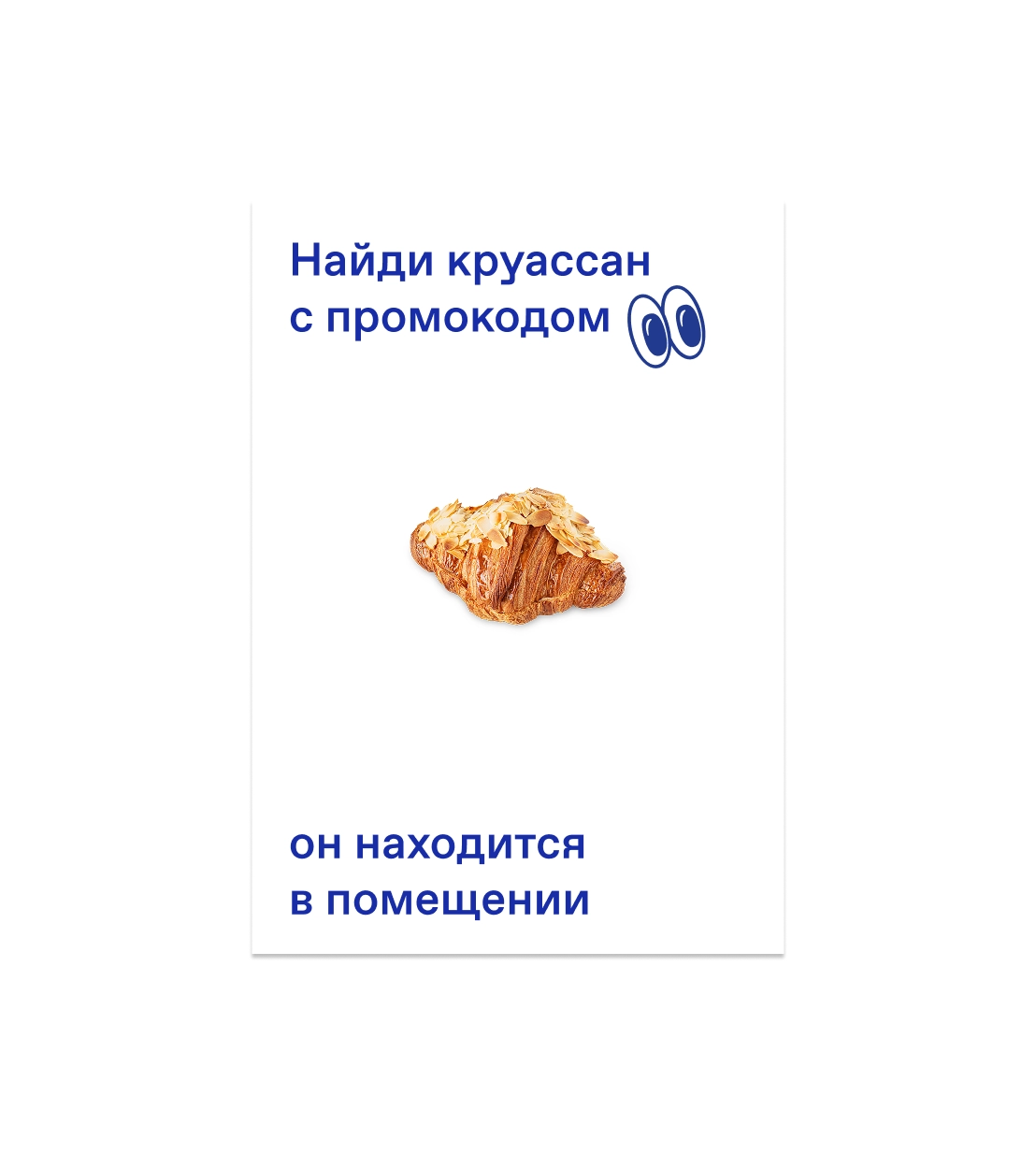
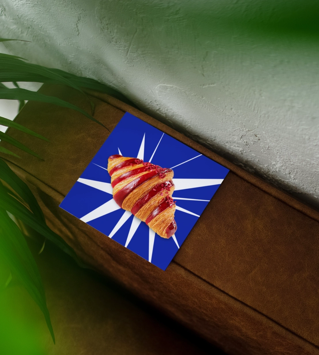
And a few fun bits too.
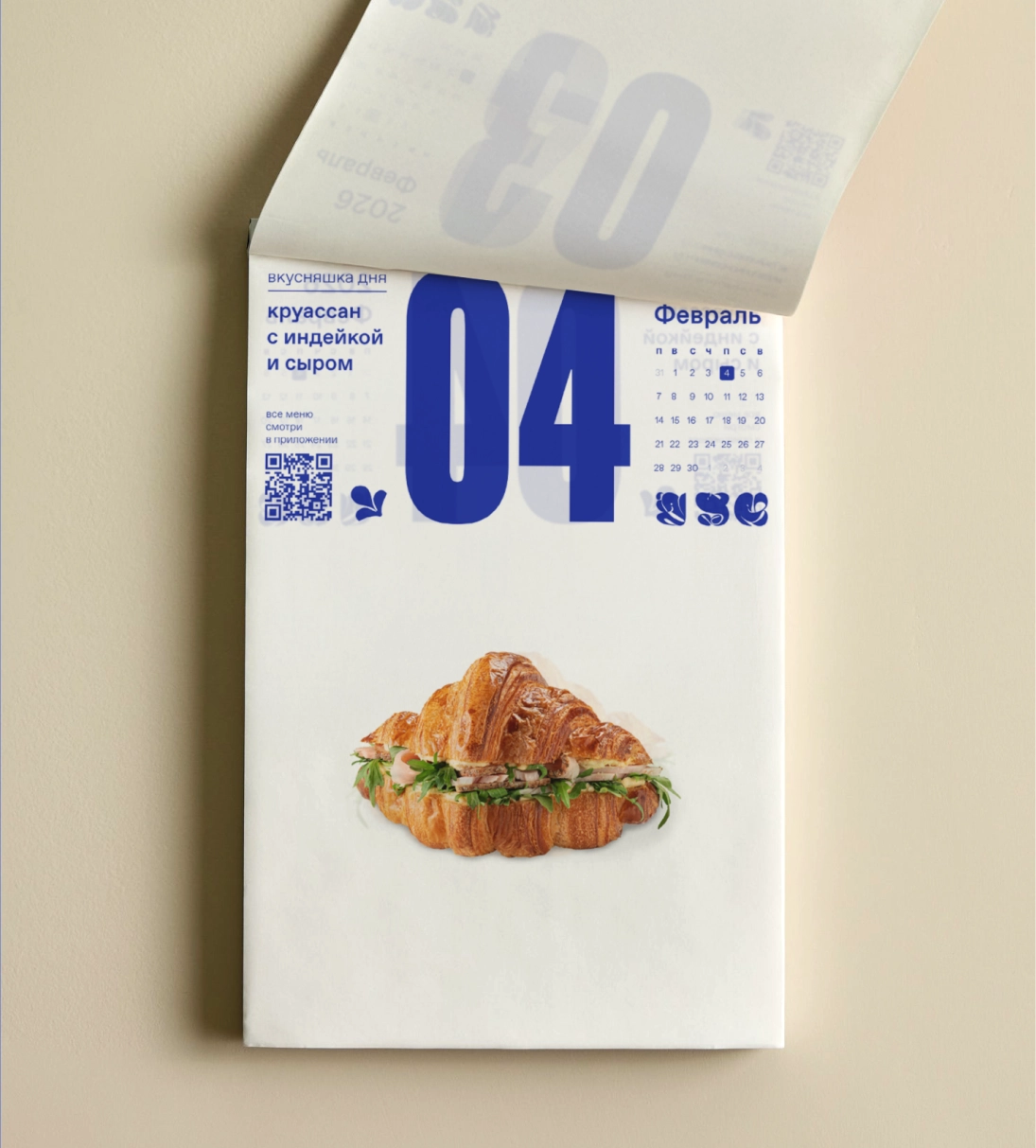
User journey
The client flagged the ideas they liked, and all that was left was to pull them together into the bigger picture — the user journey.
We built two versions of the journey: one for the street-format location and one for the business-center location.
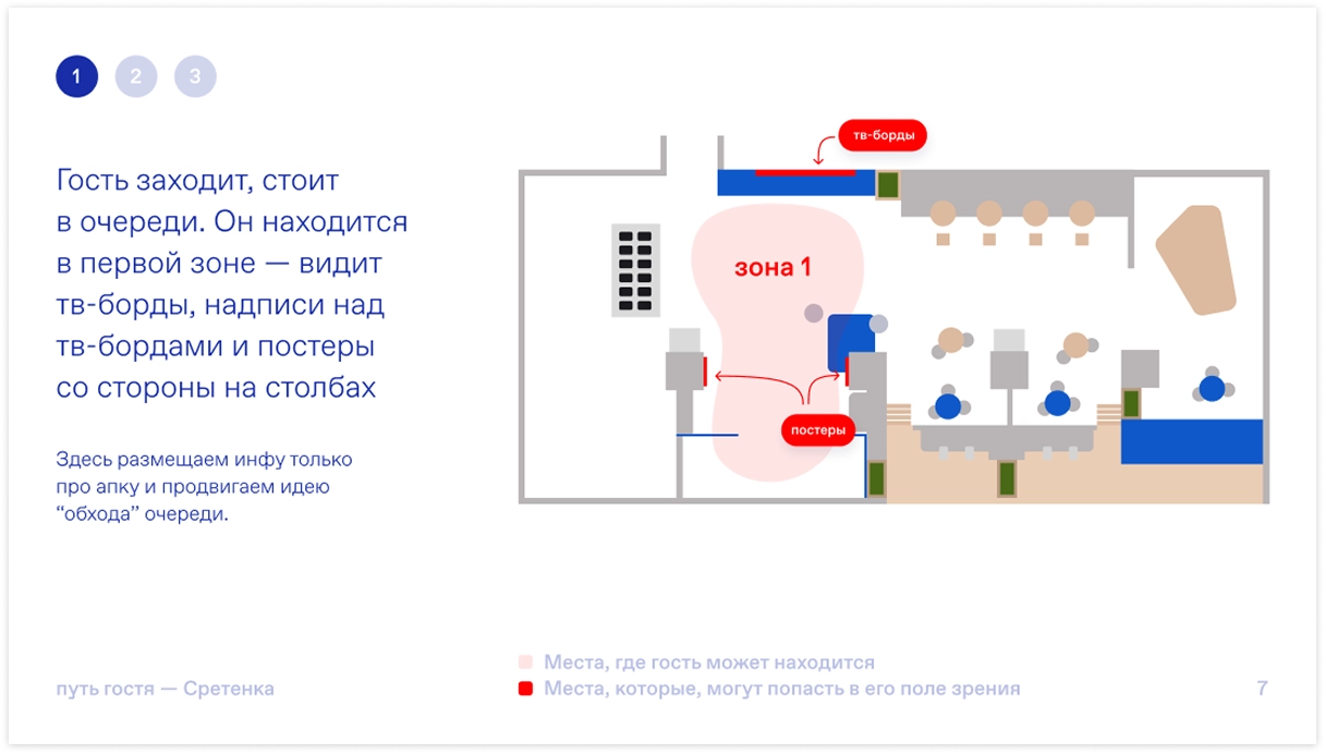
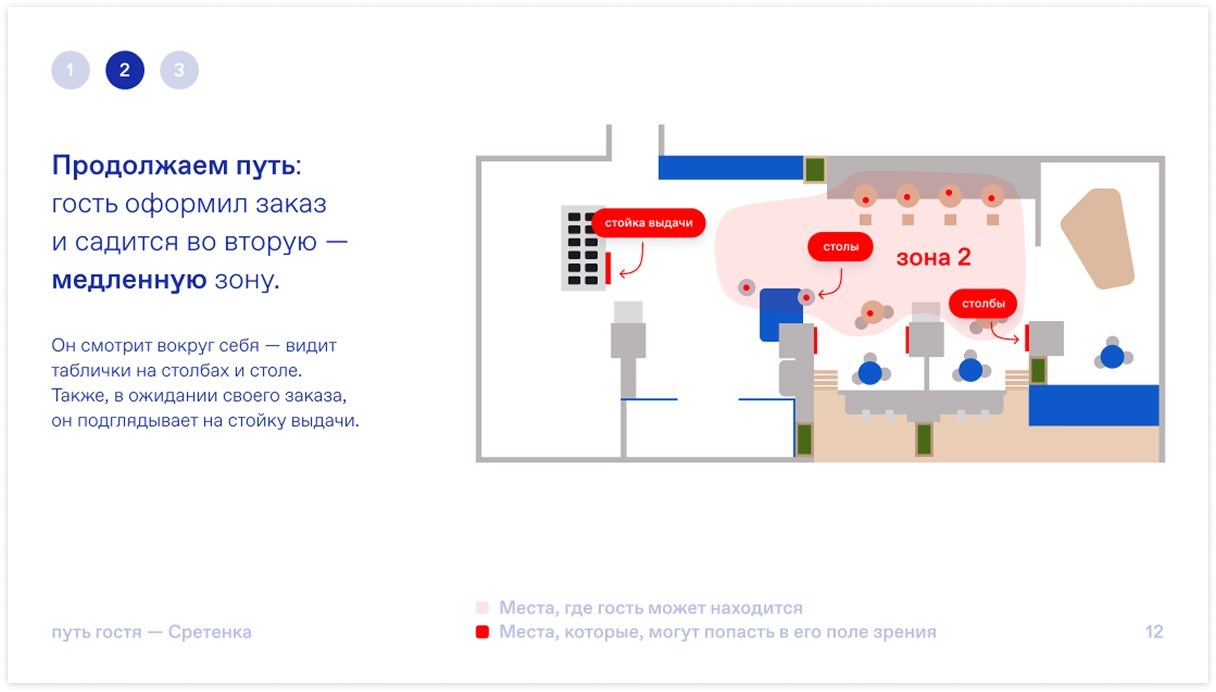
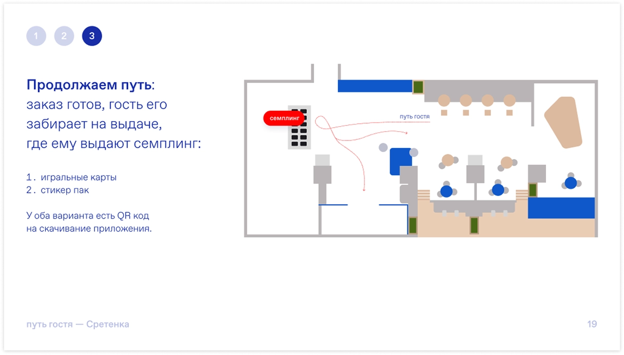
Street format
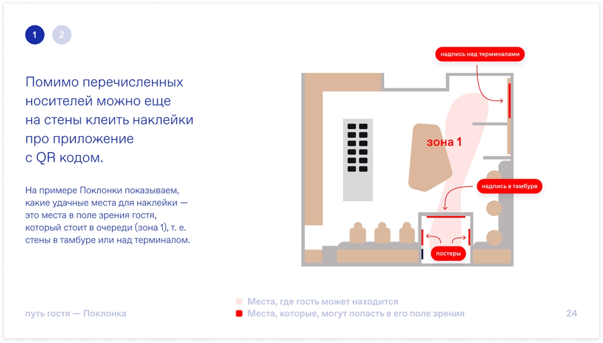
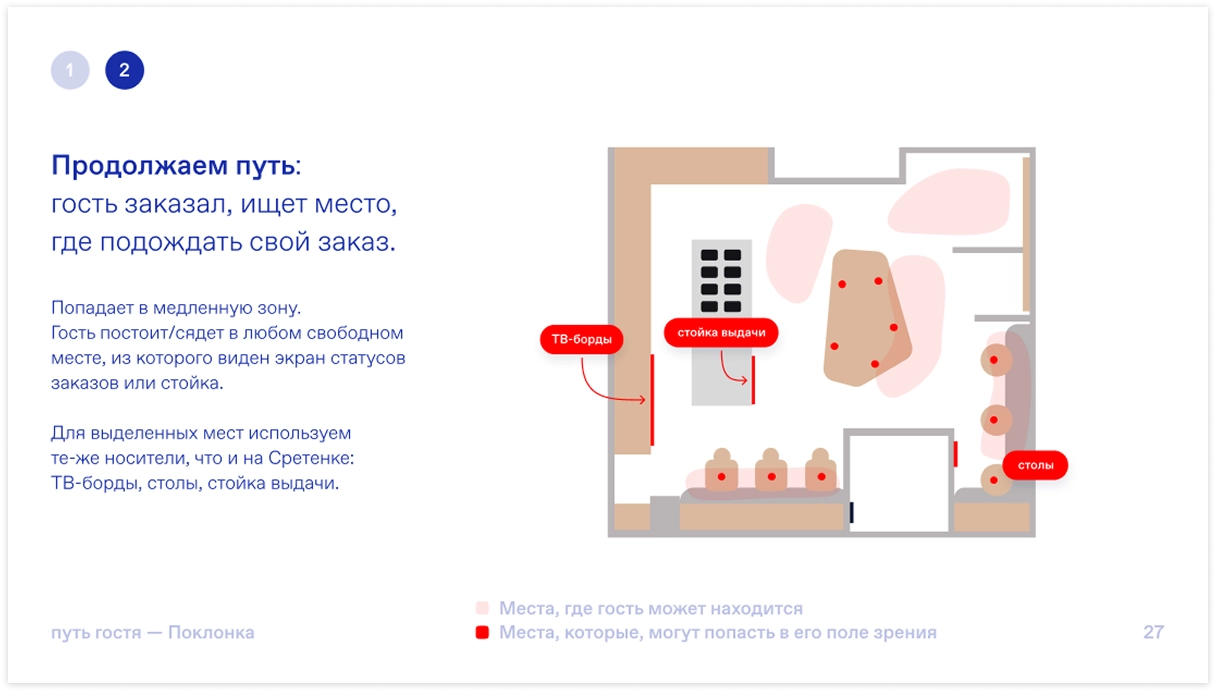
Business-center format
Once the concept was approved, we moved on to refining and scaling the materials:
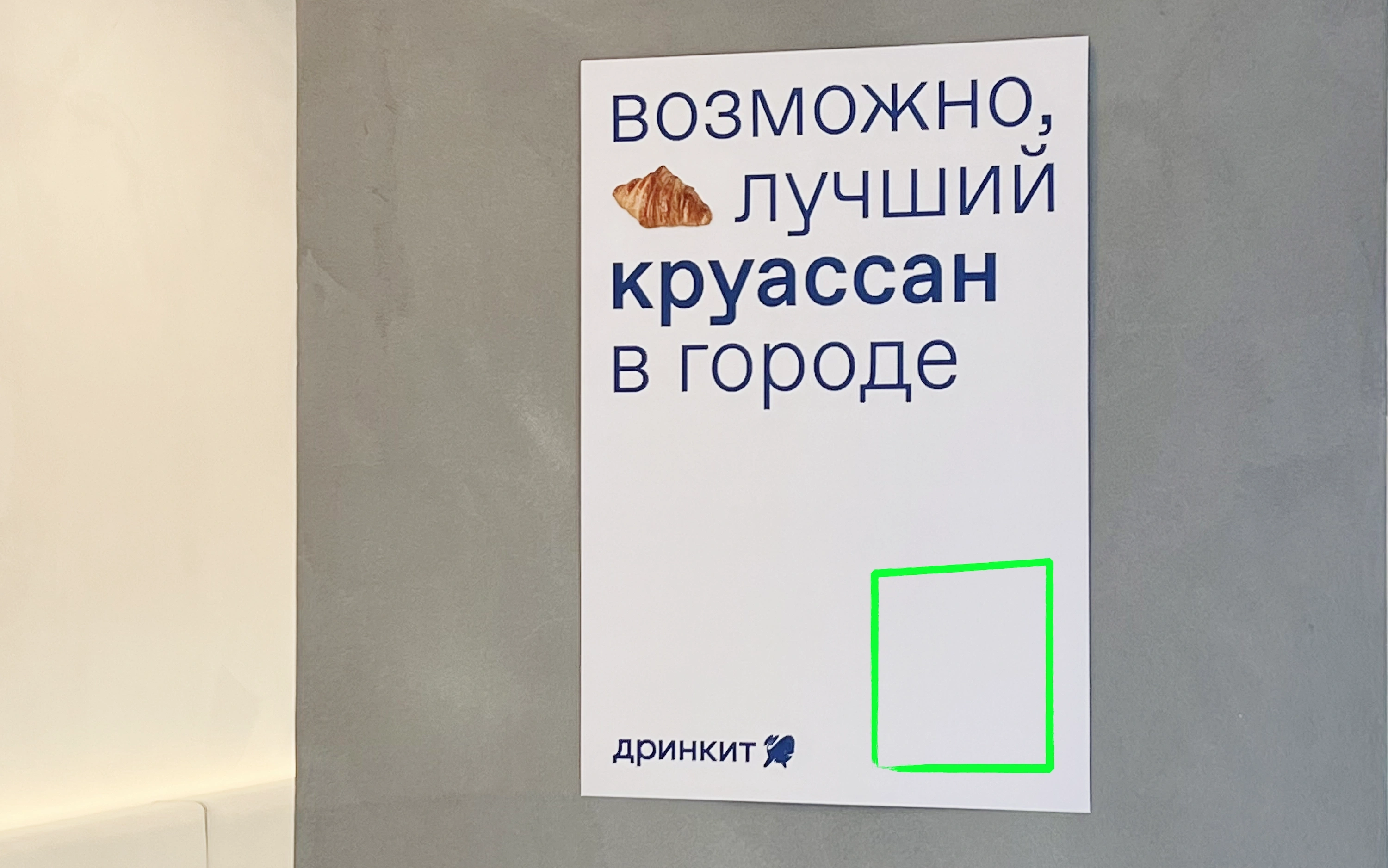
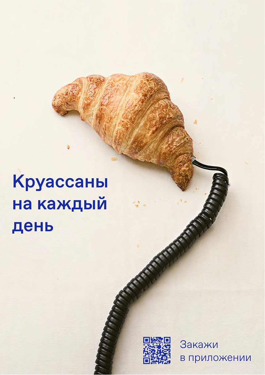
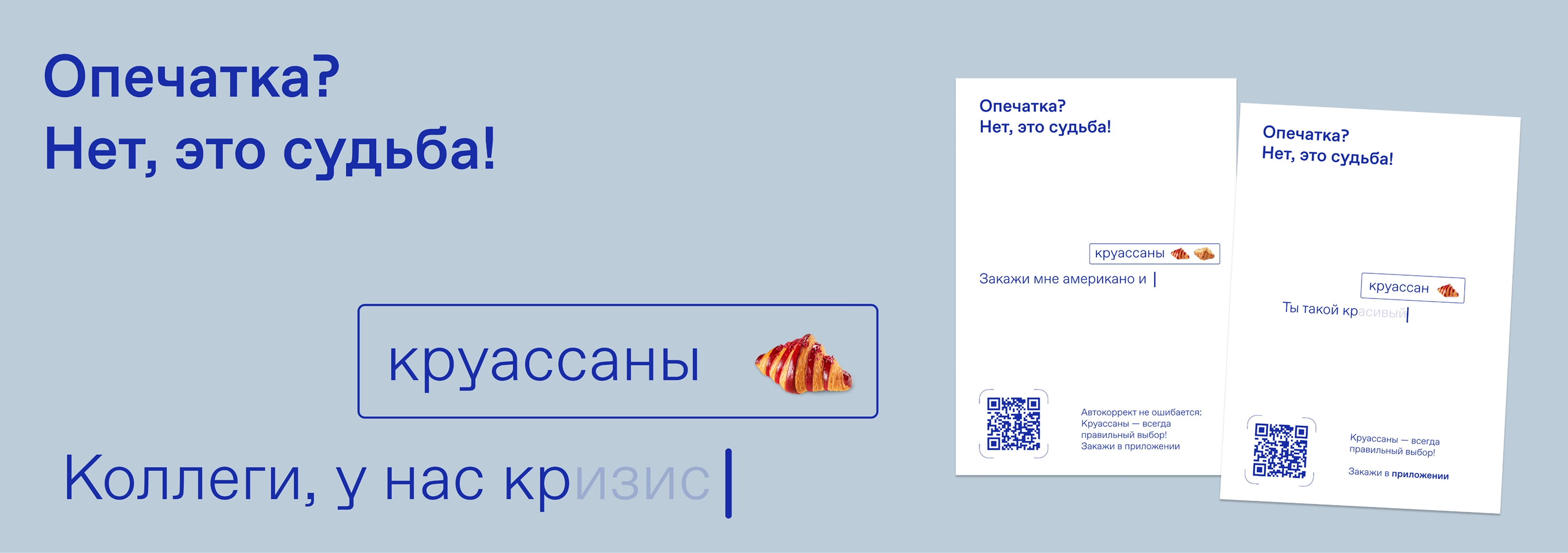
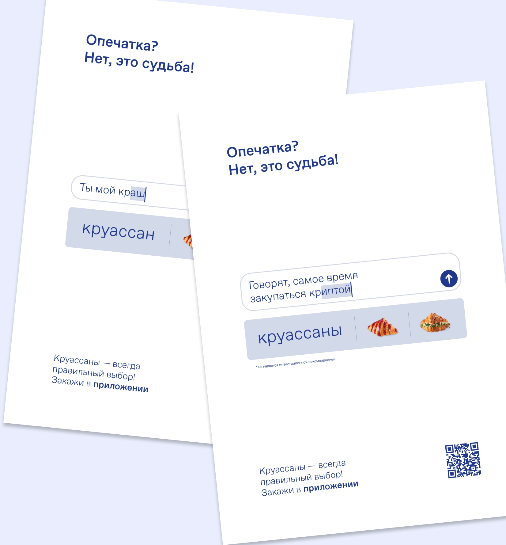
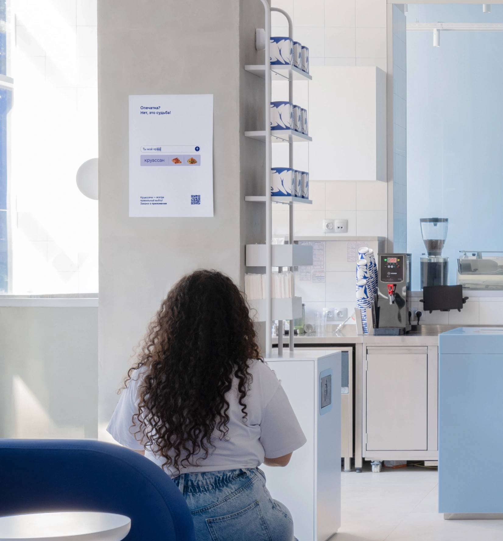
— Wall posters in a creative frame themed "It's not a typo, it's fate."
— Three videos for the TV boards.
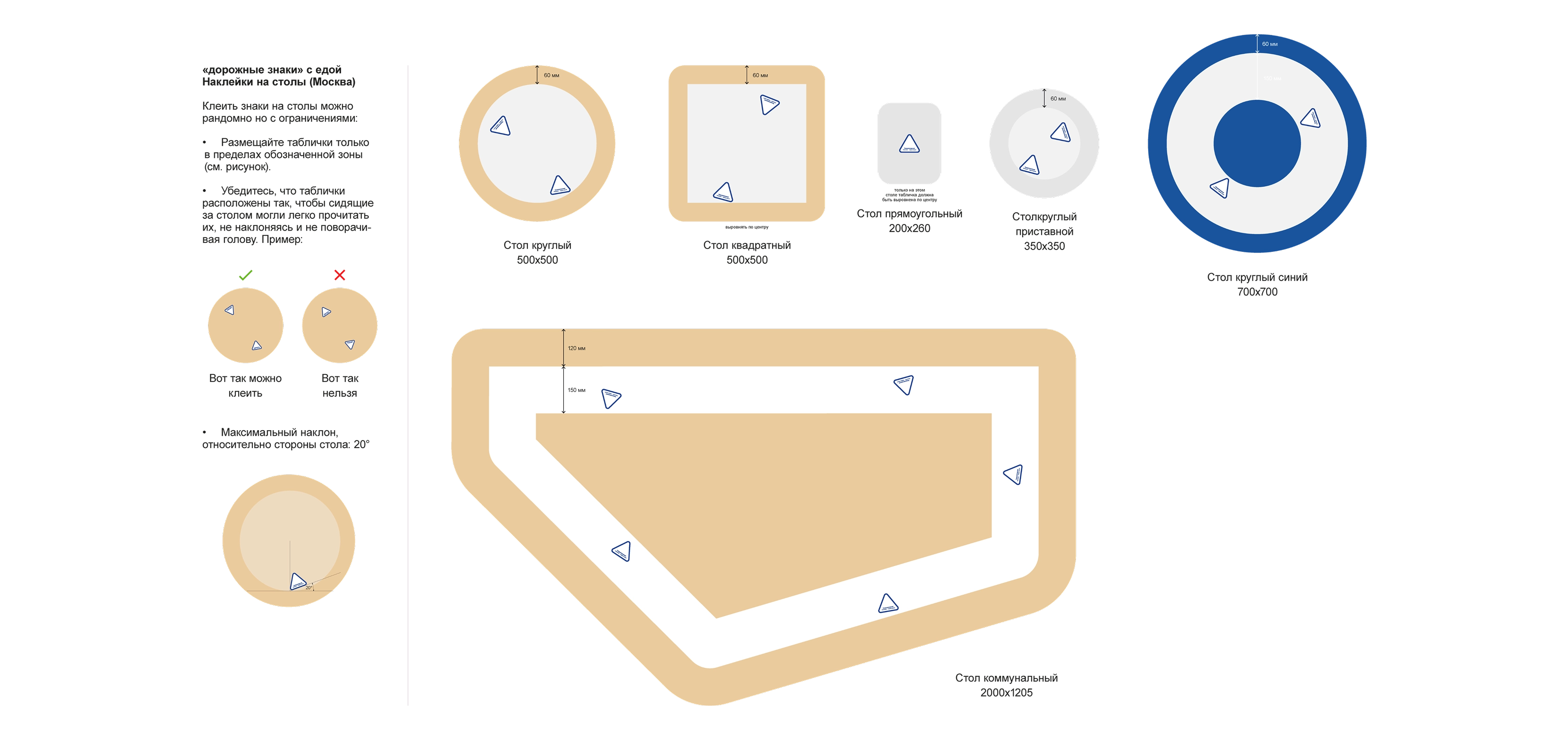
— Minimal stickers (text + QR) for the pickup counter, walls, and tables.
— Road-sign-style signs to highlight the presence of food through a metaphor.
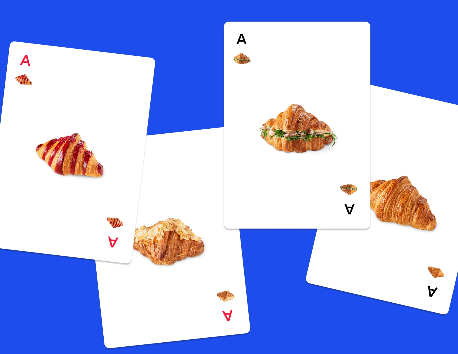
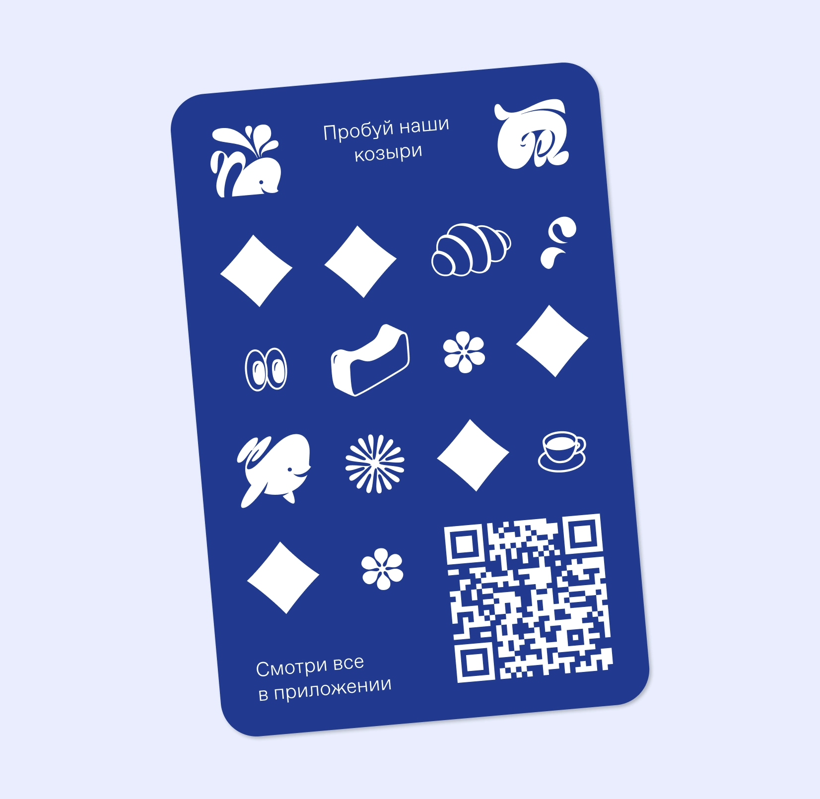
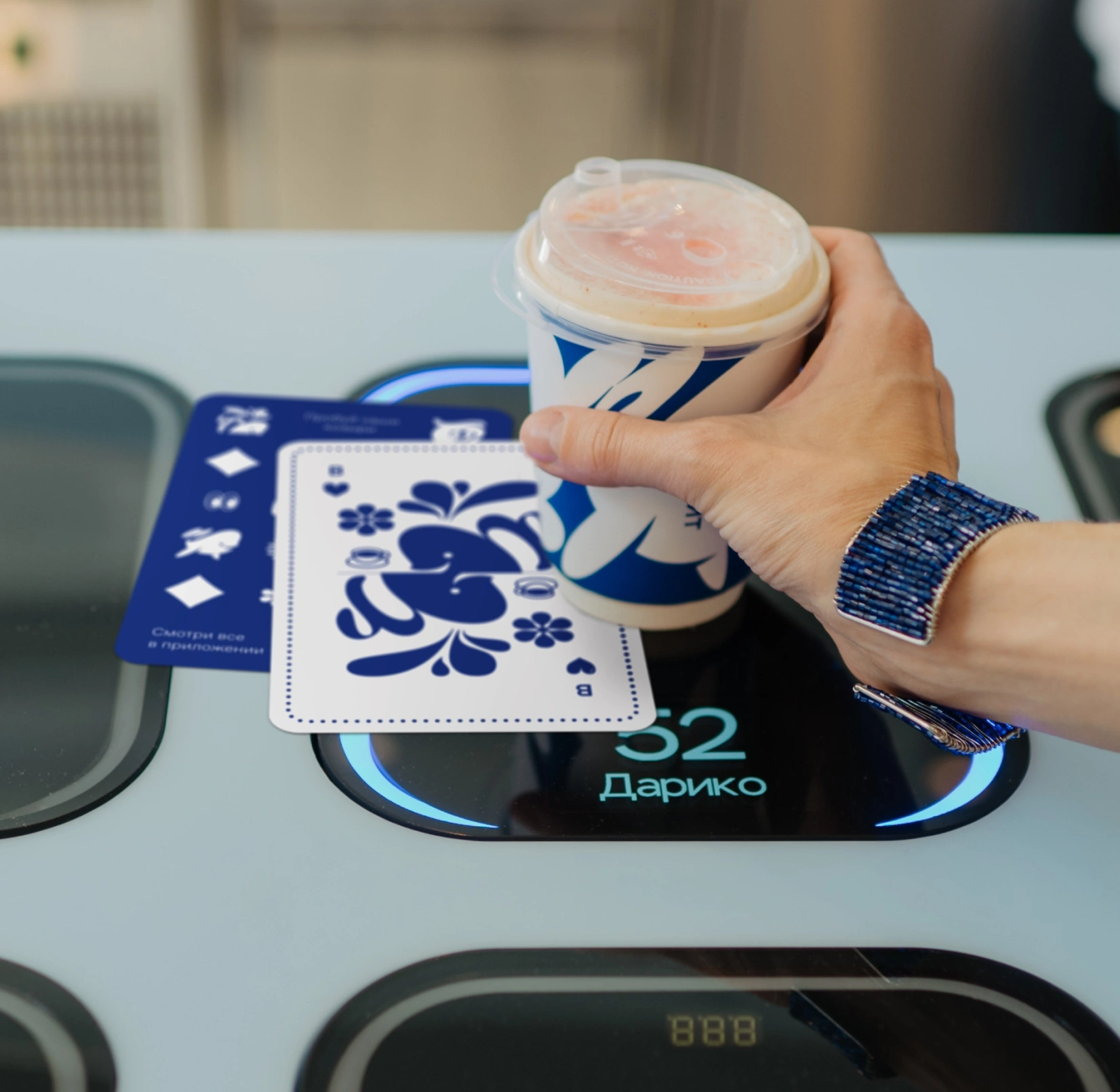
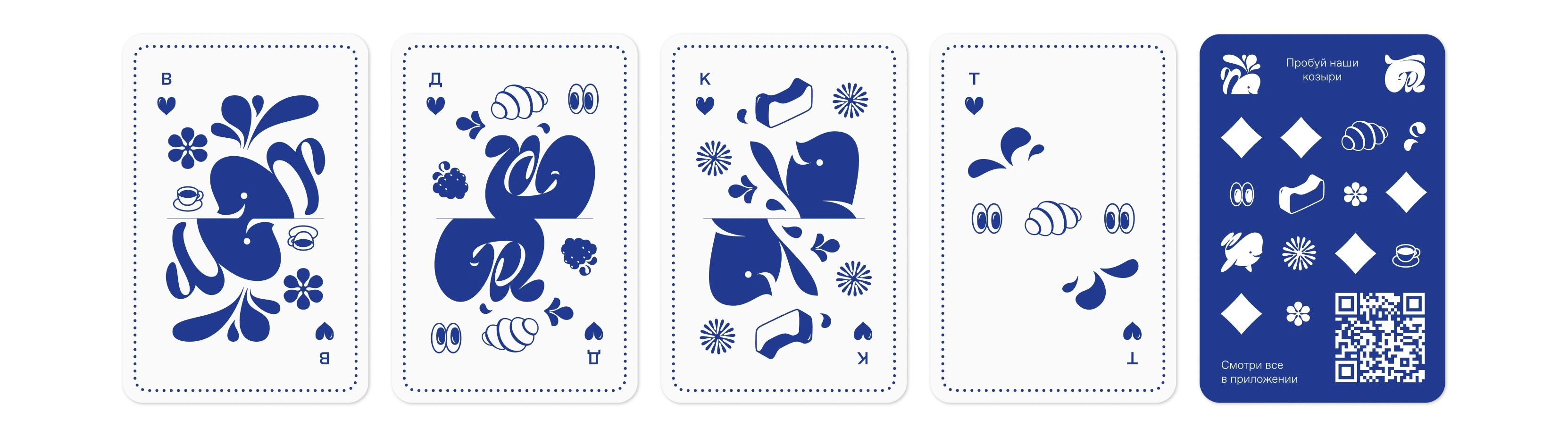
— Sampling materials: playing cards themed "Try our trump cards" and a QR sticker pack.
Drinkit's creative director liked the idea of playing with a typo: it's easy to scale across any touchpoint and to come up with different copy for. Within this concept, we prepared a series of posters.
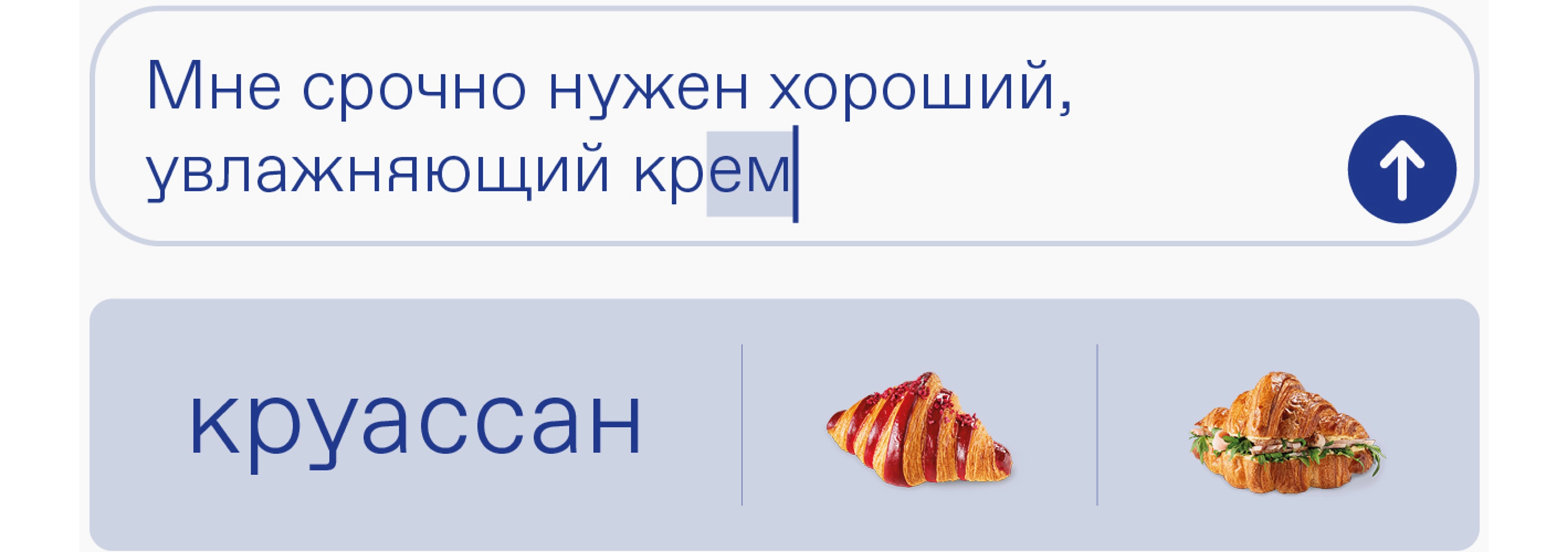
The client flagged three promising scenarios for the TV boards: one built on the typo, one on the queue theme (to promote the app), and one in a flip-through format showing off the wide food selection.
We made minimal stickers (text + QR) for the spots we'd already confirmed worked well: the pickup counter, walls, and tables. For each position, we prepared print-ready files with instructions.
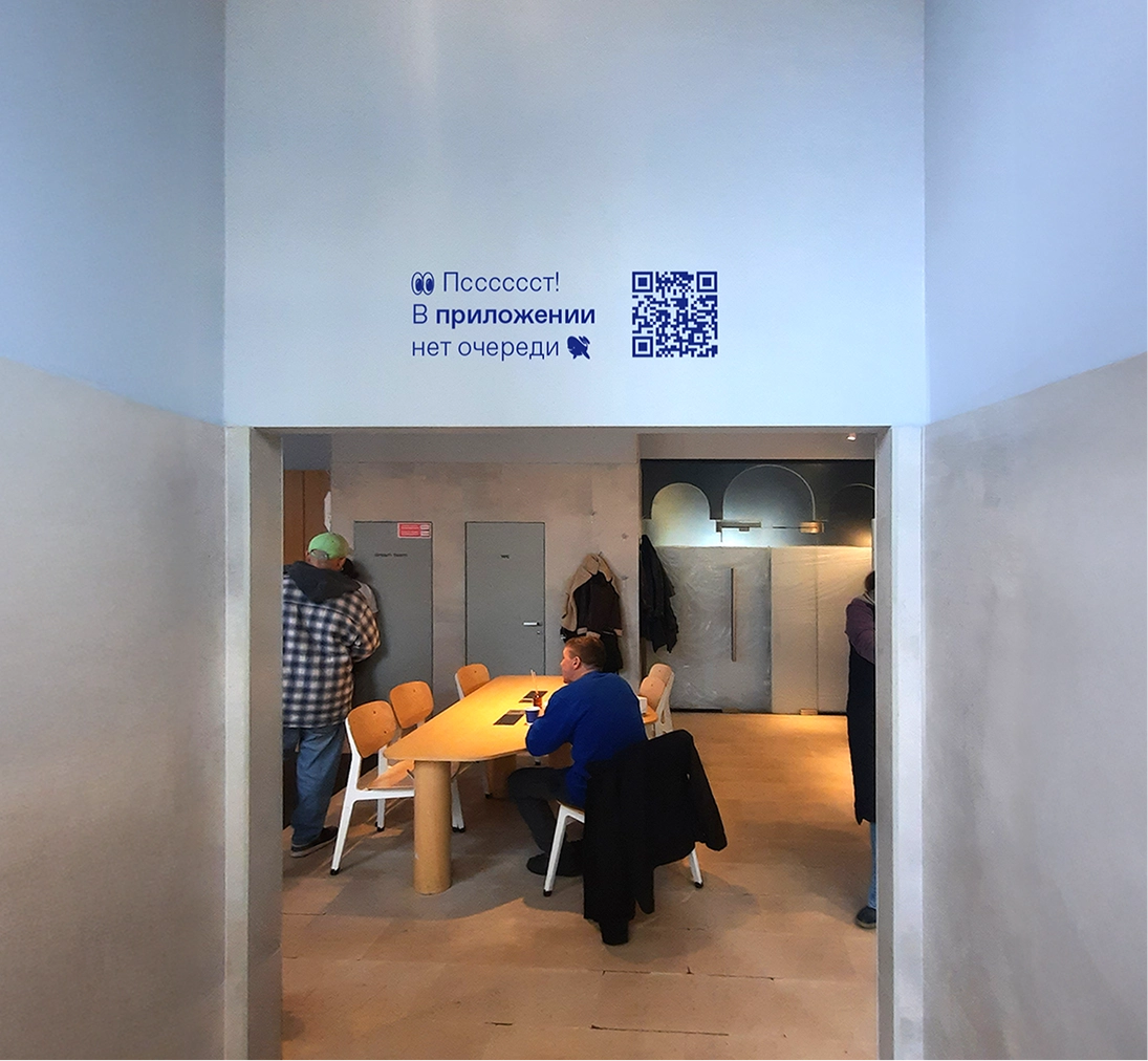
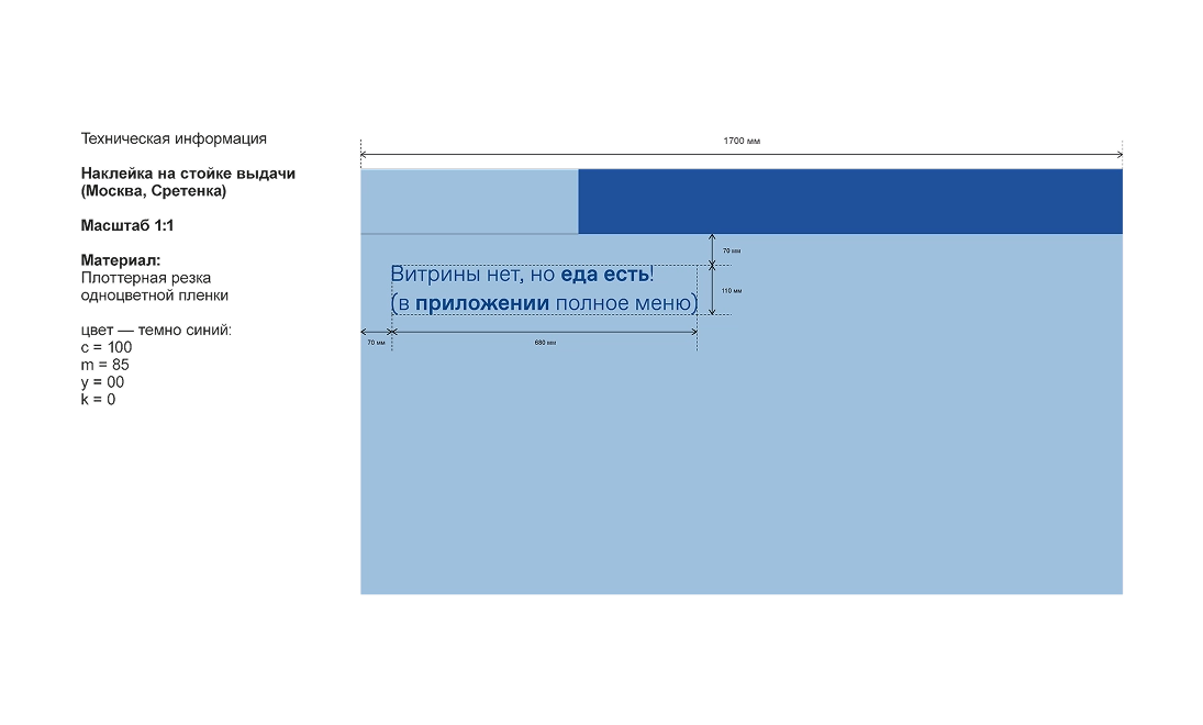
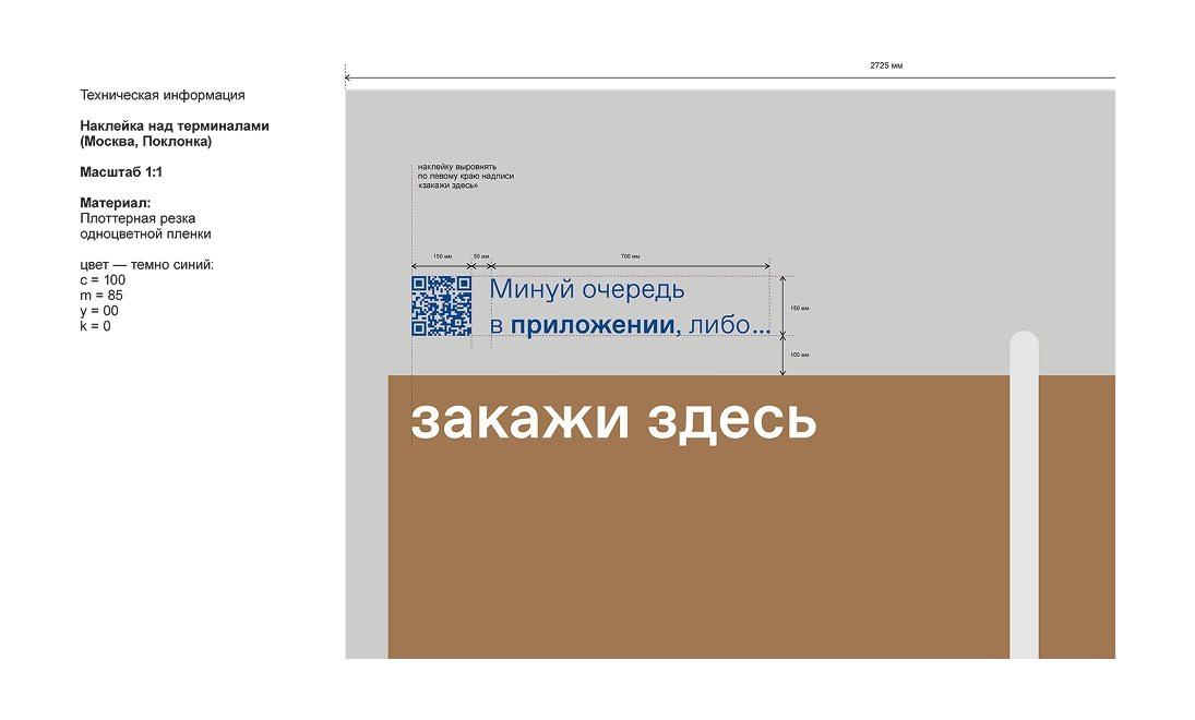
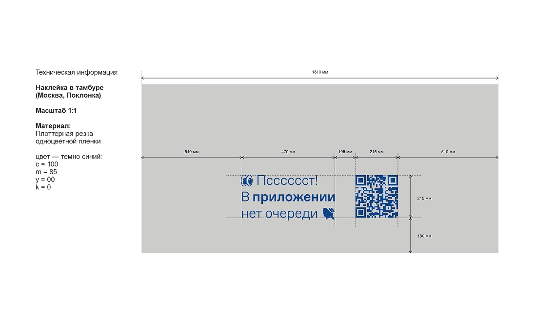
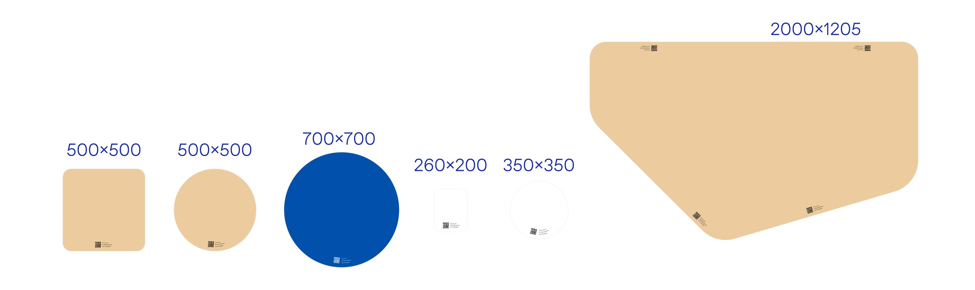
We made the table stickers in several variants — to fit any type of table.
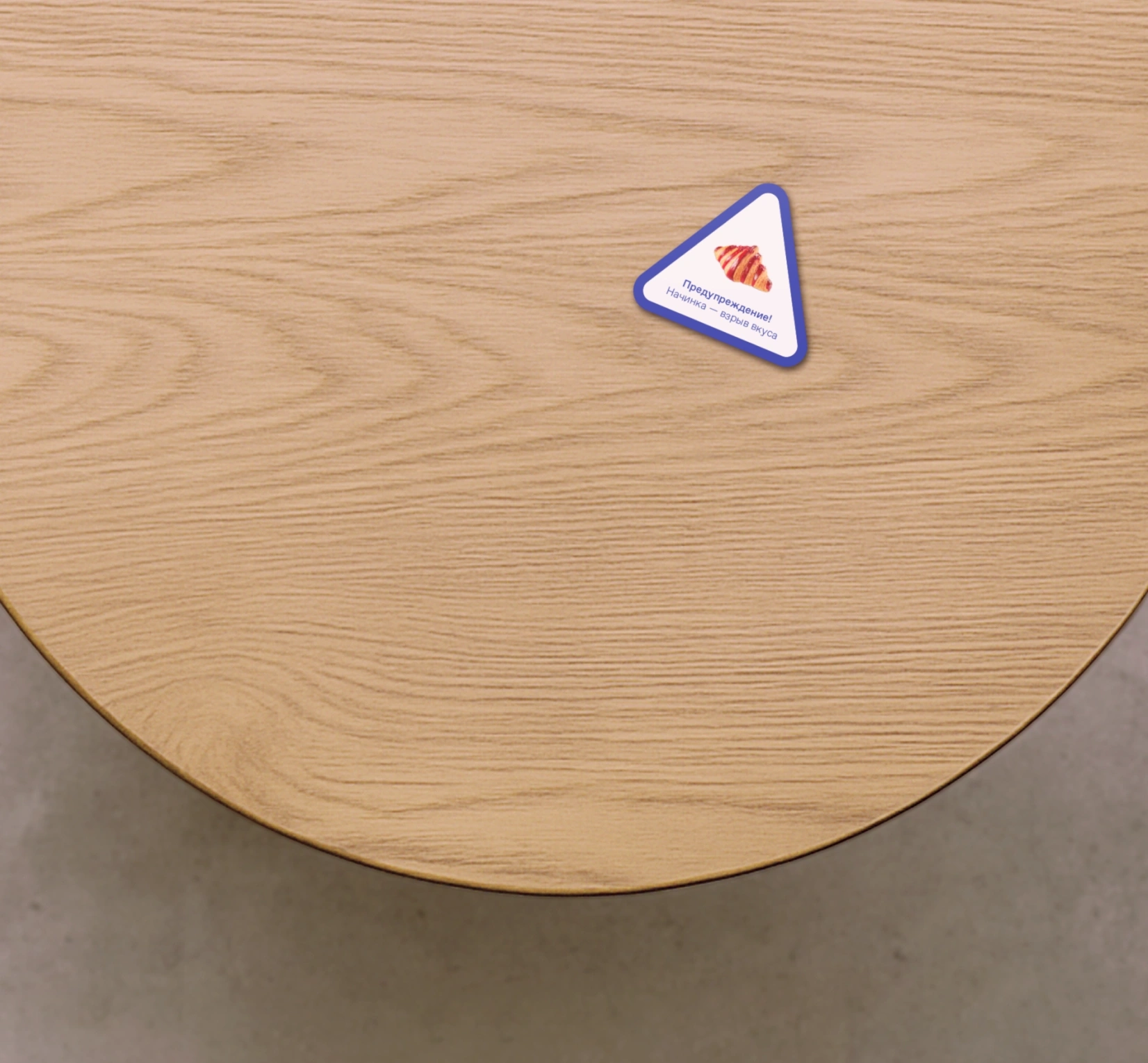
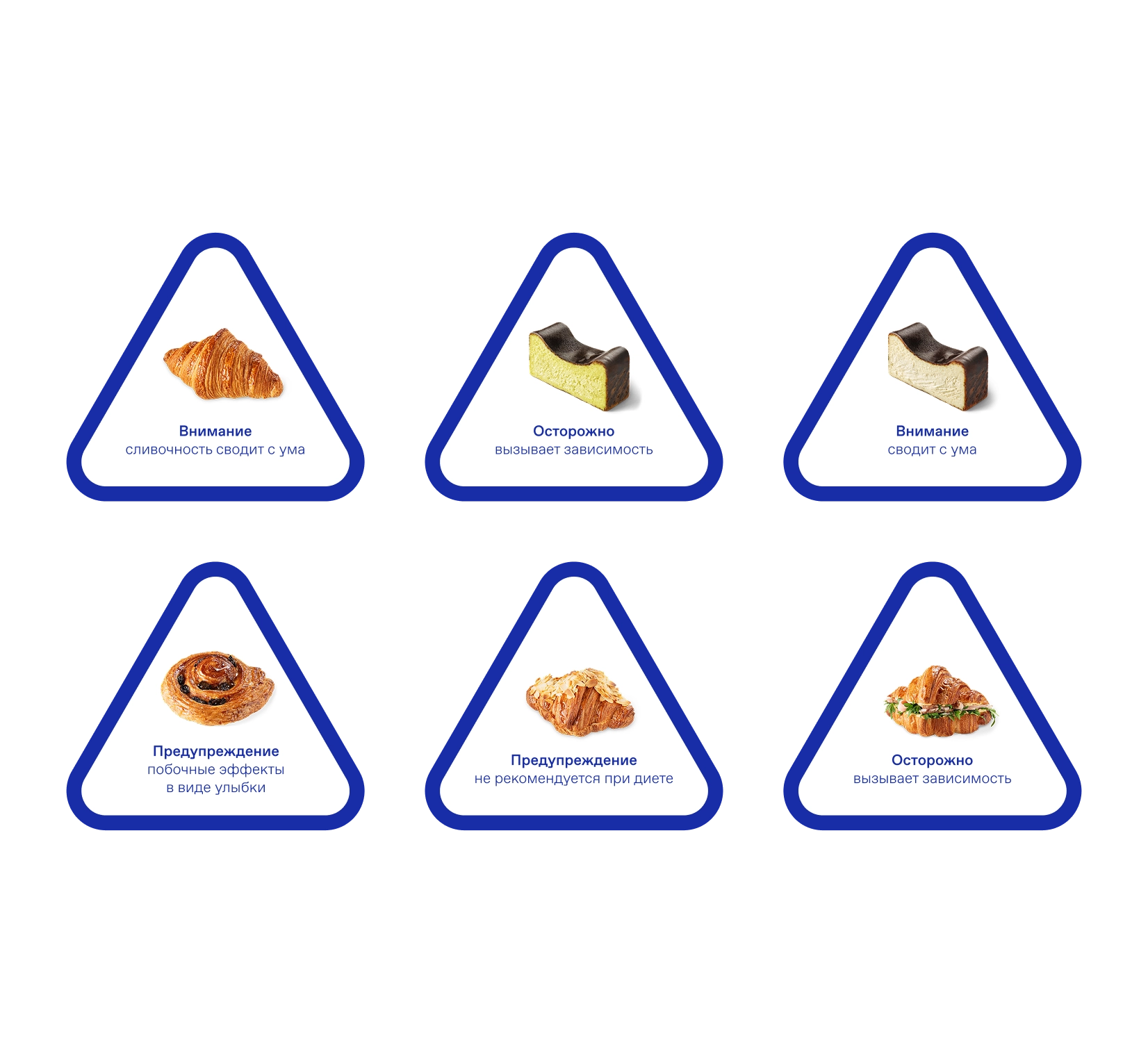
We also came up with road-sign-style signs — with messages like "Warning! Filling ahead — flavor explosion."
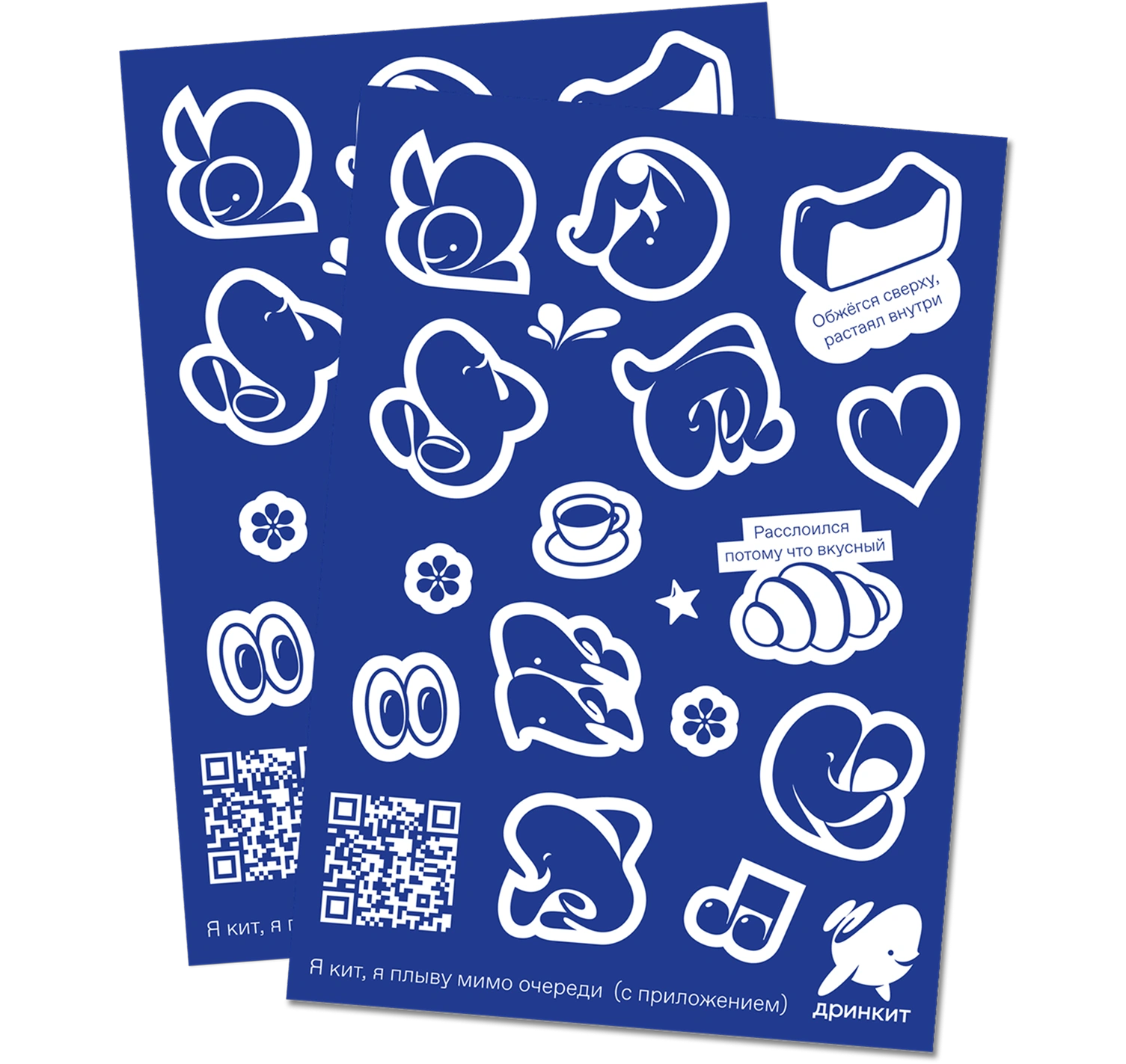
In addition, we made two sampling formats for the pickup counter, both carrying QR codes as well.
The sticker pack is a reliable staple that always works and is a nice touch for guests.
Playing cards, where we played on the theme of trump cards. This lets us promote the food idea through a metaphor: croissants and cheesecakes become the top trump cards.
By the way, the playing-card idea could be developed into a full Drinkit-branded deck that guests could gradually collect.
In the final stage, we pulled everything together into a single presentation for the marketing managers. The result was a mini-guide called "Promotional Materials," where we described the user journey in detail and included links to folders with print-ready layouts.
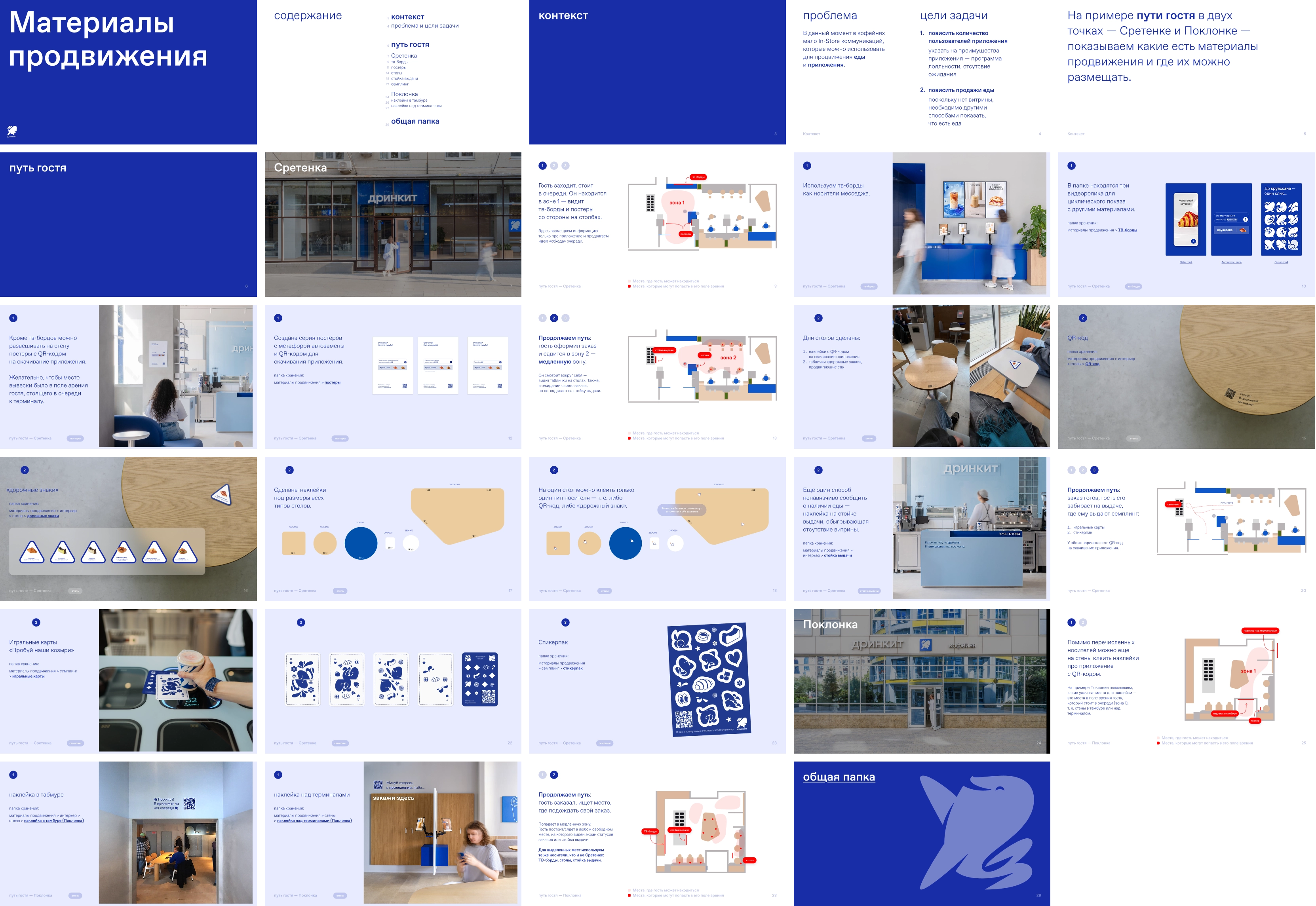
Developing the in-store communications turned out to be more complex than it looked at first glance, and required more extensive work.
We analyzed the locations, reworked the placement scheme for the materials, offered the client a range of creative solutions, and prepared everything for print.
Project team
CMO at Drinkit — Zhenya Bardizh-Malova
Creative Director at Drinkit — Sasha Loginevskaya
Art director — Zhenya Oputin
Designer — Polina Livaich
Case design — Masha Asaulyak
Case editor — Misha Kurnosov
