
Client: Dodo Brands.
Timeline: December 2024 — January 2025.
Task: developing an identity, motion design, and presentation design for an online event.
Dodo Future Week is an annual event where Dodo Brands shares its plans and achievements. In late December 2024, we received a request for full visual support of the event, which was scheduled for January 20–24, 2025.


In under a month, we needed to create the event's overall identity, develop motion design for the broadcasts, and design the speakers' presentations. For us, this was a challenge — delivering that much work in such a short time. We took it on, and here's how we worked on the project.


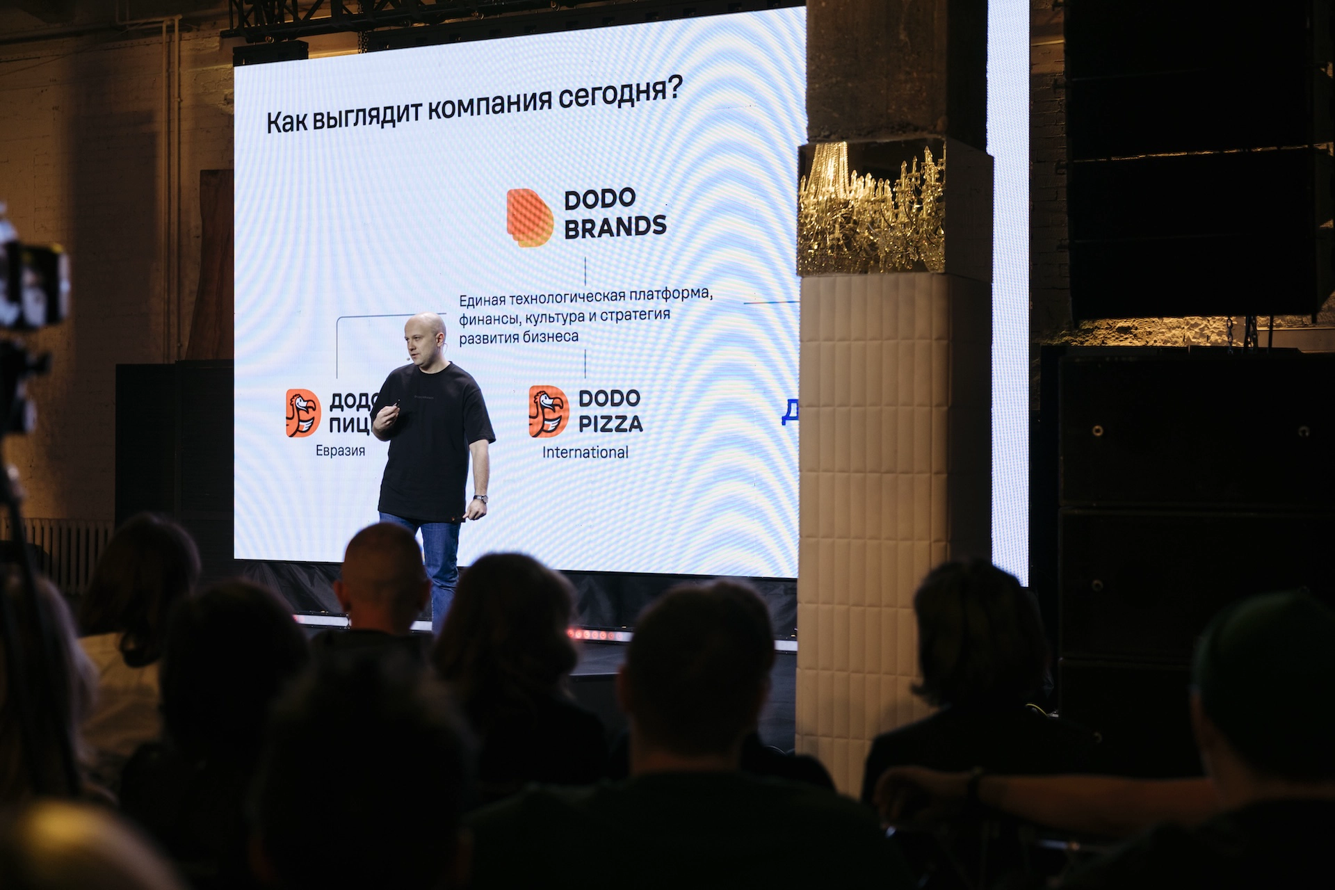
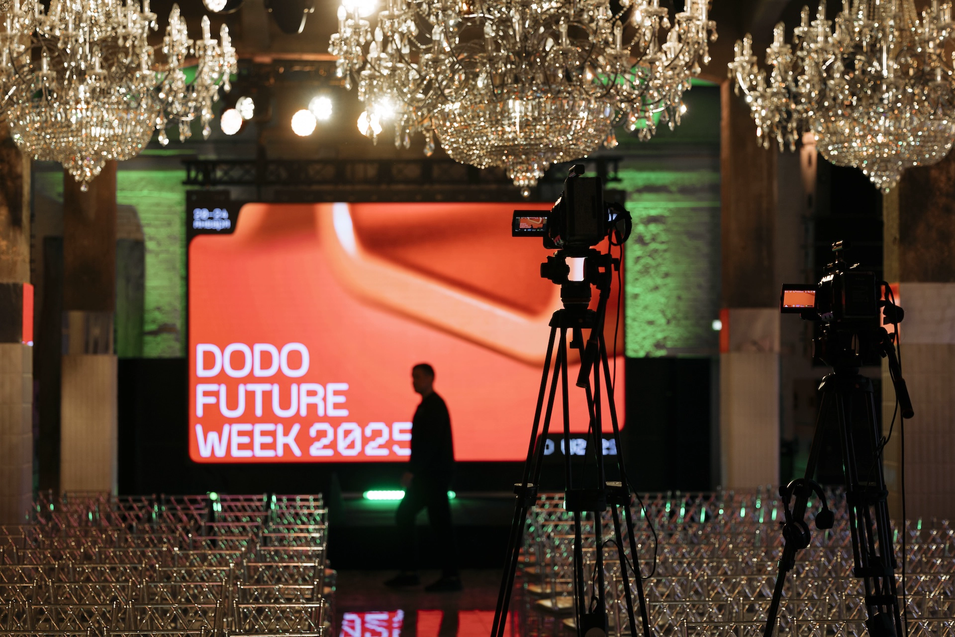
Tight deadlines and holidays
When the client came to us almost right before New Year's, we knew we might not make it, and that if we were going to start, we had to start immediately — working through weekends and holidays.
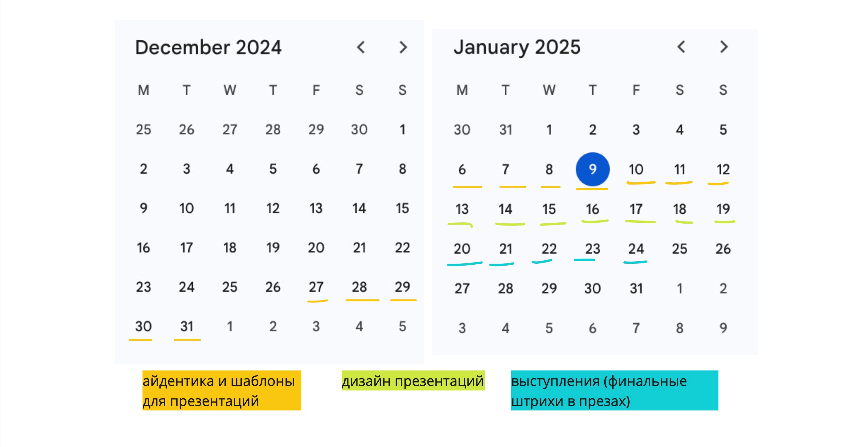
We organized the work to make the most of the time we had, breaking tasks into weekly sprints. First we needed to develop the static identity, then came the motion design, and finally the finished style had to be rolled out across every touchpoint and presentation.
Chaotic task flow
The plan was that speakers would bring their presentation drafts by the end of the year, we'd start working on them calmly in early January, and everything would be ready by January 20. In reality, we were getting presentation texts from participants less than a week out, leaving designers very little time to lay them out.
We built in a safety net: a dedicated team of three designers worked on the presentations, communicating directly with speakers in separate chats and making the necessary changes on the fly.

Evolving the existing identity
Given the brand's continuity, we decided not to create a radically new design, but to evolve the existing identity instead. Keeping the brand typography and style, we added new visual accents to refresh the event's look.
We kept the long view in mind, so that as the style of this annual event evolved, it would still stay recognizable. If you laid out the visuals from every edition of the event side by side on a YouTube page, they'd look different from each other, but you'd still be able to read the throughline.

Identity
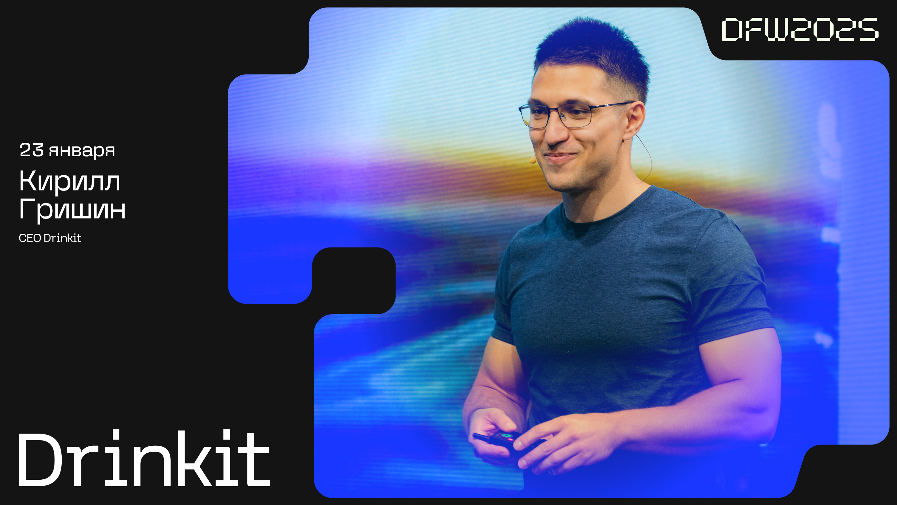
We developed a concept that makes it clear right away: Dodo Future Week is about the future and technology. Bright colors and modern graphic elements — all aimed at underscoring energy and an innovative spirit.


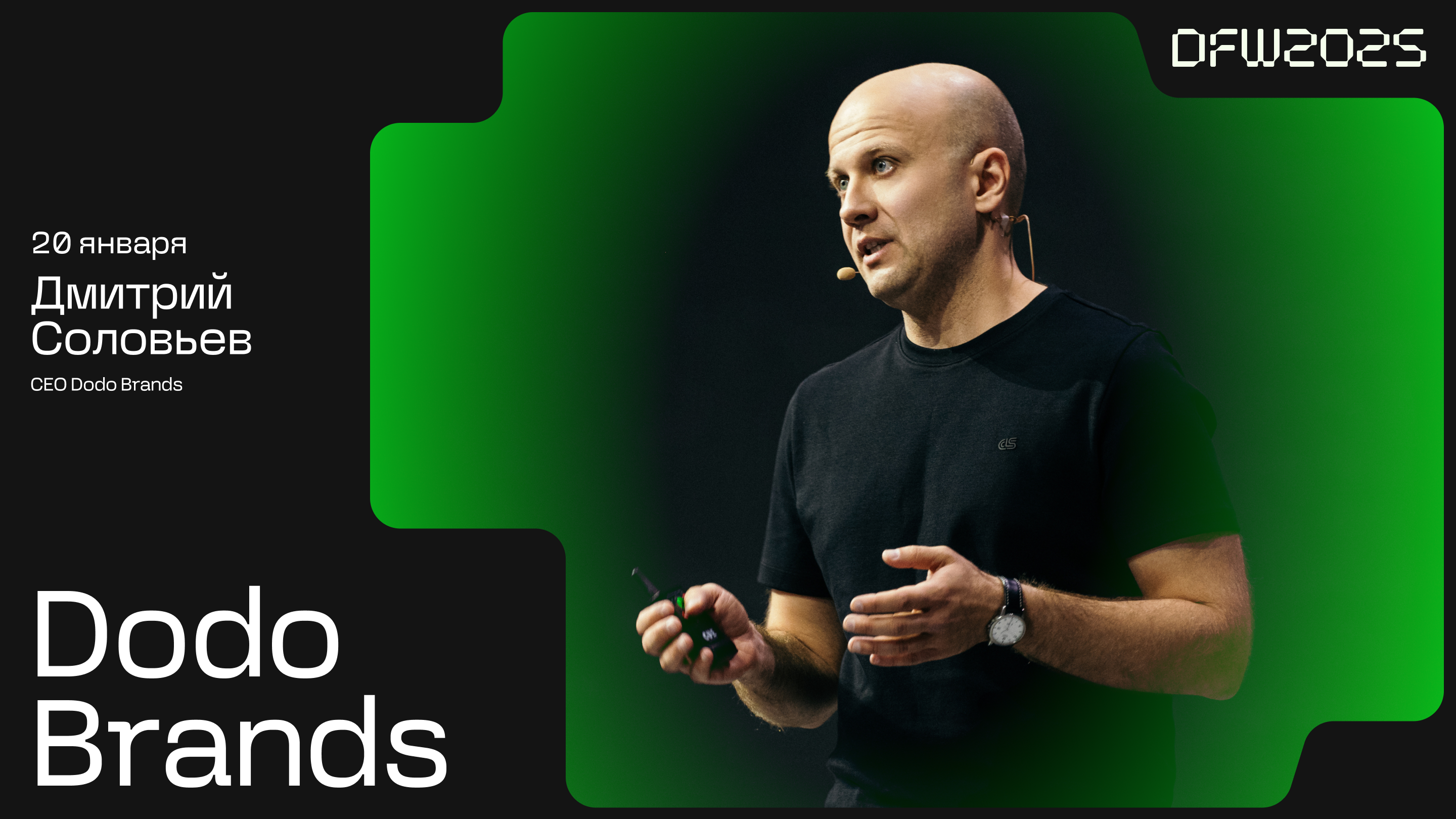
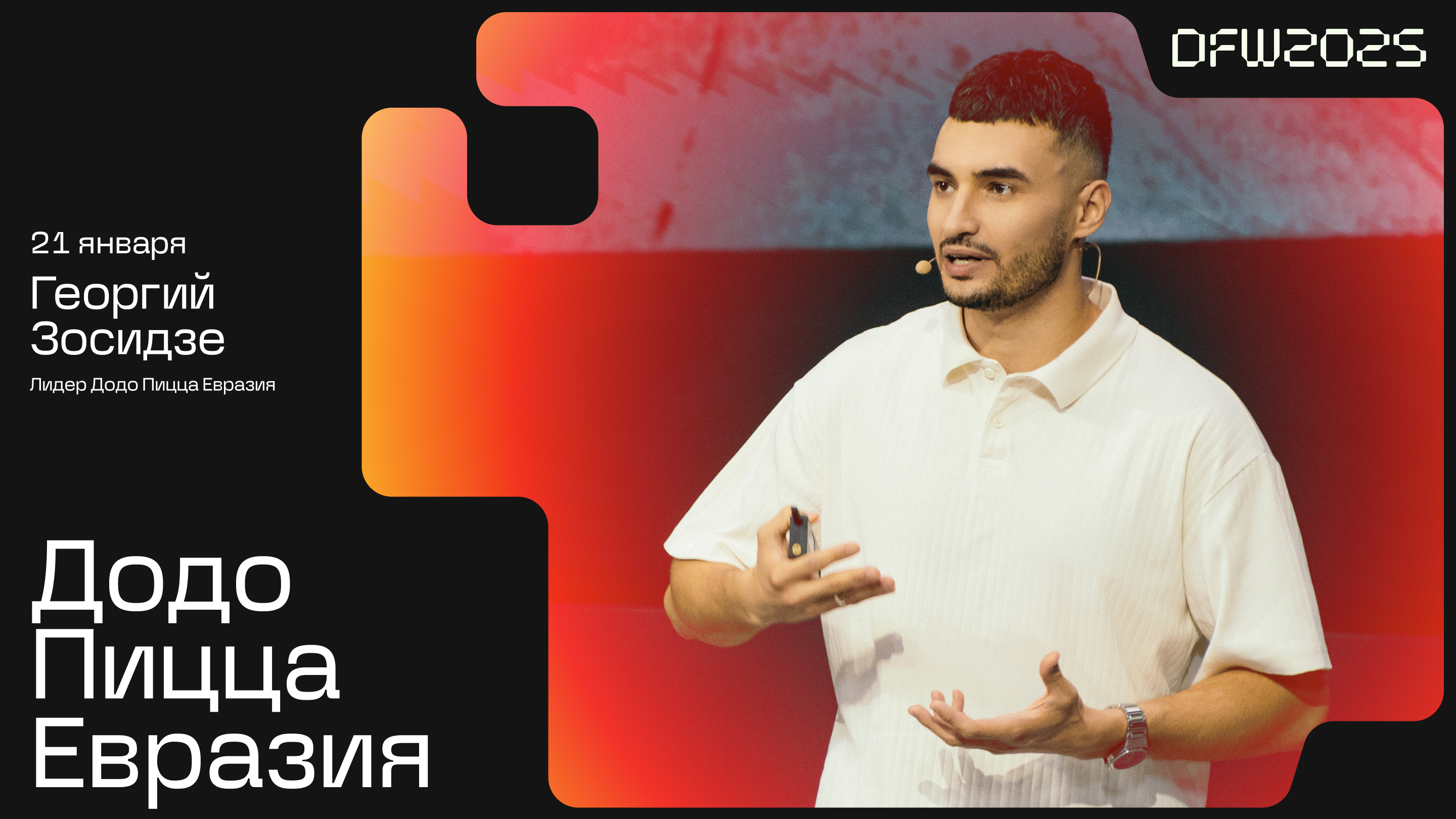


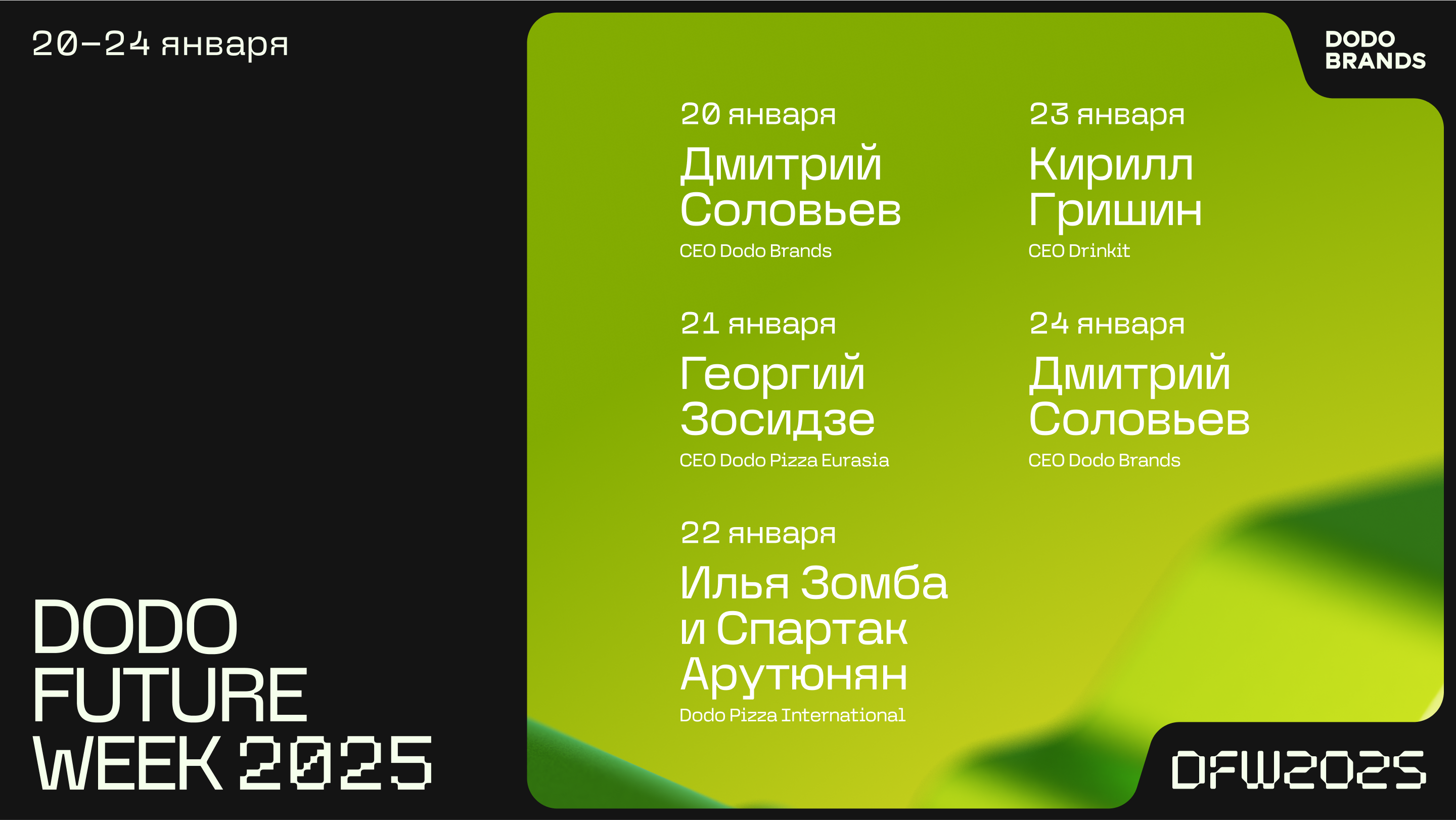


Motion design
For the broadcasts, we made animated inserts, transitions, and title cards in the event's overall style. This not only gave everything visual cohesion but also made moving between program segments feel more natural and pleasant for viewers.
Presentation design
Designers laid out the presentations while staying in constant contact with the speakers, so that every slide was accurate, up to date, and easy to take in. As a result, every participant's talk came across as professional and cohesive.
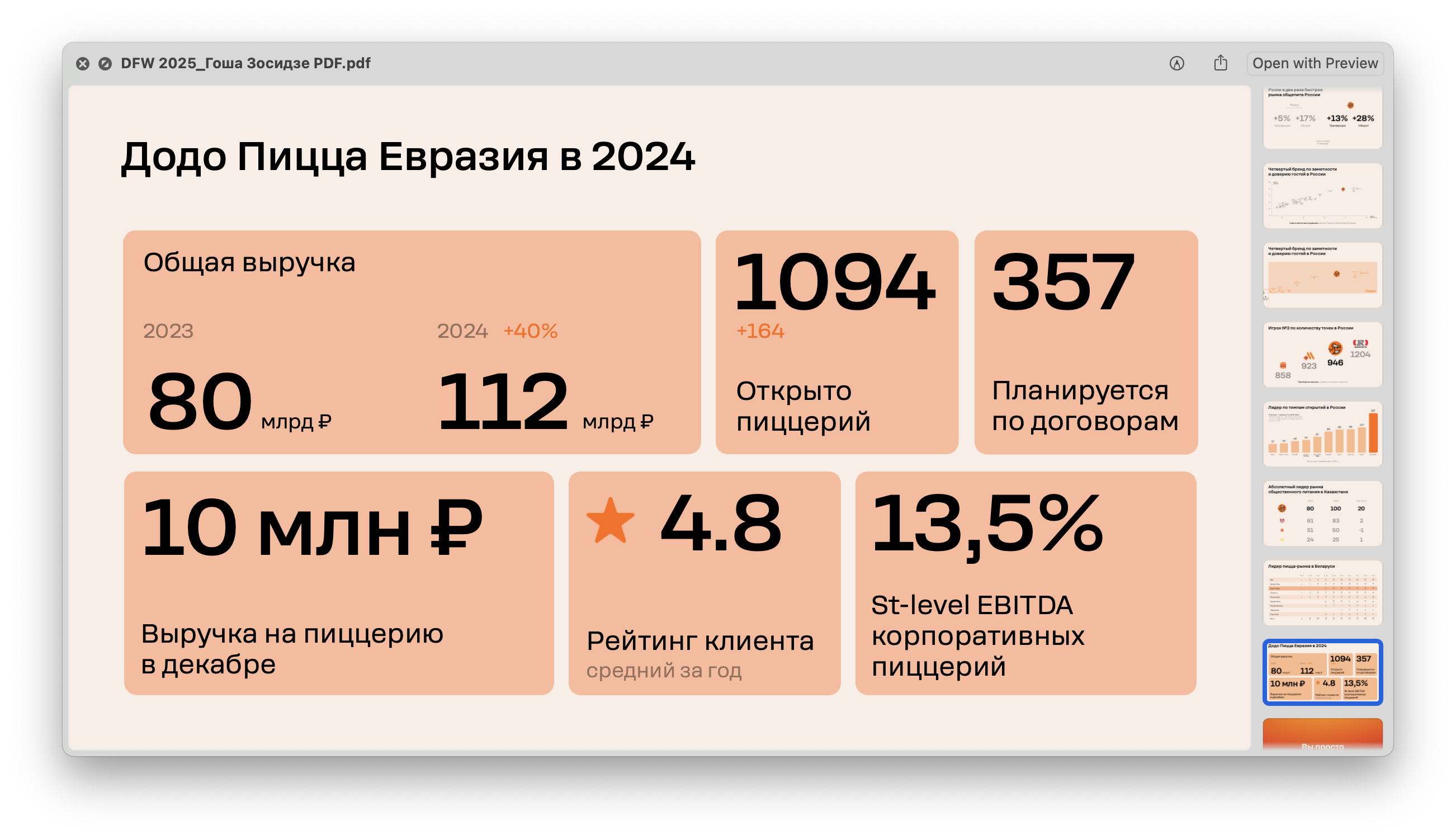
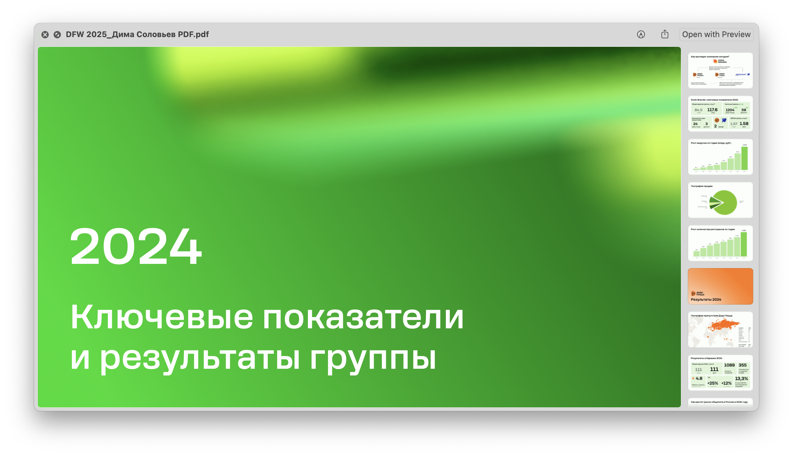
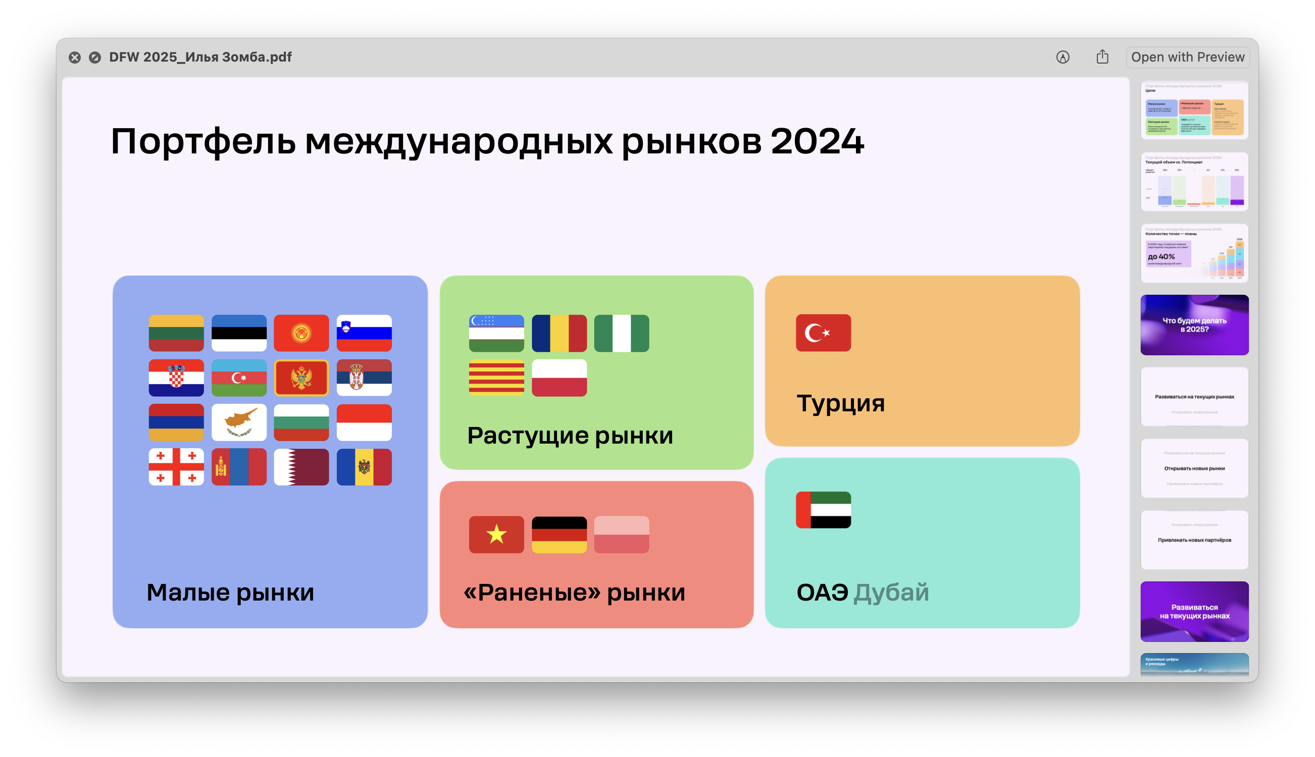

It was a great feeling to arrive on the first day of the event and see it all come to life. Things always look different in reality than they do on a work monitor.
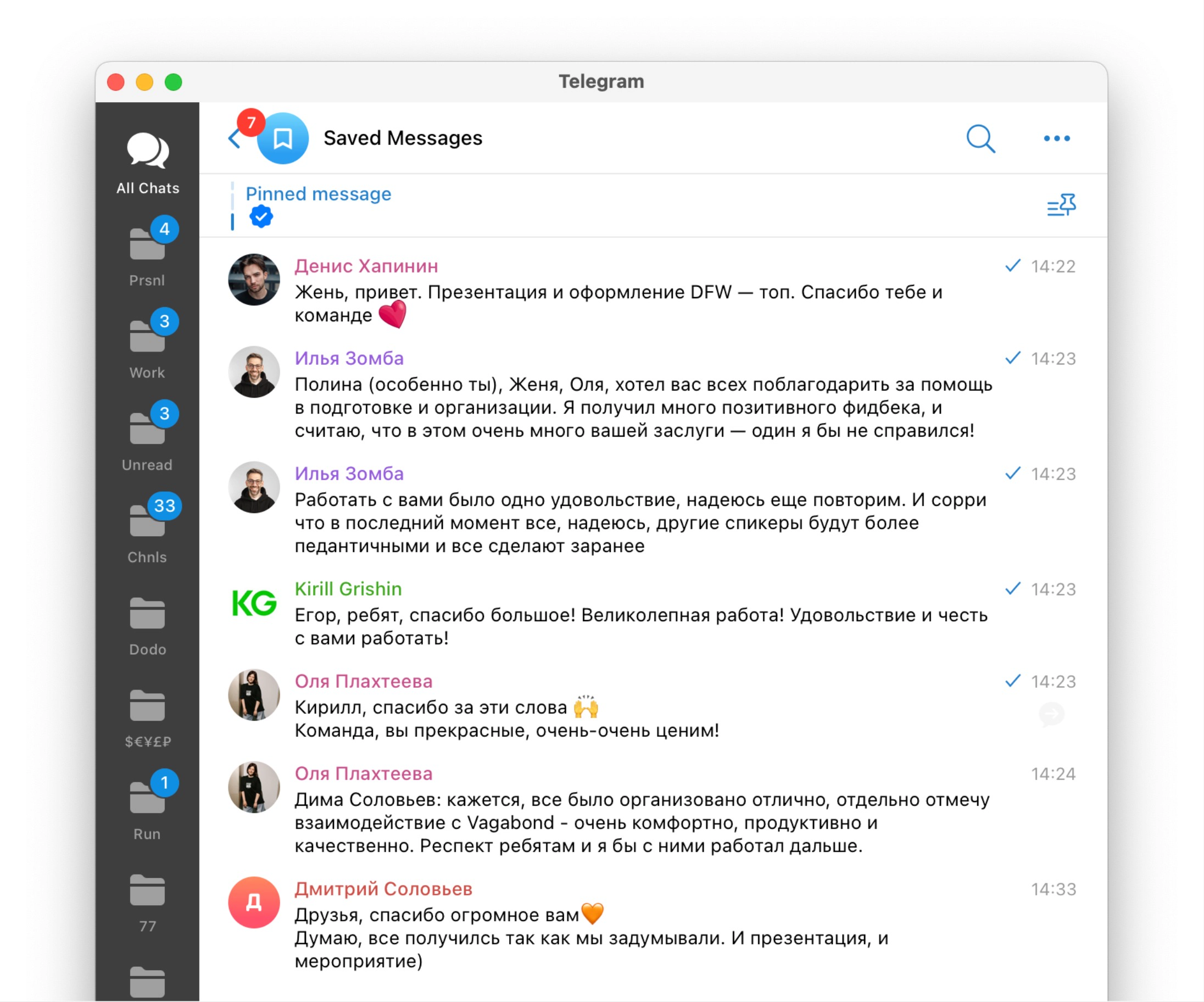
The event went off successfully, and it was also gratifying to receive thanks from the speakers and viewers. The identity and visual materials we developed underscored Dodo's brand values and created a memorable look for Dodo Future Week 2025.
We're looking forward to next year, a new project, and seeing everyone at DFW 2026!
Project team:
Art direction — Zhenya Oputin.
Concept and identity design — Serafim Shigin.
Presentation design — Egor Kubasov, Polina Livaich, Veronika Semenovskaya.
Motion design — Ekaterina Kulaga.
Case editor — Misha Kurnosov.
