In 2025, Dodo Pizza in Estonia celebrates its tenth anniversary. Over the years it has become part of everyday and festive moments — a companion at parties, picnics, and family dinners. For the local team, this was an important milestone they wanted to mark with a bold image campaign. Our task was to develop its visual language.
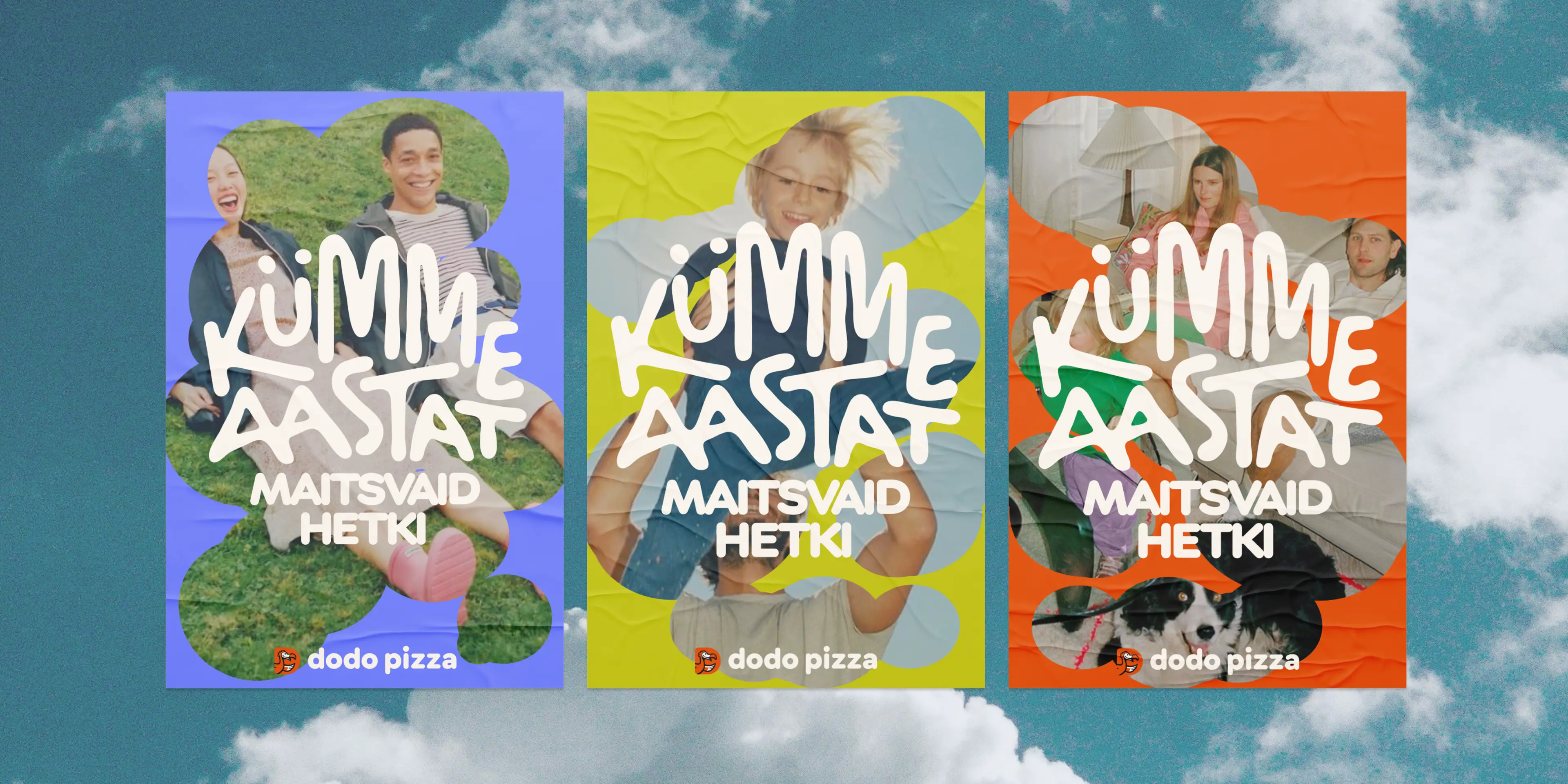
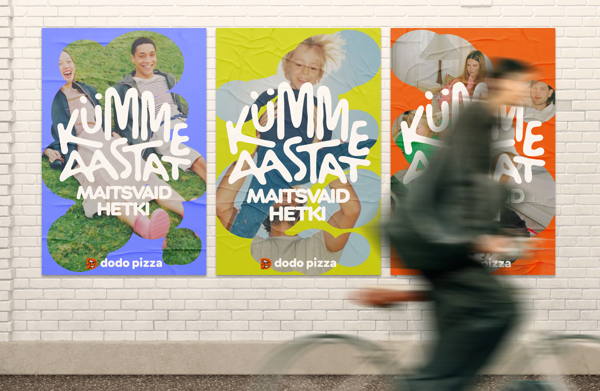
Ten years of delicious moments was the campaign concept built into the brief, and it became the foundation for the visual language. It was important for us to convey that pizza isn't the point in itself, but a natural companion to bright moments. So people and their memories became the key imagery.
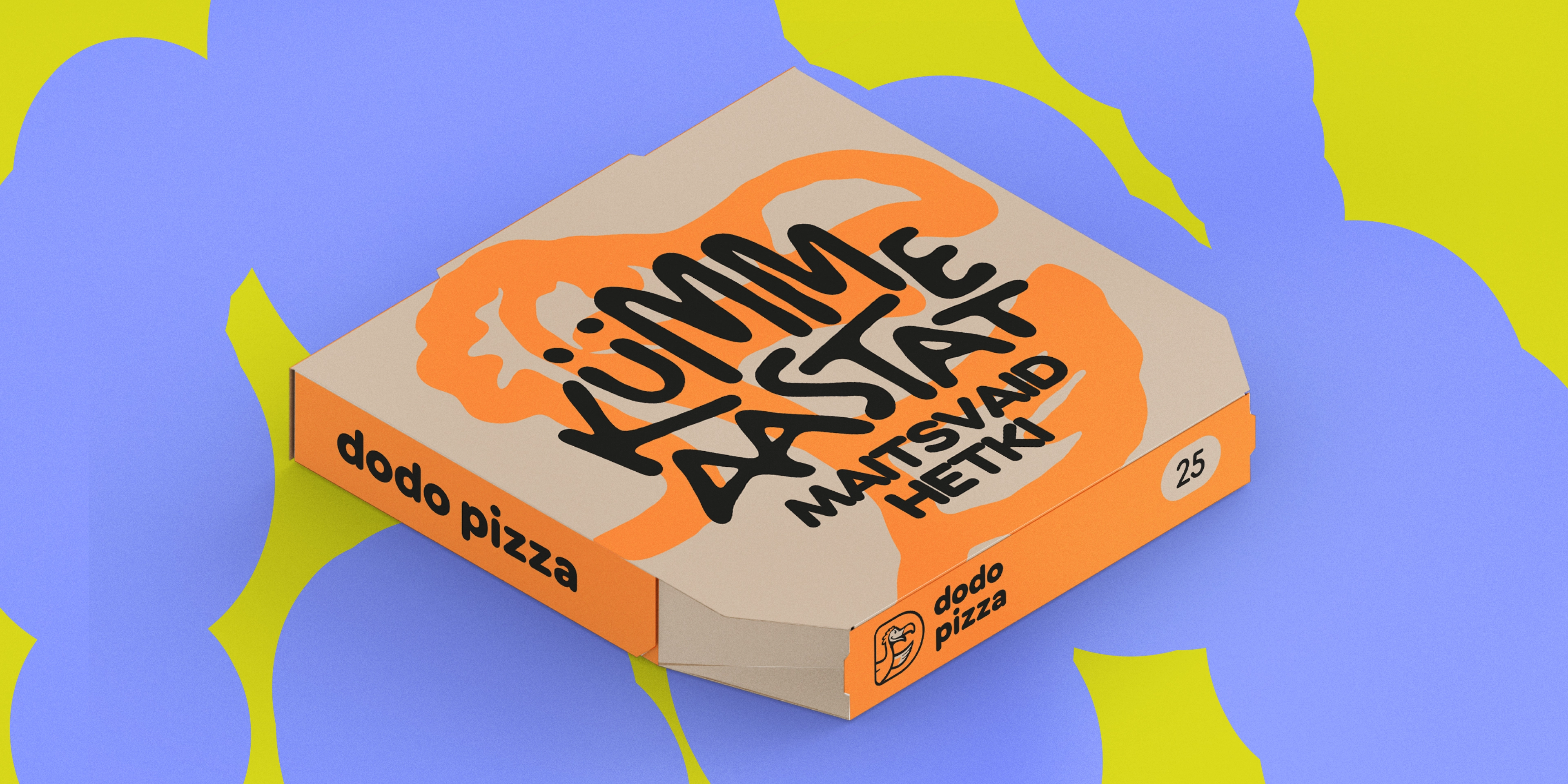
But we did take something from pizza itself: a signature blob shape that became the main visual metaphor. It works both as a cloud of memories and as sauce spread across dough. We also borrowed pizza's irregular shapes to make the graphics feel alive and tangible.

We used the analogy of pizza and fireworks, since neither is the main event on its own — both accompany celebrations and make them brighter.
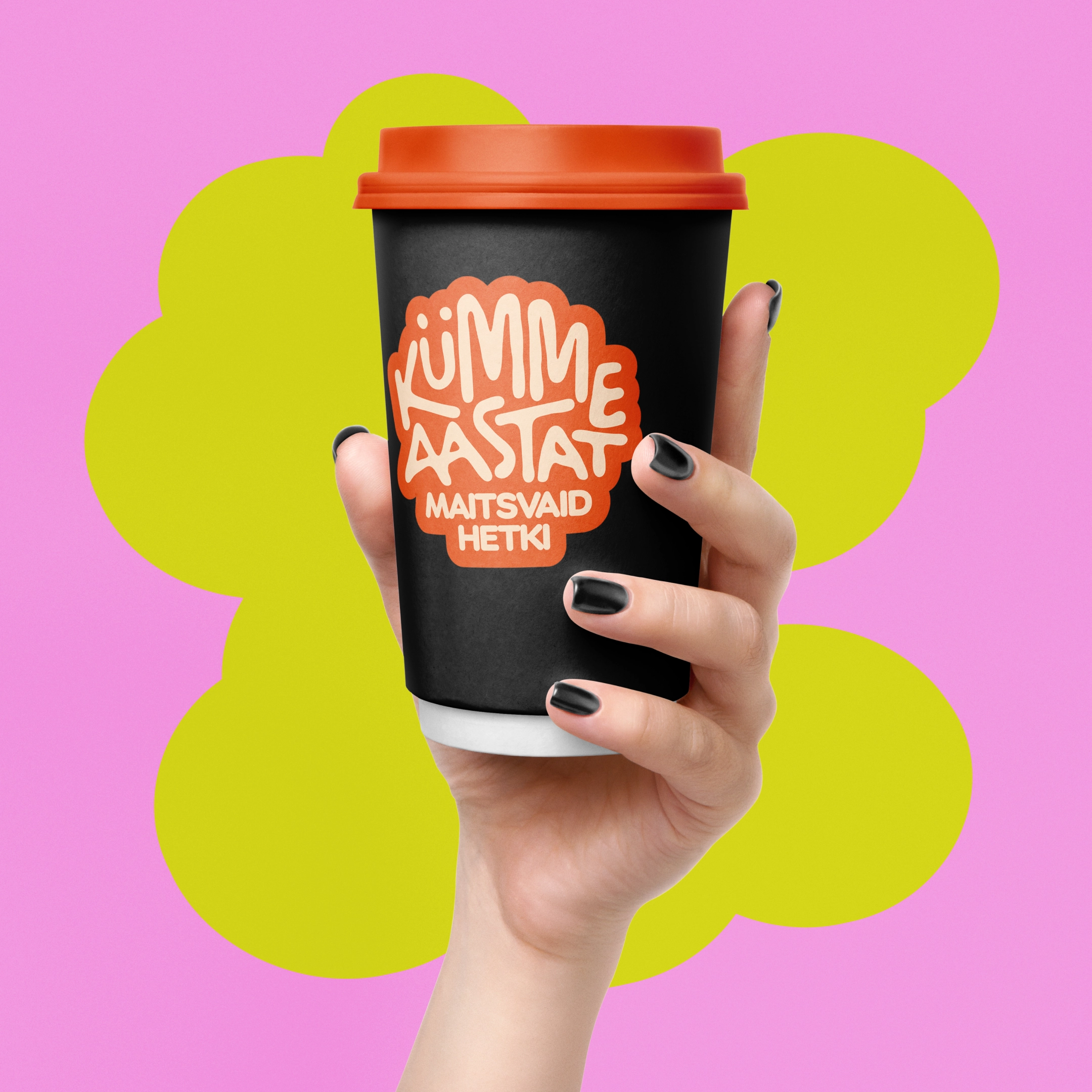
The logo sits inside a circle, a whole shape associated with pizza. To make it festive, we made the lettering inside dynamic, like fireworks.


The graphics were built on the idea of materiality: blobs like sauce, textures like traces of a real product. We even reworked the Dodo bird — making it soft, as if smudged by a brush, more like a living brushstroke than a strict graphic mark.



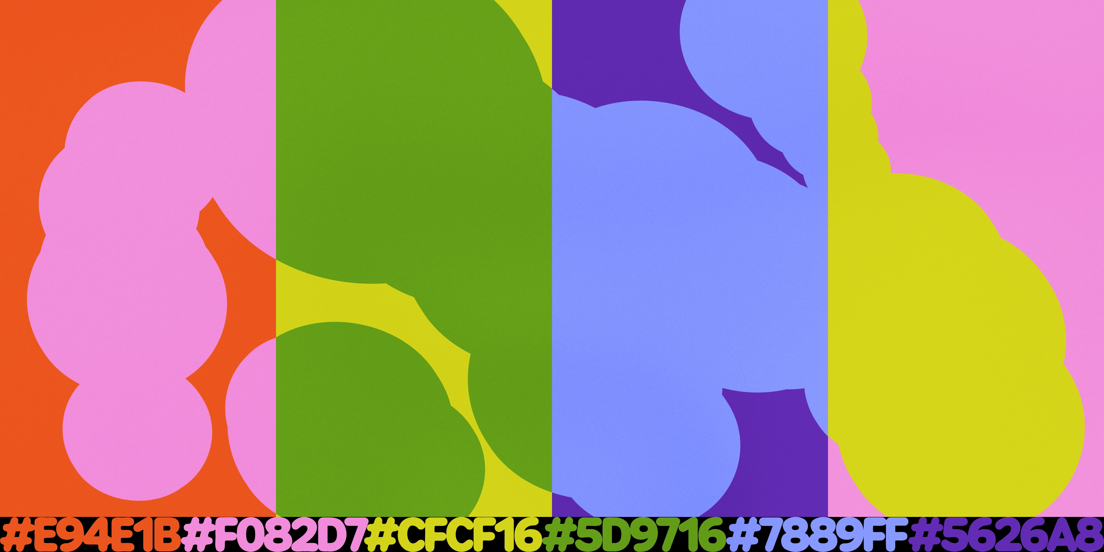
The color palette draws on Dodo's signature shades — red-orange, pink, and lime green — and we added green, blue, and blue-violet. This let us create fresh splashes of color and a new rhythm while keeping the connection to the brand.
The idea behind the photography was memories of moments with Dodo Pizza. We avoided leaning into nostalgia — instead, a memory here is a flash, a bright moment. The product appears in the photos, but it's not the focus — it's part of the atmosphere.

Creating the photography was a challenge for us. It was important that the photos reflect real emotions and unstaged moments, with actual Estonians in frame. Since we couldn't physically run a photoshoot in Estonia, we proposed two solutions:
Run a contest among followers to collect their personal photos from the past 10 years. Prepare a detailed guide for shooting the photography.
We went with the guide, where we told our Estonian colleagues that the photos needed to feel candid and unposed, to match the idea behind our key visual. The scenarios are simple and relatable to everyone: student life, holidays, family gatherings, picnics.

The campaign turned out warm and genuine rather than formal or postcard-like. It showed that Dodo in Estonia means ten years of stories where pizza was always nearby — sometimes as the star of the party, more often as a quiet companion among friends or family.
We developed a master layout for the campaign, logo stickers, and a pizza box design. The Dodo Brands team and the local Estonia office loved it — every idea and visual hit the mark.
This was a special project for us too — a rare case where everyone is on the same wavelength and the work becomes a pleasure. The anniversary turned into part of a shared memory rather than a reporting exercise — which was the whole point from the start.