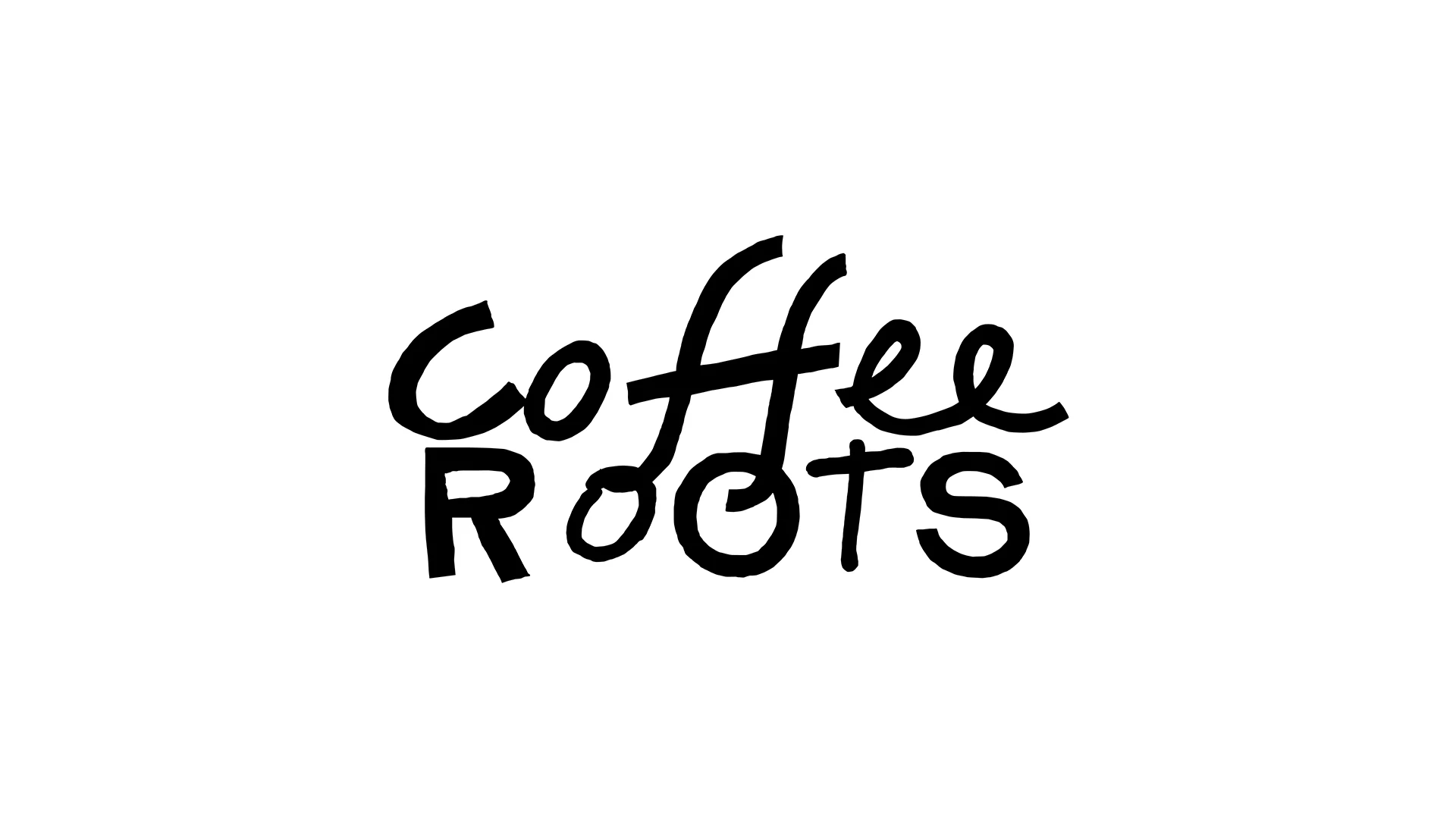
A client came to us for naming and identity for a coffee shop in Kazakhstan. The format is a spot for Gen Z and middle-aged people looking to find like-minded company.
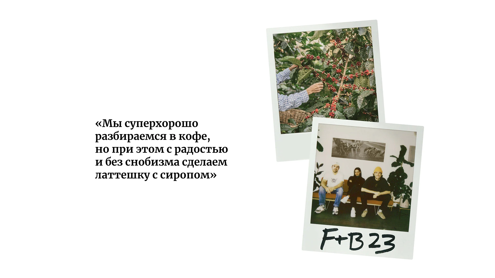
The client came in with a ready concept called "Zemlya" (Earth). The idea had positioning that was clear and close to the client's heart, but it wasn't landing with the audience the way they needed.
Our task was to propose a new name and capture in the design a sense of connection that unites a love of coffee with respect for local culture.
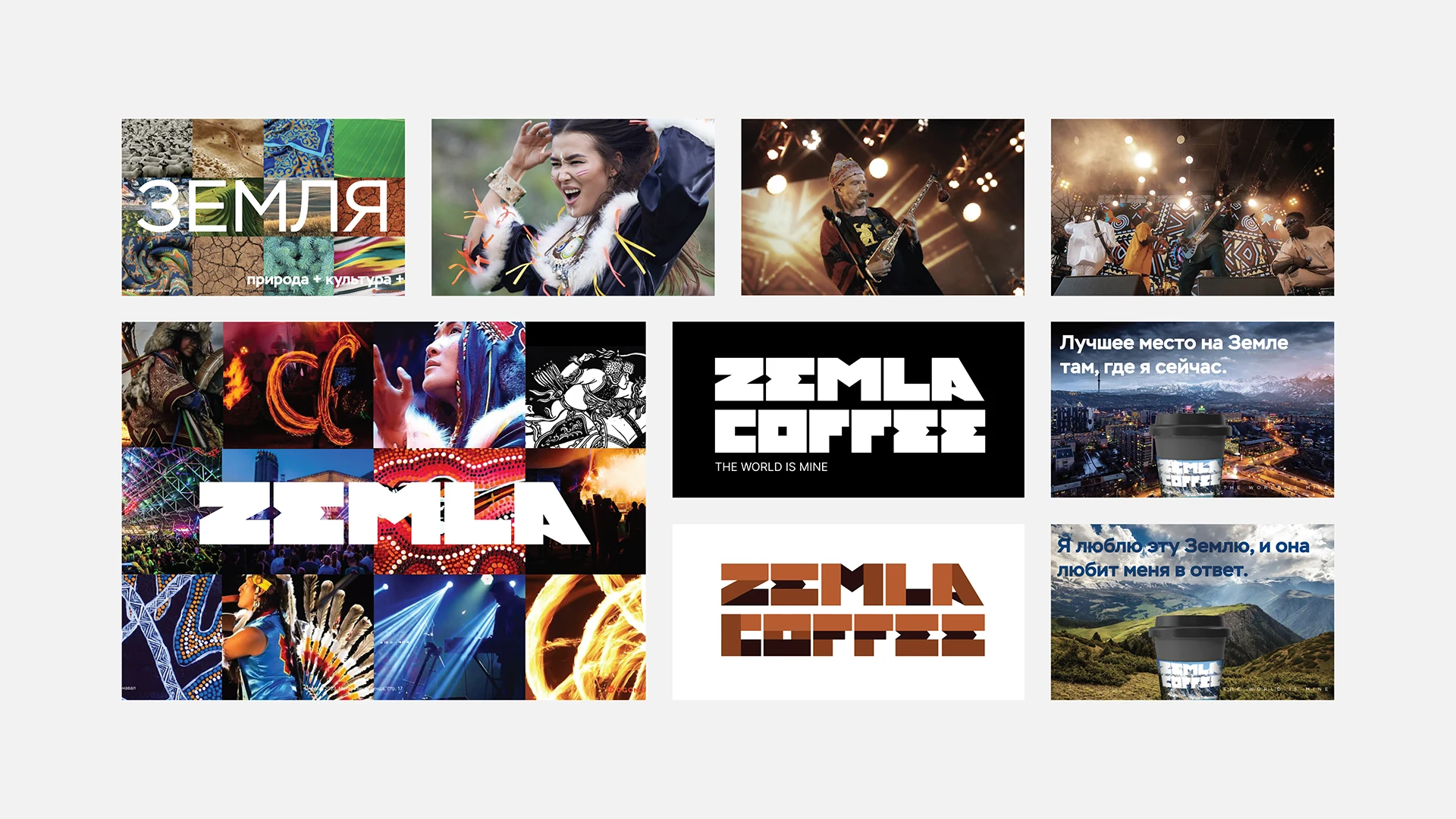
We proposed a new name — Coffee Roots. The client liked it, and it more vividly reflected the brand's idea and its many facets.
The word "roots" was meant to feel modern and layered in meaning, symbolizing a connection to something important and deep-rooted, without being literal. We avoided direct associations with roots and nature themes.

The logo needed to be stylish, concise, and versatile, underscoring the brand's friendliness and modernity.
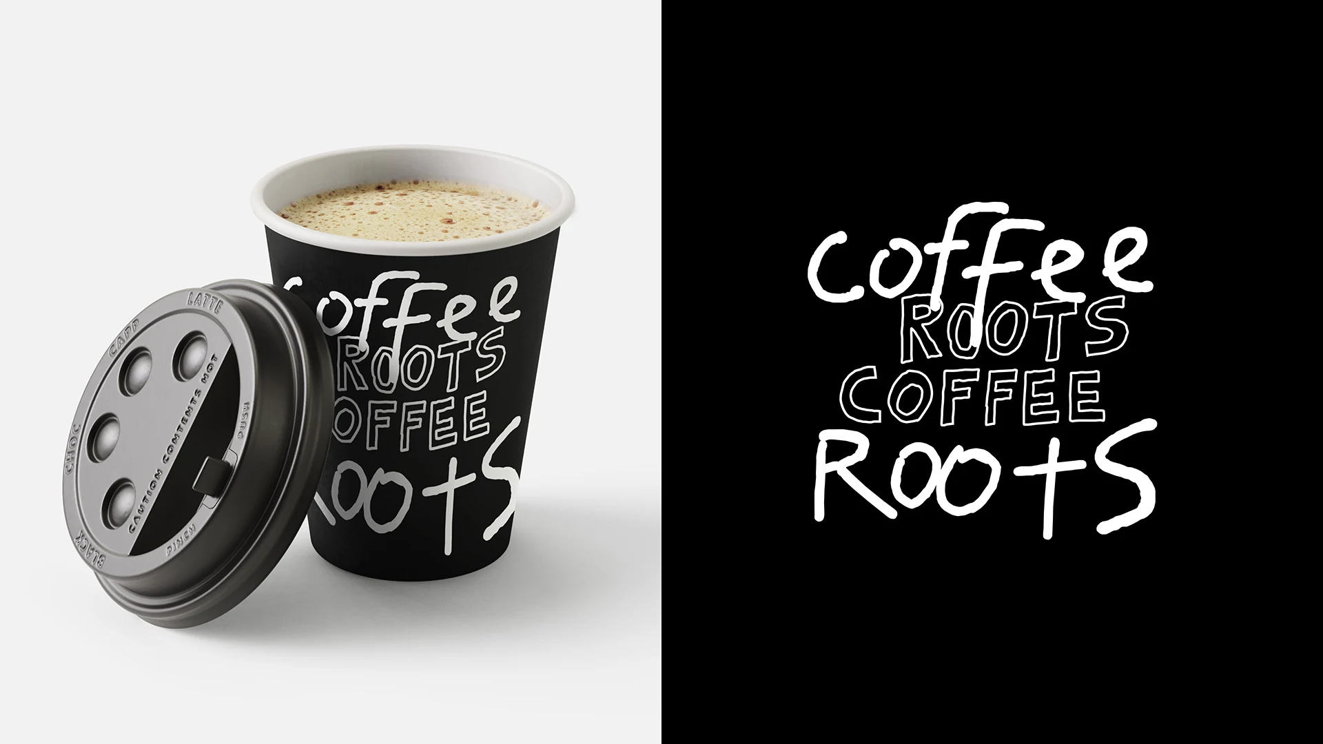
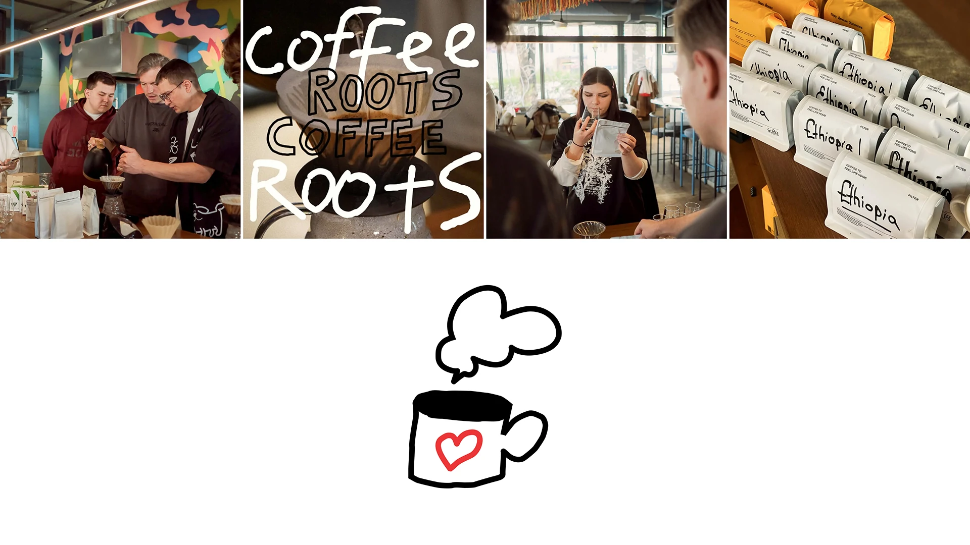
We decided to show a deep connection with the past through handwritten text — a way to preserve uniqueness while staying part of a cultural heritage. This format radiates warmth, like a letter from a close friend, and the drawings evoke home.


The guest's name on the cup is a small detail that creates a sense of care and individuality. We highlight the name in color for emphasis, and the lettering can be used in three languages.


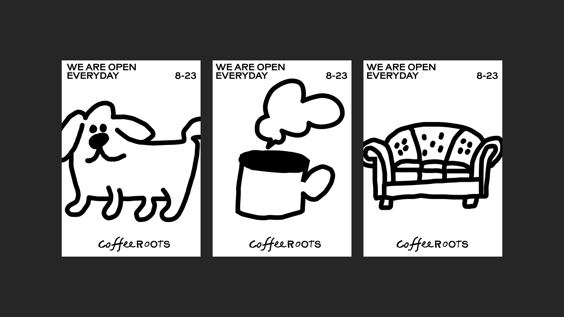
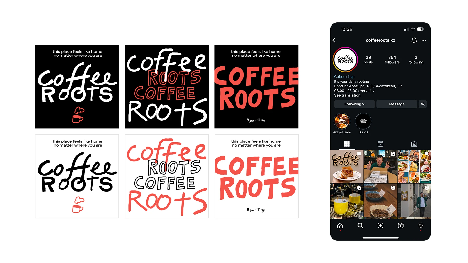
Based on the style we developed, we prepared social media visuals. Handwritten type on a contrasting background looks unpolished and builds more trust in the café's format. Thanks to the new concept, the posts feel closer to people who love coffee and life's simple pleasures.
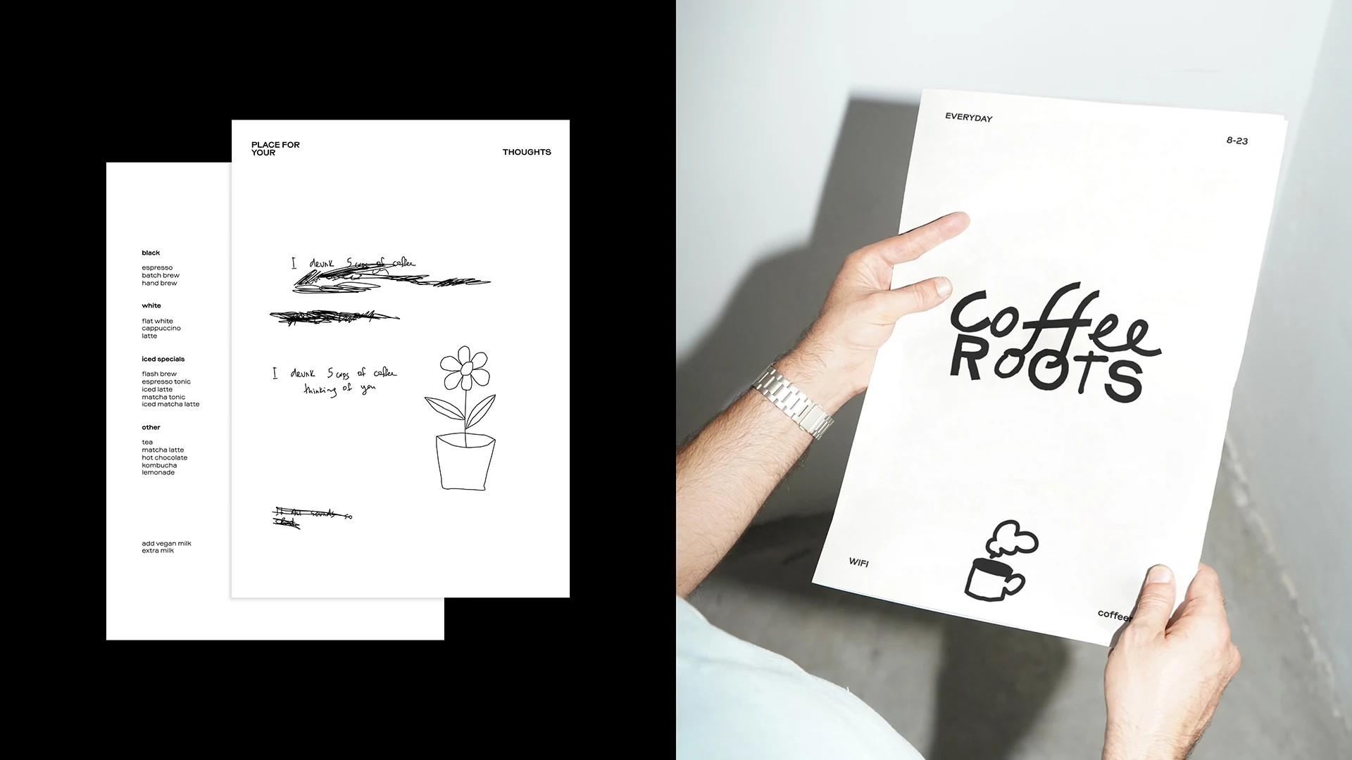
We turned the last page of the menu into blank space for guests to leave a drawing or symbol close to their heart. These personal touches become part of the visual identity, and the collection of images turns into a unique story for the café.
We created a visual identity that captures the spirit of the coffee shop: freshness, layered character, and coziness. The logo looks modern and versatile, free of clichés and competitor look-alikes. The client confirmed that the new style gave the café a distinct atmosphere and a closer feel with its customers.

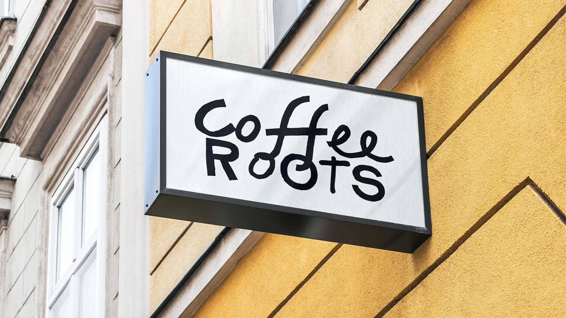

Every day, Coffee Roots welcomes guests with freshly roasted coffee and genuine smiles. It's now a place where friends and good taste meet.
Project team:
Alina Askarova — naming.
Sasha Zagorsky — brand designer.
Luiza Vasyutina — creative producer.
Veronika Mudrak — account management.
Vasilisa Kuznetsova — assistant.
Dima Loshkin — case design.
Misha Kurnosov — case editor.
