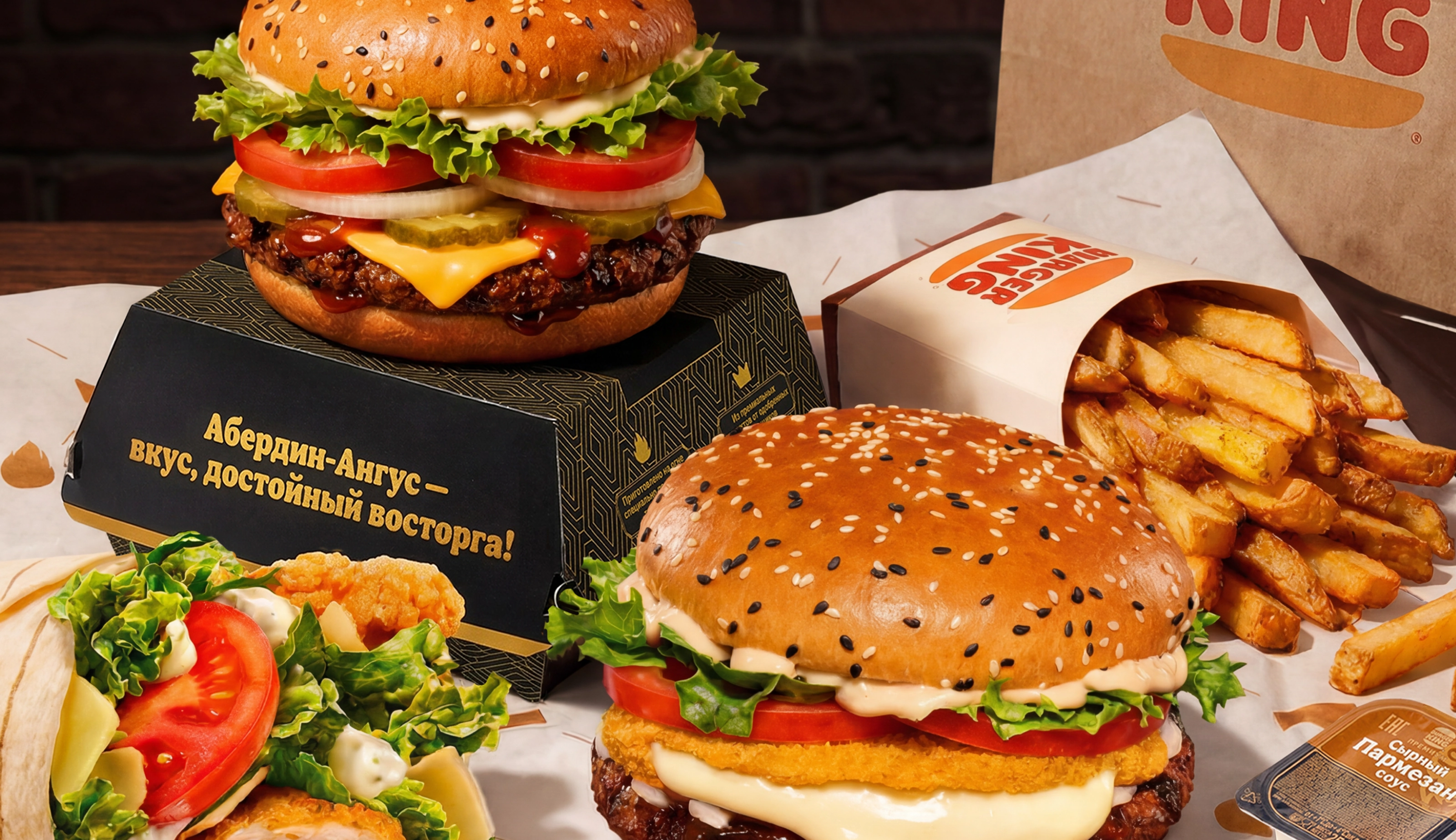
Burger King ran a tender to launch a seasonal line of burgers and rolls featuring new cheeses. The main challenge was to convey premium quality within brand guidelines — and to do it in just a few days. A task where discipline mattered as much as creativity.
— Develop creative for digital promotion.
— Come up with and visualize a name for the line.
— Work out the layout's look and overall impression within the brand's guidelines.
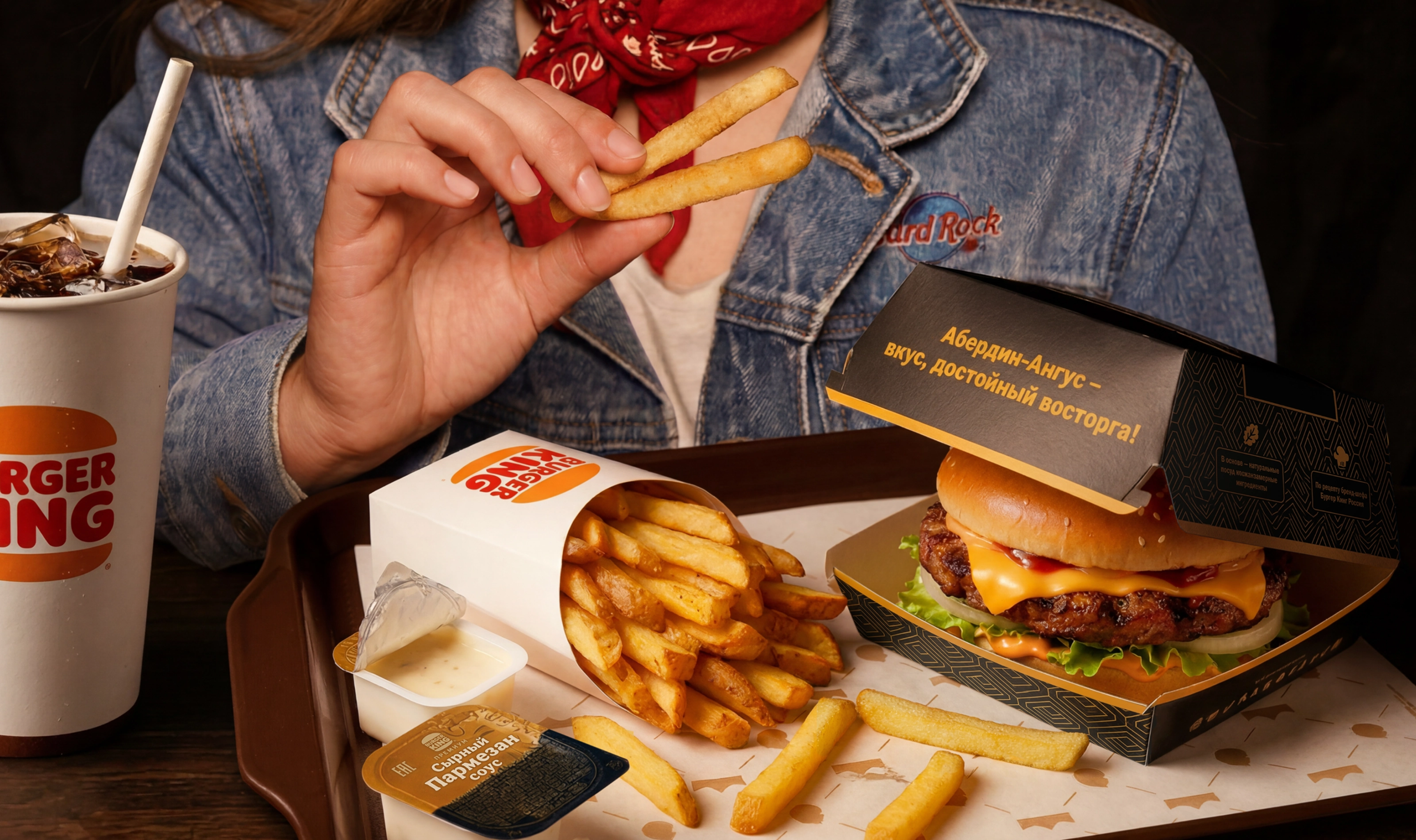
— Create a packaging concept (clamshell) for the premium Angus beef burger.
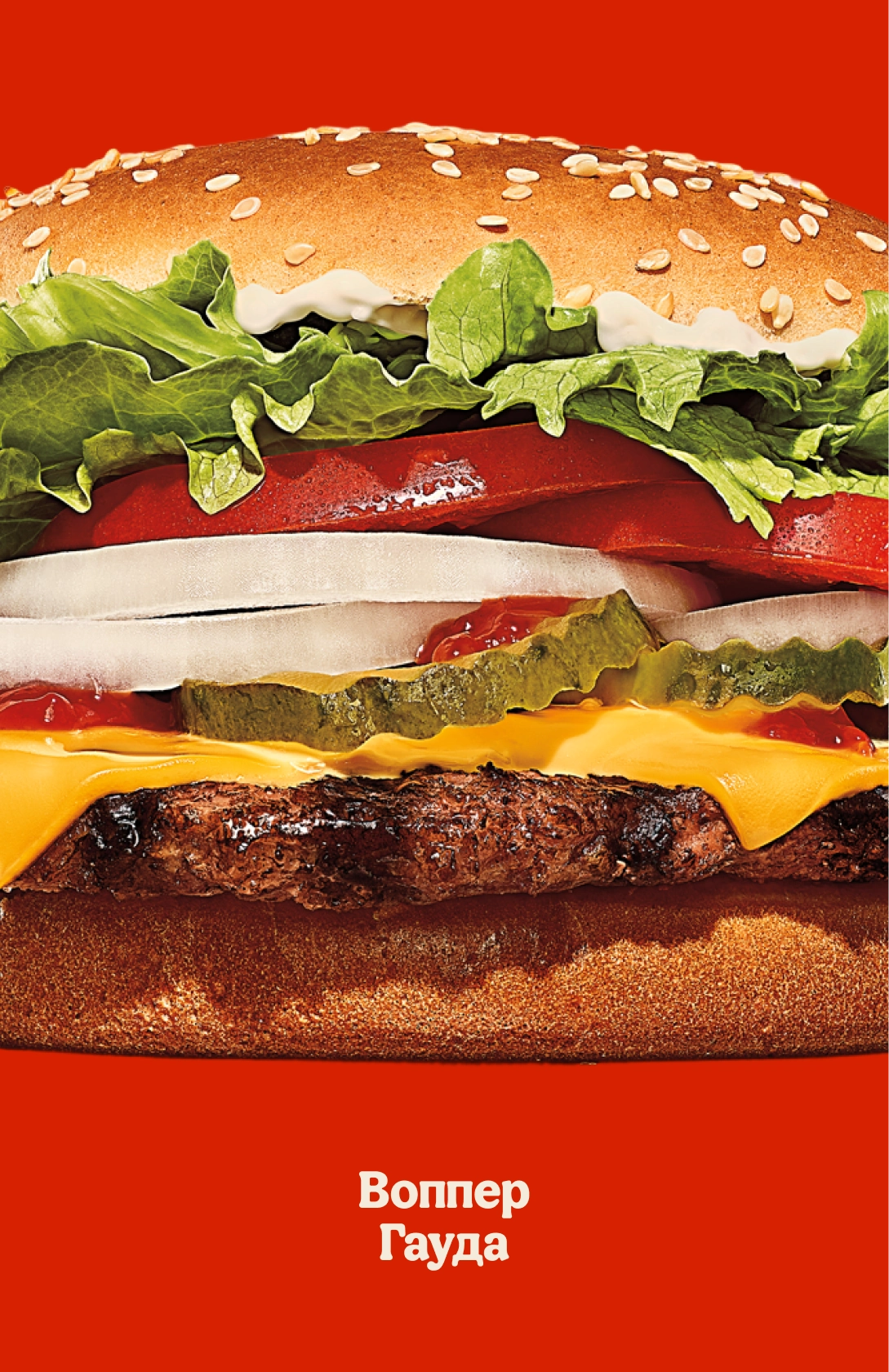
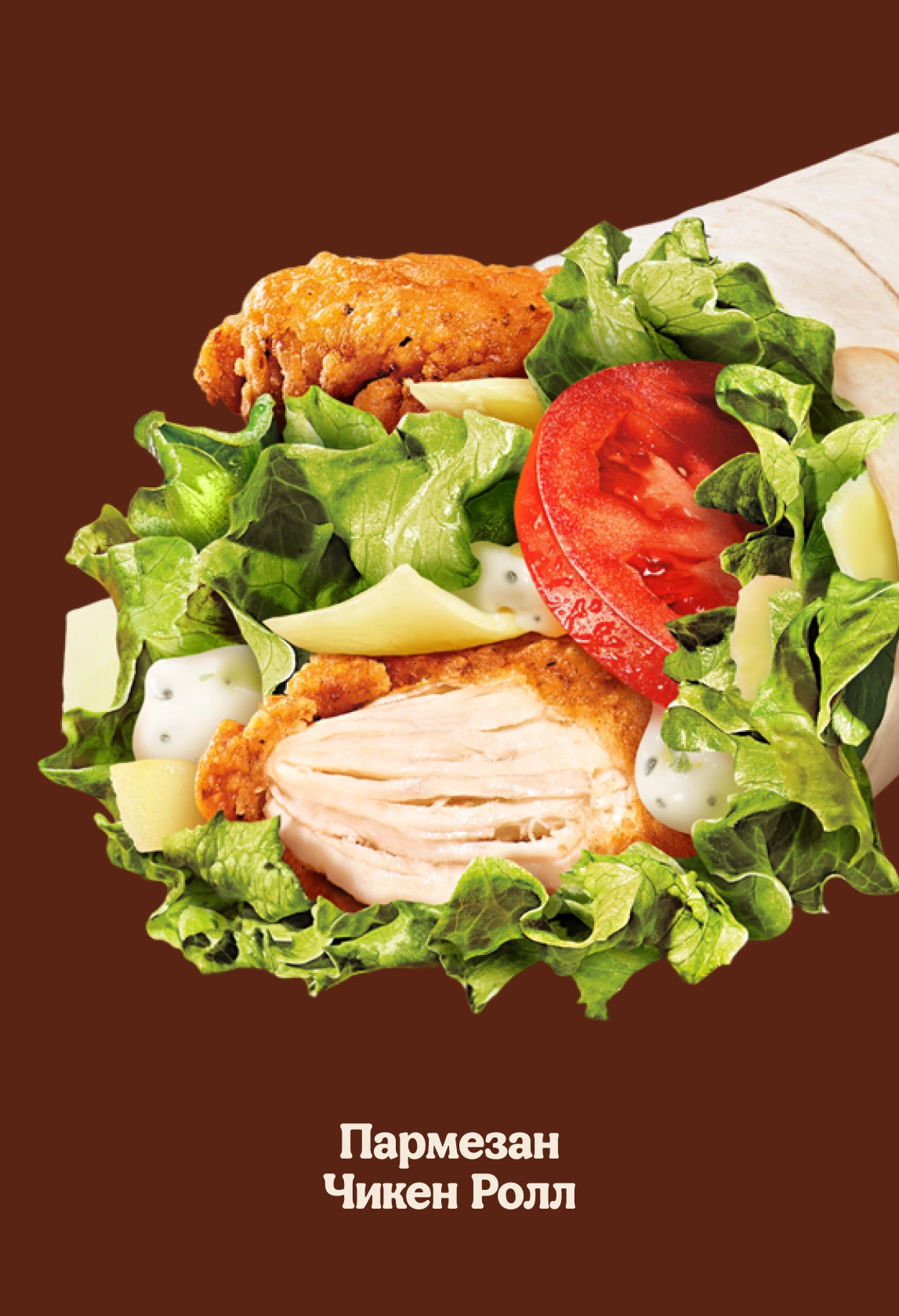
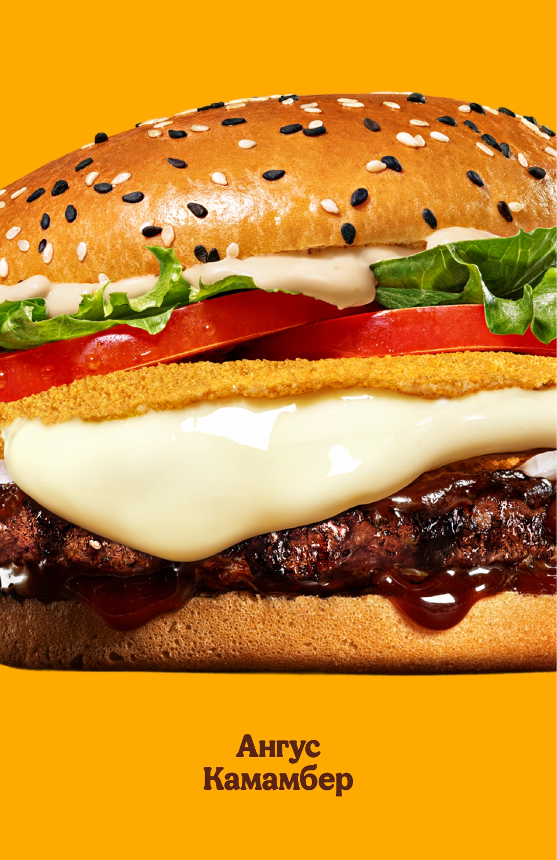
What We Saw
Burger King positions itself not as ordinary fast food but as a fully realized product developed by chefs: a juicy patty, 100% beef, natural ingredients, flame-grilled cooking. That's exactly what we built on.
What We Proposed
— Emphasize a sense of premium quality: rich combinations, juicy presentation, visual texture.
— Use clear quality markers: camembert, gouda, parmesan, pedestals, "golden" gradients.
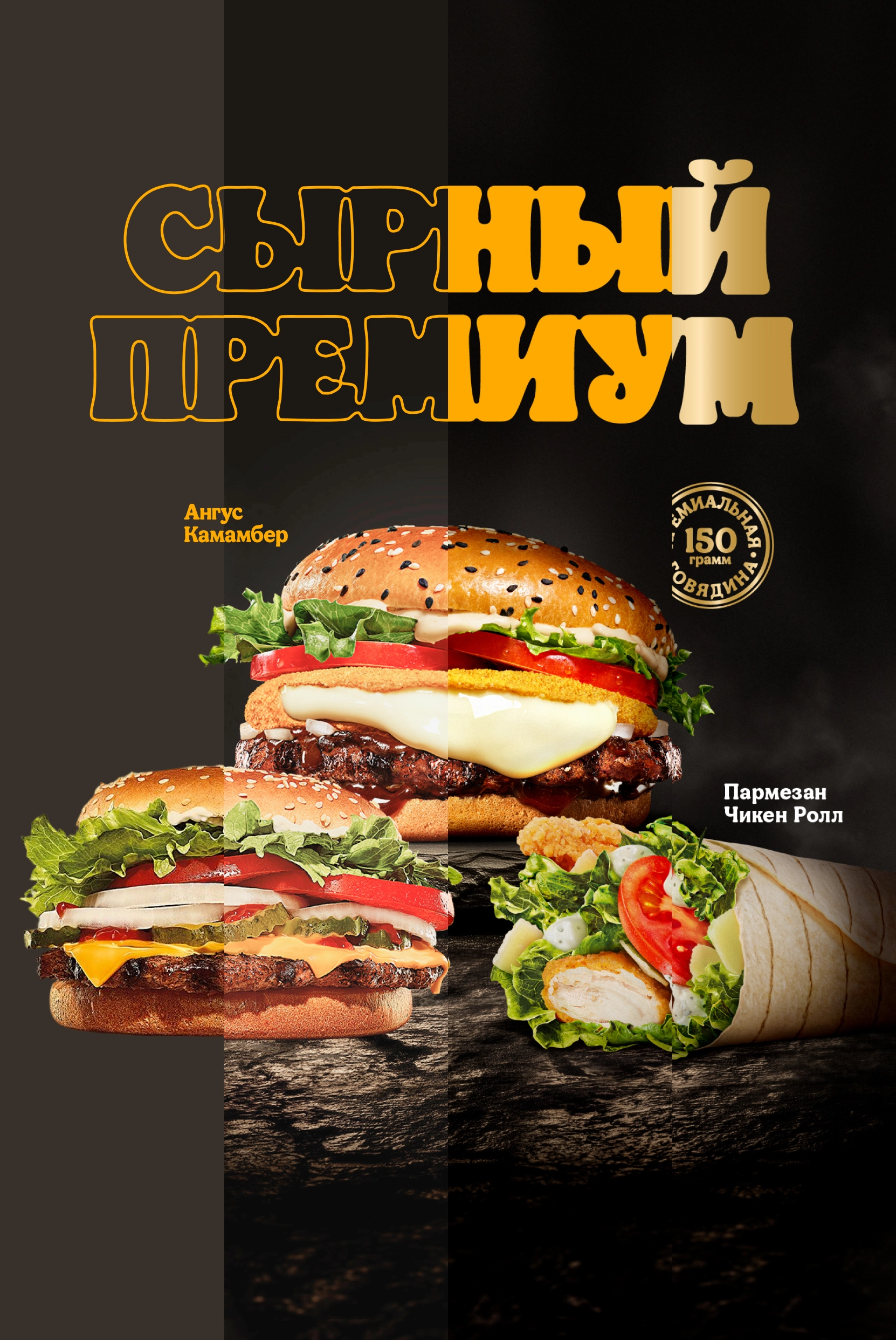
— Unite the three new items under one shared line, "Cheese Premium."
— Update the box design to highlight what makes the hero burger special.
Concept
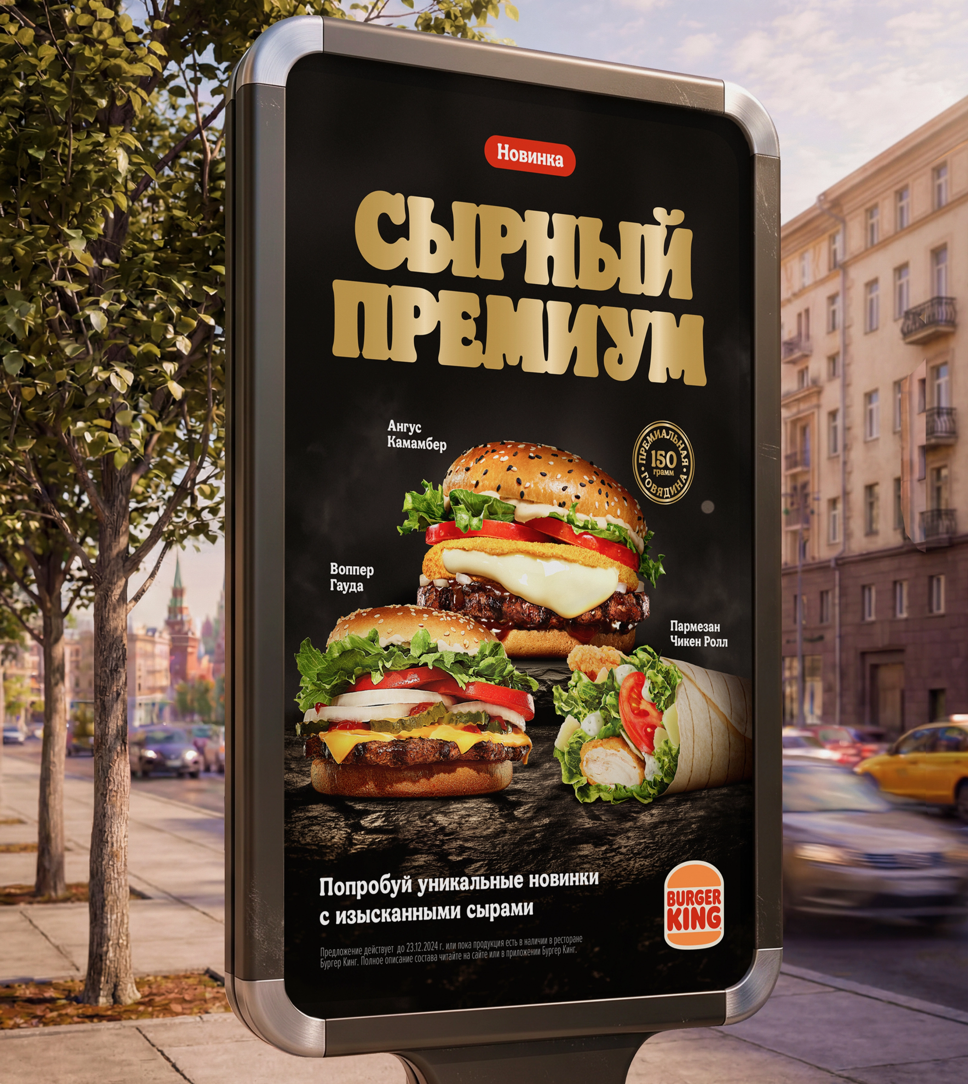
We decided not to invent excessive mechanics, but to build a sense of premium quality through composition, light, textures, and clear accents. A dark stone surface became the background, with the hero burger on a pedestal and the others arranged neatly alongside.
Branding and Look
The "Cheese Premium" line is visually supported by a gradient gold color: it started out yellow, but that cheapened the look, so we moved to a metallic finish. For the typography, we used a stretched-cheese effect.

Digital Layouts
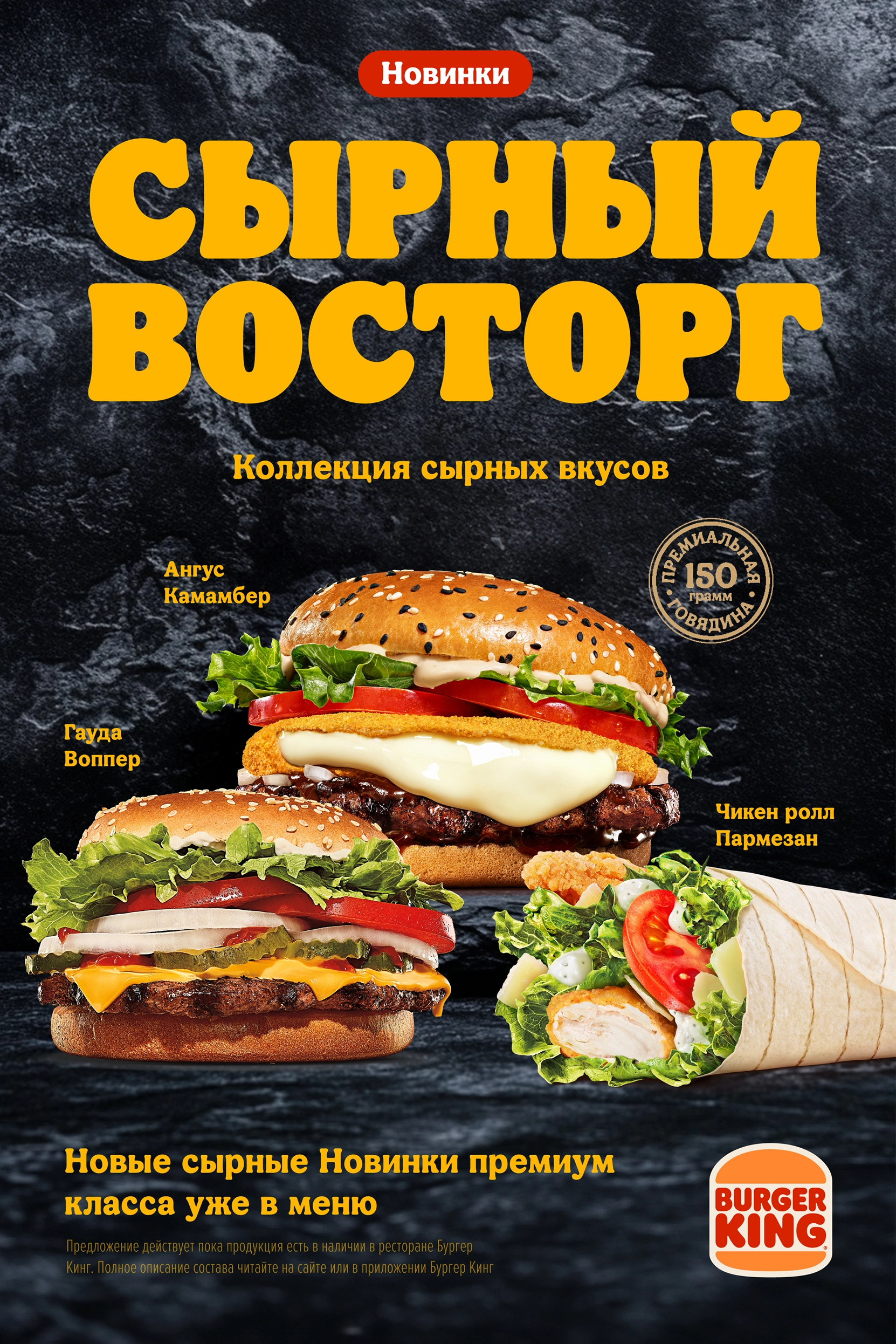
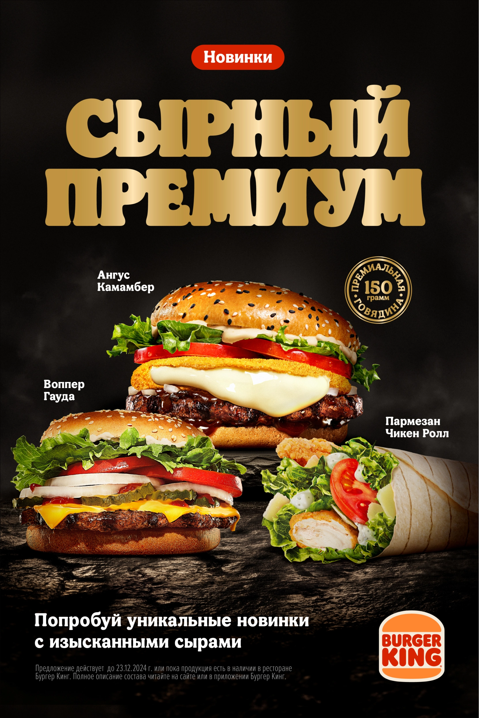
We put together a vertical key visual adapted for banner formats. The layouts were built to Burger King's guidelines, following every requirement.
Packaging (Clamshell)
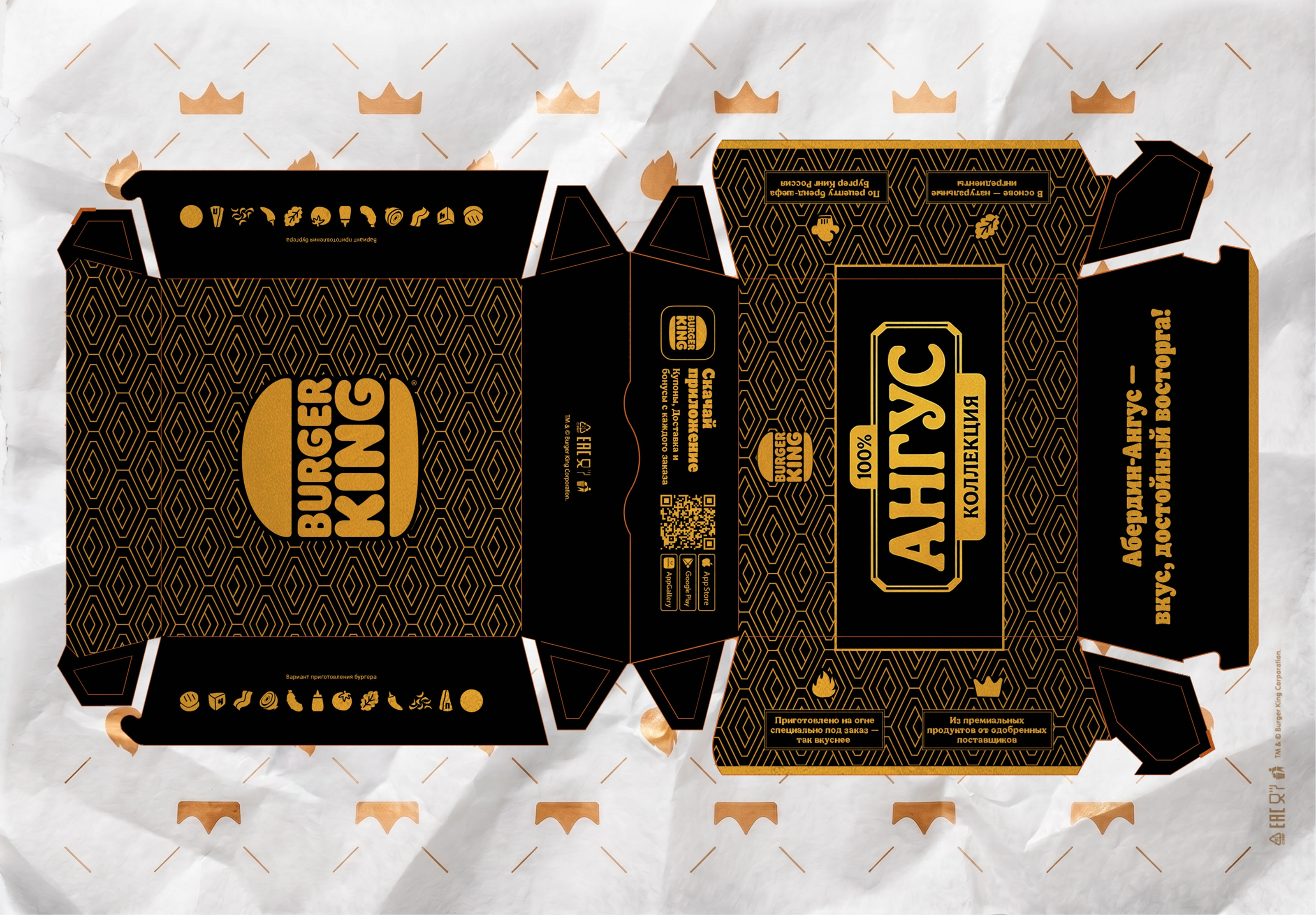
We designed a standalone branded box for the premium burgers, in the style of the existing packaging but with reworked graphics and color palette. We added the copy "Wrap up Angus. A taste worth celebrating," and styled the typography and decorative graphics in a linear Art Deco spirit.
Challenges
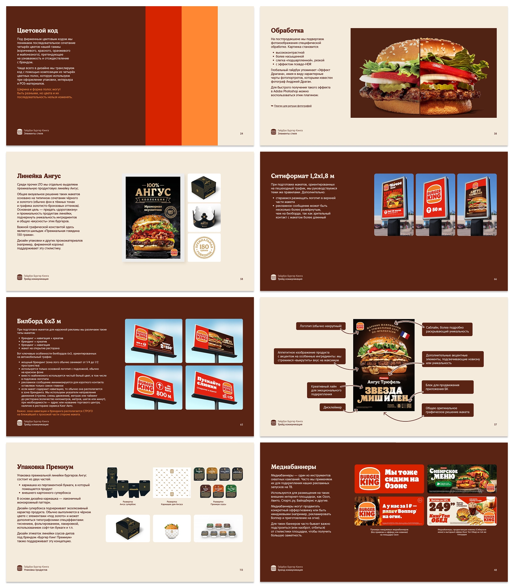
The timeline was extremely tight — under a week for the full cycle: concept, layout, retouching, packaging. On top of that, we had to follow the guidelines closely — Burger King regulates its visual presentation strictly.

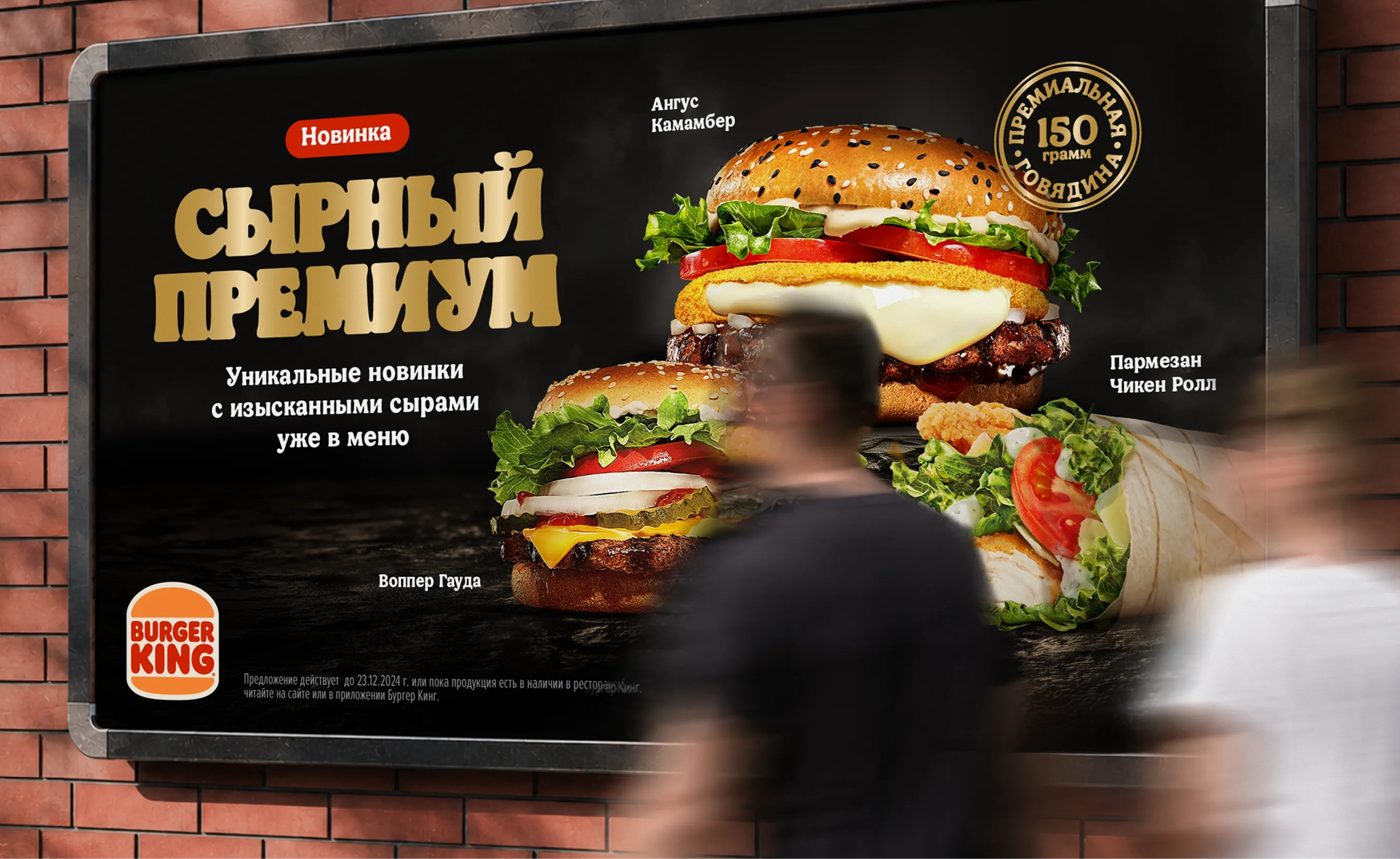
Burger King got a clear, visually strong concept for promoting its new cheese burger line.
We managed to present the product as premium: visually — through composition, light, and background; semantically — through the line name and copywriting; functionally — in line with all of the brand's guidelines.
The box rounded out the image, reinforcing the sense that this new product was something distinct and more valuable.
Project Team
Project manager — Veronika Mudrak
Case design — Masha Asaulyak
Case editor — Misha Kurnosov
